BarButtonItem.ButtonStyle Property
Get or sets the button item’s style which determines how the current bar button item functions.
Namespace: DevExpress.XtraBars
Assembly: DevExpress.XtraBars.v19.2.dll
Declaration
Property Value
| Type | Description |
|---|---|
| BarButtonStyle | A BarButtonStyle value that determines how this item functions. |
Available values:
| Name | Description |
|---|---|
| Default | Applies the Default style to the BarButtonItem component. The default style means that the link represents a regular push button. |
| DropDown | Applies the DropDown style to the BarButtonItem component. |
| Check | Applies the Check style to the BarButtonItem component. |
| CheckDropDown | Combines Check and DropDown styles. The target bar button item supports checked/unchecked states and has an assigned drop-down control. |
Remarks
By default, the ButtonStyle property is set to BarButtonStyle.Default and the item links act like regular push buttons.
Set this property to BarButtonStyle.Check to make the item links act as check items (buttons which have normal (elevated) and pressed states).
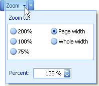
For BarButtonItem objects and their descendants, the ButtonStyle can be set to BarButtonStyle.DropDown. In this mode, you can implement a dropdown functionality for the BarButtonItem. Assign a control or menu to the BarButtonItem.DropDownControl property, and this will be displayed as a dropdown when the button (or its dropdown arrow) is clicked. The following image shows a custom dropdown control displayed for a Zoom button:
See the BarButtonItem.DropDownControl topic, to learn which controls can be used as dropdowns.
When the ButtonStyle property is set to DropDown, a corresponding button displays a dropdown arrow. Clicking it invokes the associated dropdown control. However, by default, clicking the button itself doesn’t open the dropdown, but only fires the BarItem.ItemClick event. To hide the dropdown arrow and invoke the dropdown control when the button is clicked, set the BarButtonItem.ActAsDropDown property to true.
The CheckDropDown style combines both Check and DropDown styles, giving a drop-down control to the bar button item and allowing it to support checked/unchecked states.