ValidationHintBaseDefaultProperties.ShowBorder Property
Gets or sets whether or not this ValidationHint object should draw a border around its target UI element.
Namespace: DevExpress.Utils.VisualEffects
Assembly: DevExpress.Utils.v19.2.dll
Declaration
[DefaultValue(DefaultBoolean.Default)]
[DXCategory("Appearance")]
public DefaultBoolean ShowBorder { get; set; }Property Value
| Type | Default | Description |
|---|---|---|
| DefaultBoolean | **Default** | A DefaultBoolean enumeration value that specifies whether or not this ValidationHint object should draw a border around its target UI element. |
Available values:
| Name | Description |
|---|---|
| True | Corresponds to a Boolean value of true. |
| False | Corresponds to a Boolean value of false. |
| Default | The value is determined by the current object’s parent object setting (e.g., a control setting). |
Remarks
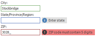
A border drawn around a target UI element can accompany a hint with text and an image (see the figure below). To colorize these elements, use the appearance settings accessed through the ValidationHint.Appearances group.
The ShowBorder and ValidationHintBaseDefaultProperties.ShowHint properties are accessed through the ValidationHint.Properties group, which provides three sets of properties, one for each available control navigation state - valid, invalid and indeterminate. Thus, you can customize the ValidationHint object’s behavior for each validation state separately.
If the ShowBorder property equals DefaultBoolean.Default, this ValidationHint will act based on the global behavior (the ValidationHintBaseProperties.ShowBorder property). Otherwise, the ShowBorder setting will be prioritized.
Refer to the Adorner UI Manager article for more details.