Guide Class
A child Adorner UI Manager element that highlights specific form regions. Provides a built-in flyout panel for displaying additional information and/or actions related to the highlighted region.
Namespace: DevExpress.Utils.VisualEffects
Assembly: DevExpress.Utils.v19.2.dll
Declaration
Remarks
As other Adorner UI Manager elements, guides relate to specific form elements using their AdornerElement.TargetElement properties. When guides are shown (set the AdornerUIManager.ShowGuides property to true to do so), a semi-transparent adorner layer covers the form (user control) to darken it. A currently selected guide cuts a “hole” in this layer to display its target element as is. This creates a highlight effect for the desired region. Optionally, a selected guide displays a flyout panel that carries any custom content. Guides that are not currently selected display only borders around their target elements.
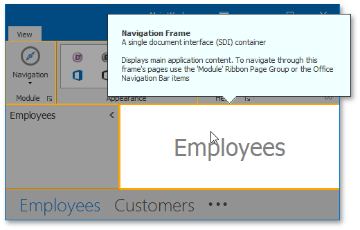
In the following figure, a guide highlights the “Employees” region of a sample form. To hide all guides and their adorner layer, an end-user must press Escape.
The background adorner layer, highlight regions, guide borders and flyouts - all can be painted using your custom colors. To do so, utilize properties accessible through the Guide.Appearances and AdornerUIManager.GuideAppearances groups.
Base guide properties can be accessed through the Guide.Properties section. You may also use the AdornerUIManager.GuideProperties group to customize all guides at once.
The AdornerUIManager.QueryGuideFlyoutControl event allows you to set content for guide flyout panels.
To select guides in code, use AdornerUIManager.SelectNext and AdornerUIManager.SelectPrev methods or pass the desired guide to the AccordionControl.SelectElement method as a parameter.
See the Adorner Guides article to learn more.