AdornerUIManager Class
The component that provides a transparent adorner layer for highlighting certain UI elements and/or displaying notifications for these elements.
Namespace: DevExpress.Utils.VisualEffects
Assembly: DevExpress.Utils.v18.2.dll
Declaration
[ToolboxBitmap(typeof(ToolboxIconsRootNS), "AdornerUIManager")]
public class AdornerUIManager :
    Component,
    IAdornerUIManagerListener,
    IAdornerUIManager,
    ISupportBatchUpdate,
    IAdornerUIManagerInternal,
    ISupportInitialize,
IObserver<ILayeredWindowNotification>Remarks
The following figure illustrates a sample application that utilizes the Adorner UI Manager.
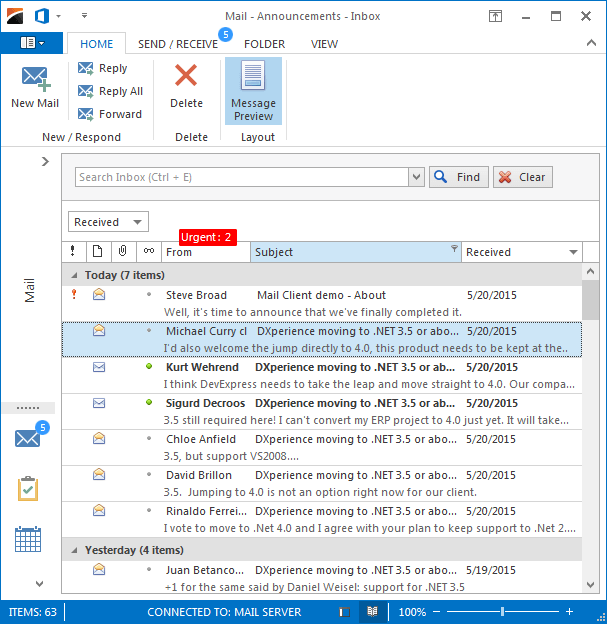
Here, the adorner layer contains the red rectangular element that displays the number of urgent messages above the ‘From’ column, and circular blue elements above the ‘Mail’ button and the ‘Send\Receive’ page, which shows the total number of new messages. These simple elements are called badges and are objects of the Badge class.
To add a new element, use the ‘Choose Elements’ link within the manager’s smart-tag. Clicking this link invokes the elements designer that allows you to add, modify or remove adorner elements.
Adorner elements are bound to the specific control via the AdornerElement.TargetElement property. When the parent UI element for the adorner element is set, you can use Location property to align the adorner element relative to its parent. Use the Offset property to move the adorner element from this initial position.
To set a container control above items for which the adorner manager will be able to draw its elements, use the AdornerUIManager.Owner property.
See the Adorner UI Manager article to learn more.