TextOptions.HotkeyPrefix Property
Gets or sets the hotkey prefix for the text.
Namespace: DevExpress.Utils
Assembly: DevExpress.Utils.v19.2.dll
Declaration
[DefaultValue(HKeyPrefix.Default)]
[XtraSerializableProperty]
public virtual HKeyPrefix HotkeyPrefix { get; set; }Property Value
| Type | Default | Description |
|---|---|---|
| HKeyPrefix | **Default** | A HKeyPrefix enumeration value which represents the hotkey prefix for the text. |
Available values:
| Name | Description |
|---|---|
| Default | A default control behavior. |
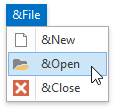
| None | The ampersand character (&) is shown, the next character is not underlined.
|
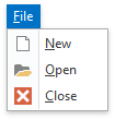
| Show | The ampersand character (&) is hidden, the next character is underlined.
|
| Hide | The ampersand character (&) is hidden, the next character is not underlined.
|

Property Paths
You can access this nested property as listed below:
| Object Type | Path to HotkeyPrefix |
|---|---|
| AppearanceObject |
|
| AppearanceObjectEx |
|
| DiagramAppearanceObject |
|
| HyperlinkLabelControlAppearanceObject |
|
| LabelControlAppearanceObject |
|
Remarks
In a graphical user interface, the hot key is an underlined letter in a word (usually combined with another key, such as the Alt key) that you can press on the keyboard to activate the functionality that the word represents.
When an AppearanceObject’s style setting (for example, BackColor, ForeColor, Font and TextOptions.HAlignment) is set to a non-default value, the corresponding Options.Use… option (for instance, Options.UseBackColor, Options.UseForeColor, Options.UseFont and Options.UseTextOptions) is automatically set to true in the following cases:
- The AppearanceObject belongs to a control/component (or its element), and this control/component has been completely loaded (see the control’s IsLoading property to check the load status);
- The AppearanceObject belongs to a grid column/band or tree list column/band, and the column/band belongs to a grid/tree list control;
- The AppearanceObject is standalone, that is, it does not belong to any control or component.
In other cases, the Options.Use… options are not automatically enabled. You may need to enable these options manually for the style settings to be in effect.
Related GitHub Examples
The following code snippet (auto-collected from DevExpress Examples) contains a reference to the HotkeyPrefix property.
Note
The algorithm used to collect these code examples remains a work in progress. Accordingly, the links and snippets below may produce inaccurate results. If you encounter an issue with code examples below, please use the feedback form on this page to report the issue.