TablePanel Class
A panel with a table layout, where each cell can host a control.
Namespace: DevExpress.Utils.Layout
Assembly: DevExpress.Utils.v21.2.dll
NuGet Packages: DevExpress.Utils, DevExpress.Win.Design, DevExpress.Wpf.Core
Declaration
Remarks
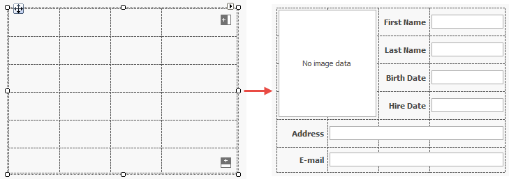
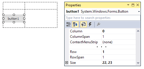
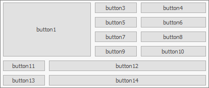
The figure below illustrates the table layout of a sample TablePanel, and the same panel populated with controls.
Columns and Rows
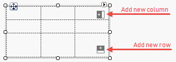
The fastest way to add columns and rows to a Table Panel is to click related buttons at design time.
You can also use the panel’s smart tag menu. Two “Edit…” links open the Collection Editor that allows you to customize rows and columns as you add them.
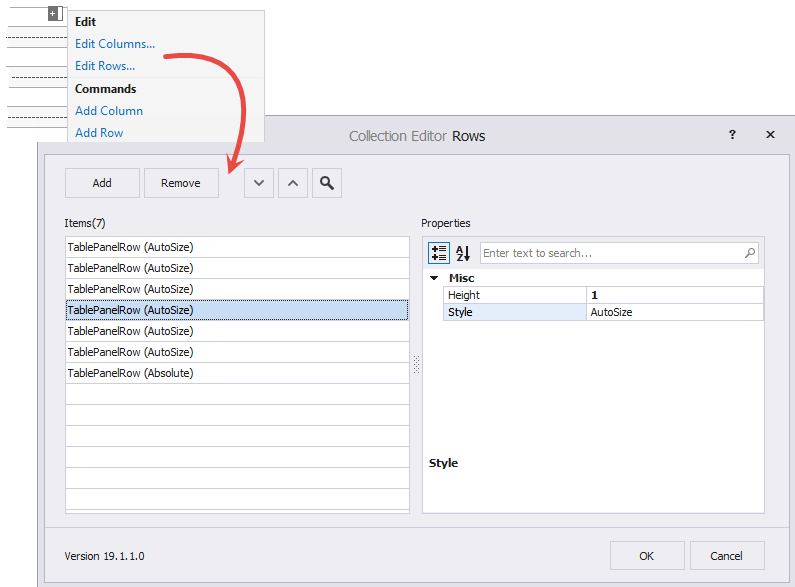
For individual rows and columns, you can specify size mode with the Style property, which can be set to the following values.
- Absolute - Width and Height properties specify the absolute row/column size, in pixels.
- Relative - Width and Height properties store relative values. For example, two columns with a relative width of 1 and a column with a relative width of 2: the first two columns have equal widths, and the last column is twice as wide.
- AutoSize - Rows and columns resize automatically depending on their content. The Width and Height settings are ignored
The sample below illustrates how to add columns and rows in code.
tablePanel2.Columns.AddRange(new DevExpress.Utils.Layout.TablePanelColumn[] {
    new DevExpress.Utils.Layout.TablePanelColumn(DevExpress.Utils.Layout.TablePanelEntityStyle.Relative, 2F),
    new DevExpress.Utils.Layout.TablePanelColumn(DevExpress.Utils.Layout.TablePanelEntityStyle.Relative, 2F),
    new DevExpress.Utils.Layout.TablePanelColumn(DevExpress.Utils.Layout.TablePanelEntityStyle.Relative, 2F),
    new DevExpress.Utils.Layout.TablePanelColumn(DevExpress.Utils.Layout.TablePanelEntityStyle.Relative, 3F)
});

tablePanel2.Rows.AddRange(new DevExpress.Utils.Layout.TablePanelRow[] {
    new DevExpress.Utils.Layout.TablePanelRow(DevExpress.Utils.Layout.TablePanelEntityStyle.AutoSize, 1F),
    new DevExpress.Utils.Layout.TablePanelRow(DevExpress.Utils.Layout.TablePanelEntityStyle.AutoSize, 1F),
    new DevExpress.Utils.Layout.TablePanelRow(DevExpress.Utils.Layout.TablePanelEntityStyle.AutoSize, 1F),
    new DevExpress.Utils.Layout.TablePanelRow(DevExpress.Utils.Layout.TablePanelEntityStyle.AutoSize, 1F),
    new DevExpress.Utils.Layout.TablePanelRow(DevExpress.Utils.Layout.TablePanelEntityStyle.AutoSize, 1F),
    new DevExpress.Utils.Layout.TablePanelRow(DevExpress.Utils.Layout.TablePanelEntityStyle.AutoSize, 1F)
});
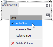
To select a column or row at design time, hover a mouse pointer over it in close proximity to a border. Once a column or row is highlighted, you can drag it to a new position, and right-click it to change the Style.
Add and Arrange Controls
To add a control to a Table Panel, drag it to a table cell. You can drag controls from one cell to another to re-arrange them. You can also create a StackPanel, fill it with items, and drag this entire panel to a Table Panel cell.
When a control is added to a panel’s Controls collection, it dispays four extension properties in Visual Studio’s Property Grid. These properties allow you to specify the control’s location and the number of rows/columns this control occupies.
- Row
- Column
- RowSpan
- ColumnSpan
Use the following methods to arrange controls in the panel in code:
- TablePanel.SetCell(Control, Int32, Int32)
- TablePanel.SetRow(Control, Int32)
- TablePanel.SetColumn(Control, Int32)
- TablePanel.SetRowSpan(Control, Int32)
- TablePanel.SetColumnSpan(Control, Int32)
The following sample illustrates how to fill the table created in the previous section with buttons.
tablePanel2.Controls.AddRange(new Control[] {
    button1, button3, button4, button5, button6,
    button7, button8, button9, button10, button11,
    button12, button13, button14});

tablePanel2.SetCell(button1, 0, 0);
tablePanel2.SetColumnSpan(button1, 2);
tablePanel2.SetRowSpan(button1, 4);
button1.Dock = DockStyle.Fill;

tablePanel2.SetCell(button3, 0, 2);

tablePanel2.SetCell(button4, 0, 3);

tablePanel2.SetCell(button5, 1, 2);

tablePanel2.SetCell(button6, 1, 3);

tablePanel2.SetCell(button7, 2, 2);

tablePanel2.SetCell(button8, 2, 3);

tablePanel2.SetCell(button9, 3, 2);

tablePanel2.SetCell(button10, 3, 3);

tablePanel2.SetCell(button11, 4, 0);

tablePanel2.SetCell(button12, 4, 1);
tablePanel2.SetColumnSpan(button12, 3);

tablePanel2.SetCell(button13, 5, 0);

tablePanel2.SetCell(button14, 5, 1);
tablePanel2.SetColumnSpan(button14, 3);
Overlap Multiple Cells
In Absolute and Relative row/column size mode, the Table Panel resizes controls placed inside the panel to fit the bounds of cells.
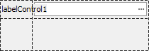
However, a control within a Table Panel can have size restrictions or calculate its size automatically. For instance, LabelControl‘s size is set according to its content. You can limit a control’s size with the MinimumSize property. In these cases, the control can overlap adjacent cells within the Table Panel.
To allow a control to occupy only one cell, consider the following solutions.
- Resize the Table Panel’s rows and columns, so that each control only resides within its cell.
Enable AutoSize mode for rows/columns, as shown above.
- Disable auto-size mode for controls within cells. For the LabelControl, use the LabelControl.AutoSizeMode property.
- Set the MinimumSize property for a control within a cell to a smaller value.
- If controls overlap adjacent cells when a user resizes the Table Panel (or the parent form), you can prevent the Table Panel/form from being resized (use their MinimumSize properties).
Auto-Size Mode
The TablePanel can automatically adjust its size to fit its contents. Use the following two properties to enable the panel’s auto-size mode:
- AutoSize - Set this option to true to enable the auto-size functionality.
- AutoSizeMode - Use this property to choose between auto-size modes: GrowOnly or GrowAndShrink. See the AutoSizeMode MSDN topic for more information.
Tip
You can also enable the auto-size functionality for controls within the TablePanel and for containers (for example, a form) where the TablePanel resides.
The Style settings of rows and columns specify how the rows and columns are resized. This property is interpreted as follows when you enable auto-size mode for the panel:
- The Style property is set to Absolute - The row’s height (Height) and column’s width (Width) are fixed.
- The Style property is set to AutoSize - Rows and columns resize themselves according to their contents.
- The Style property is set to Relative - This mode is equivalent to the AutoSize option.
Other Settings
- AutoScroll - Gets or sets whether the panel enables scrollbars that allow you to scroll to any controls placed outside the panel’s visible boundaries.
- AutoTabOrder - Gets or sets whether the panel maintains an automatic tab order of its child controls.
- LabelVertAlignment - Gets or sets how LabelControls are vertically aligned in relation to the text editors displayed to the label’s right (to the label’s left in right-to-left locales).