FlyoutPanel.ToolTipController Property
Gets or sets the tooltip controller component that controls the appearance, position and content of tooltips displayed by buttons in the button panel.
Namespace: DevExpress.Utils
Assembly: DevExpress.Utils.v19.1.dll
Declaration
[DXCategory("Appearance")]
[DefaultValue(null)]
public virtual ToolTipController ToolTipController { get; set; }Property Value
| Type | Default | Description |
|---|---|---|
| ToolTipController | *null* | A ToolTipController object which controls the appearance and behavior of tooltips displayed by buttons in the button panel. |
Remarks
By default, when the ToolTipController property is set to null, tooltips for buttons in the button panel (see FlyoutPanel.OptionsButtonPanel) are managed by the default ToolTipController. To access settings of the default controller, use the DefaultToolTipController component. If a ToolTipController object is assigned to the ToolTipController property, tooltips are managed by this controller, not by the default controller.
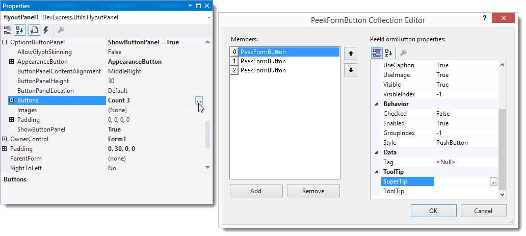
To assign a regular hint or SuperToolTip to a button in the button panel, use the corresponding property in the PeekFormButton Collection Editor, which can be invoked by clicking the ellipsis button of the FlyoutPanelButtonOptions.Buttons property. See the figure below.
See Tooltip Management, for more information on displaying tooltips.