Application Button
- 2 minutes to read
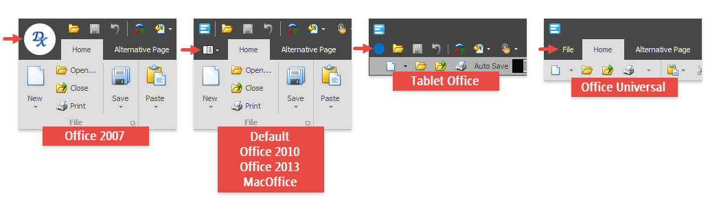
End-users can use the Application button in the Ribbon Control’s top left corner to access an application’s main menu. The Ribbon style (see the RibbonControl.RibbonStyle property) determines the button’s appearance and behavior. You can test all available styles in the “Ribbon Simple Pad” demo module available in the DevExpress Demo Center.
The table below lists the properties and events related to the Application Button.
API | Description |
|---|---|
Gets or sets the drop-down control which is invoked when the Application Button is clicked. This property accepts the following class instances as a value: | |
Gets or sets whether the Application Button is visible.
| |
Provides access to options that allow you to specify and customize the Application Button‘s raster or vector icon.
| |
Gets or sets the Application Button‘s text.
| |
Occurs when the Application Button is clicked. | |
These events allow you to perform custom actions before/after a main application menu opens/closes. | |
Applies a color to the Application Button and other Ribbon elements. |