Cell Values, Editors, and Validation
- 24 minutes to read
Cell Values
Cell Editors
- Default Cell Editors
- Replace Default Cell Editors at Design Time
- Replace Default Cell Editors in Code
- Use Any Control as a Cell Editor
- Use Different Controls to Display and Edit Cell Values
- Manage Cell Editors in Code
Edit Data in a Separate Form
Manage End-User Input
Read and Modify Cell Values in Code
Processed Cell | Read the Cell Value | Change the Cell Value |
|---|---|---|
A focused cell | ||
A cell of a focused row | ColumnView.GetFocusedRowCellValue | |
Any row cell | ||
A cell value in an underlying data source | ||
A currently edited cell |
Changing a cell value raises the ColumnView.CellValueChanged event.
The following code samples illustrate this API.
Grid cell editors wait for a user to move focus to another cell or row before their new value is accepted. The code below forces editors to immediatelly update their values.
    BaseEdit edit = null;
    private void gridView1_ShownEditor(object sender, EventArgs e)
    {
        GridView view = sender as GridView;
        edit = view.ActiveEditor;
        edit.EditValueChanged += edit_EditValueChanged;
    }

    void edit_EditValueChanged(object sender, EventArgs e)
    {
        gridView1.PostEditor();
    }

    private void gridView1_HiddenEditor(object sender, EventArgs e)
    {
        edit.EditValueChanged -= edit_EditValueChanged;
        edit = null;
    }
In the Change column cell values based on other cell values demo checkboxes under the “Mark” column are automatically checked if you enter “Length” more than 10, and cleared otherwise.
Cell Editors
Default Cell Editors
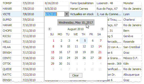
Data Grid supports in-place data editing out-of-the box. To edit a cell value at runtime, an end-user must focus it and press Enter, or double-click this cell. To discard edits, press Esc while editing.
Columns utilize DevExpress Editors to display and edit data source records. Columns automatically choose editors depending on the column data type. For instance, if a column displays dates, it will utilize the DateEdit in-place editor.
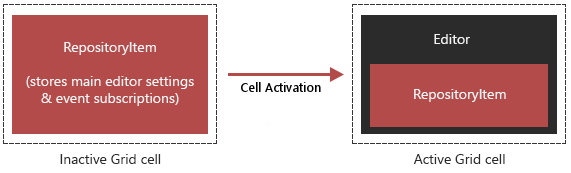
All DevExpress Editors contain related repository items. For instance, a SpinEdit editor contains a RepositoryItemSpinEdit object. Repository items are cores that store a set of properties required to generate a fully-fledged editor. You can access an editor’s repository item through the BaseEdit.Properties property.
All inactive Grid cells contain repository items. When a user clicks a cell to edit its value, a real editor is created from this repository item. After all edits are done and the cell is deselected, its editor is destroyed again. This means unless Grid is in edit mode, no fully initialized cell editors exist. This technique greatly improves the Data Grid performance.
Demos: Inplace Cell Editors | Show buttons in grid cells
Replace Default Cell Editors at Design Time
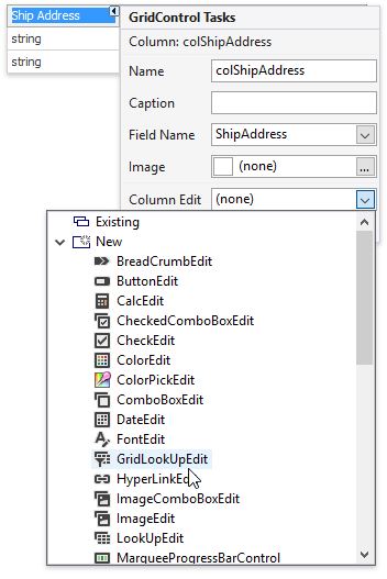
To modify an in-place editor for a Data Grid column, invoke drop-down menu for the GridColumn.ColumnEdit property and create a new editor (or choose an existing one). This property can be accessed from the column smart tag.
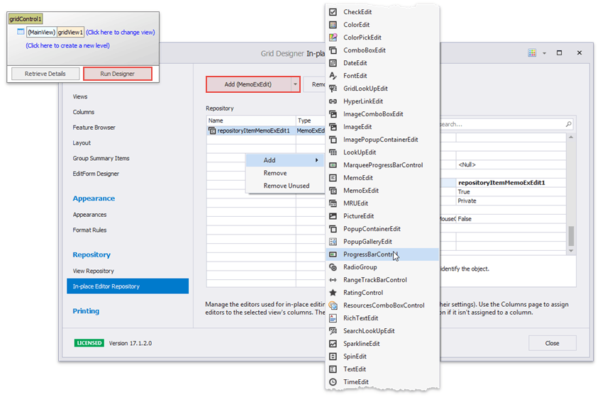
The “In-place Editor Repository” tab of a Data Grid Designer provides a centralized access to all in-place editors. Here you can add new editors, as well as modify and remove existing ones.
Replace Default Cell Editors in Code
To use custom editors for column cells, assign related repository items to the GridColumn.ColumnEdit property. The Assign in-place editors (repository items) demo illustrates how to replace standard checkboxes for the “Mark” column with ToggleSwitch editors.
    // Assign a repository item to a column
    RepositoryItemToggleSwitch edit = new RepositoryItemToggleSwitch();
    gridControl.RepositoryItems.Add(edit);
    gridView.Columns["Mark"].ColumnEdit = edit;
If you need to specify an in-place editor for a specific cell rather than an entire column, handle the GridView.CustomRowCellEdit event. Note that any repository item you create in code must be manually added to the grid control’s EditorContainer.RepositoryItems collection.
The code below illustrates how to utilize a ProgressBarControl as an in-place editor for the integer “Relevance” grid column. End-users can tap or hold numpad “+” and “-“ keys to modify these integer values.
using DevExpress.XtraGrid.Views.Grid;
using DevExpress.XtraEditors.Repository;

//create a repository item
RepositoryItemProgressBar ieProgress = new RepositoryItemProgressBar();
gridControl1.RepositoryItems.Add(ieProgress);
ieProgress.KeyPress += IeProgress_KeyPress;

//assign repository item
colRelevance.ColumnEdit = ieProgress;
//or
private void GridView1_CustomRowCellEdit(object sender, CustomRowCellEditEventArgs e) {
    if (e.Column == colRelevance) e.RepositoryItem = ieProgress;
}

//handle + and - keys press
private void IeProgress_KeyPress(object sender, KeyPressEventArgs e) {
    int i = 0;
    if (gridView1.ActiveEditor == null) return;

    if (e.KeyChar == '+') {
        i = (int)gridView1.ActiveEditor.EditValue;
        if (i < 100)
            gridView1.ActiveEditor.EditValue = i + 1;
    }
    if (e.KeyChar == '-') {
        i = (int)gridView1.ActiveEditor.EditValue;
        if (i > 0)
            gridView1.ActiveEditor.EditValue = i - 1;
    }
}
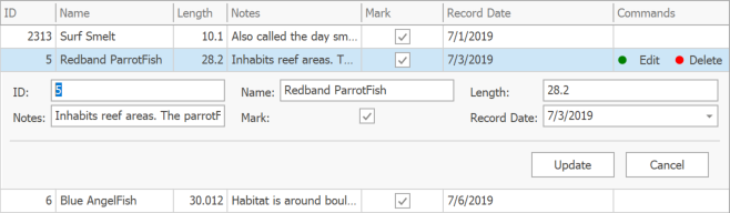
The Cell commands to edit and delete rows demo has the “Commands” column with a ButtonEdit cell editor. The editor has two buttons: “Edit” invokes the Edit Form, “Delete” removes the current row.
    // Create the Commands column editor
    RepositoryItemButtonEdit commandsEdit = new RepositoryItemButtonEdit { AutoHeight = false, Name = "CommandsEdit", TextEditStyle = TextEditStyles.HideTextEditor };
    commandsEdit.Buttons.Clear();
    commandsEdit.Buttons.AddRange(new EditorButton[] {
    new EditorButton(ButtonPredefines.Glyph, "Edit", -1, true, true, false, ImageLocation.MiddleLeft, DemoHelper.GetEditImage()),
    new EditorButton(ButtonPredefines.Glyph, "Delete", -1, true, true, false, ImageLocation.MiddleLeft, DemoHelper.GetDeleteImage())});

    // Create an unbound Commands column
    GridColumn _commandsColumn = gridView.Columns.AddField("Commands");
    _commandsColumn.UnboundType = UnboundColumnType.Object;
    _commandsColumn.Visible = true;
    _commandsColumn.Width = 100;

    // Hide commandsColumn from EditForm
    _commandsColumn.OptionsEditForm.Visible = DevExpress.Utils.DefaultBoolean.False;

    // Display commands only for focused row
    gridView.CustomRowCellEdit += (s, e) => {
        if (e.RowHandle == gridView.FocusedRowHandle && e.Column == _commandsColumn)
            e.RepositoryItem = commandsEdit;
    };
    gridView.CustomRowCellEditForEditing += (s, e) => {
        if (e.RowHandle == gridView.FocusedRowHandle && e.Column == _commandsColumn)
            e.RepositoryItem = commandsEdit;
    };

    // Allow only commandsColumn to be edited
    gridView.ShowingEditor += (s, e) => {
        e.Cancel = gridView.FocusedColumn != _commandsColumn;
    };

    gridView.OptionsEditForm.ShowOnDoubleClick = DevExpress.Utils.DefaultBoolean.False;
    gridView.OptionsEditForm.ShowOnEnterKey = DevExpress.Utils.DefaultBoolean.False;
    gridView.OptionsEditForm.ShowOnF2Key = DevExpress.Utils.DefaultBoolean.False;
    gridView.OptionsBehavior.EditingMode = GridEditingMode.EditFormInplace;

    // Perform a specific action when an EditorButton is clicked
    commandsEdit.ButtonClick += (s, e) => {
        switch (e.Button.Caption) {
            case "Edit":
                // Start edit a row using EditForm
                gridView.CloseEditor();
                gridView.ShowEditForm();
                break;
            case "Delete":
                // Delete focused row
                gridControl.BeginInvoke(new MethodInvoker(() => { gridView.DeleteRow(gridView.FocusedRowHandle); }));
                break;
        }
    };
In the Assign in-place editors dynamically demo the “Length” column receives either a SpinEdit or a CalcEdit editor depending on whether the checkbox under the “Mark” column is checked.
RepositoryItemSpinEdit spinEdit = new RepositoryItemSpinEdit();
RepositoryItemCalcEdit calcEdit = new RepositoryItemCalcEdit();

gridView.Columns["Length"].ShowButtonMode = ShowButtonModeEnum.ShowAlways;

// Handle this event to assign editors to individual cells
gridView.CustomRowCellEdit += (sender, e) => {
    GridView view = sender as GridView;
    if (e.Column.FieldName == "Length") {
        bool boolVal = (bool)view.GetRowCellValue(e.RowHandle, "Mark");
        if (boolVal)
            e.RepositoryItem = spinEdit;
        else
            e.RepositoryItem = calcEdit;
    }
};
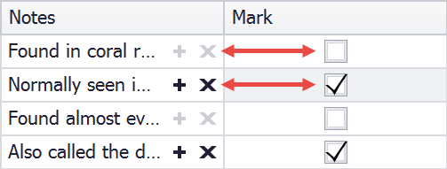
The code sample below creates two identical RepositoryItemButtonEdit editors with buttons that copy or remove a cell value. The second editor buttons are disabled. If a checkbox under the “Mark” column is currently checked, an editor with enabled buttons becomes this cell’s editor. Otherwise, when the “Mark” checkbox is clear, the editor with disabled buttons is assigned.
gridView.OptionsView.ShowButtonMode = ShowButtonModeEnum.ShowAlways;

RepositoryItemButtonEdit riButtonEditEnabled = new RepositoryItemButtonEdit();
riButtonEditEnabled.Buttons.Clear();
riButtonEditEnabled.Buttons.Add(new EditorButton(ButtonPredefines.Plus, "Copy cell value"));
riButtonEditEnabled.Buttons.Add(new EditorButton(ButtonPredefines.Delete, "Clear this cell"));

RepositoryItemButtonEdit riButtonEditDisabled = new RepositoryItemButtonEdit();
// Create a similar RepositoryItem
riButtonEditDisabled.Assign(riButtonEditEnabled);
// Disable all buttons
riButtonEditDisabled.Buttons.ToList<EditorButton>().ForEach(button => button.Enabled = false);

gridView.CustomRowCellEdit += (s, e) => {
    if (e.Column.FieldName == "Notes") {
        GridView view = s as GridView;
        bool actionsAvailable = Convert.ToBoolean(view.GetRowCellValue(e.RowHandle,"Mark"));
        e.RepositoryItem = actionsAvailable ? riButtonEditEnabled : riButtonEditDisabled;
    }
};
Demos: Assign in-place editors (repository items) | Assign in-place editors dynamically
Use Any Control as a Cell Editor
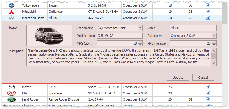
The RepositoryItemAnyControl allows you to embed any static control into a grid cell. The figure below illustrates an embedded Chart Control.

In order to embed a control, it must implement the DevExpress.XtraEditors.CustomEditor.IAnyControlEdit interface. The Gauge Control implements this interface out-of-the-box. To embed other controls, you need to implement it manually.
Embedded Gauge Control: Demo | Example
Embedded Chart Control: Demo | Example
Use Different Controls to Display and Edit Cell Values
By default, in-place editors are used for both presenting data and editing records. If needed, you can use separate in-place editors for both tasks. To do so, handle the GridView.CustomRowCellEditForEditing event. In the code sample below, a numeric column utilizes ProgressBarControl in-place editors to display data. When end-users focus cells, SpinEdit editors replace progress bars, which provide a more straightforward way of modifying cell values.
using DevExpress.XtraEditors.Repository;

// In-place editors used in display and edit modes respectively.
RepositoryItem editorForDisplay, editorForEditing;

private void Form1_Load(object sender, EventArgs e) {
    // Initialize the editors and assign the default editor to a column.
    editorForDisplay = new RepositoryItemProgressBar();
    editorForEditing = new RepositoryItemSpinEdit();
    gridView1.GridControl.RepositoryItems.AddRange(
      new RepositoryItem[] { editorForDisplay, editorForEditing });
    gridView1.Columns["Quantity"].ColumnEdit = editorForDisplay;
}

// Provide the editor for in-place editing.
private void gridView1_CustomRowCellEditForEditing(object sender,
  CustomRowCellEditEventArgs e) {
    if (e.Column.FieldName == "Quantity")
        e.RepositoryItem = editorForEditing;
}
Demo: Override the default in-place editor for certain cells
Manage Cell Editors in Code
API | Description |
|---|---|
Invokes the focused cell’s editor | |
Closes the currently active editor and discards any changes | |
Saves any changes made and closes the currently active editor | |
Saves any changes made without closing the currently active editor | |
Retrieves the currently active editor | |
Fires whenever an in-place editor activates. The code below automatically sets the current date and opens the DateEdit popup when end-users activate the “Order Date” column editor. | |
Fires whenever an in-place editor closes. In the sample below, focus automatically moves to the cell below after an editor for the current cell closes. This allows your end-users to quickly change values of multiple cells that belong to the same column by entering new values and pressing Enter (or Escape). This code will not be executed when end-users work with a New Item Row. |
Edit Data in a Separate Form
Edit Form
Instead of in-place data editing, end-users can modify grid records by using an Edit Form. To invoke this form, double-click a grid row at runtime or press the Enter or F2 key.
For regular Views you can select one of three available Edit Form display modes:
- a floating modal form (default mode);
- an in-place form displayed below a grid row that is being edited;
- an in-place form displayed instead of the edited row.
Detail Views do not support in-line edit forms.
Related API
API | Description |
|---|---|
Allows you turn on the Edit Form and select its display mode. | |
Call these methods to manually display and hide an Edit Form. | |
Specifies whether to show confirmation dialogs when end-users modify records. | |
Gets or sets whether or not the “Update” and “Cancel” buttons should be displayed. When these buttons are hidden, end-users can still utilize hotkeys to save (Ctrl+Enter) or discard (Escape) changes. | |
Specifies whether to pass changes to a Data Grid immediately after an end-user moves focus to another Edit Form field, or only after all changes have been accepted. | |
Allows you to modify a caption of a floating Edit Form. | |
Fires when the Edit Form is about to be shown, and allows you to forcibly hide the Edit Form when you do not want users to edit specific cell values. In the Prevent the Edit Form from Showing demo you cannot edit odd rows. |
Demos: Inline Edit Form | Prevent the Edit Form from showing | Access an editor within the Edit Form
Access Editors in the Edit Form
When an Edit Form is initialized and is about to be shown, the GridView.EditFormPrepared event raises. You can handle this event to access any Edit Form editor and modify its settings. The Access an Editor Within the Edit Form demo illustrates how to find the DateEdit editor and focus it.
gridView.OptionsBehavior.EditingMode = GridEditingMode.EditForm;
DateEdit dateEdit = null;

// This event occurs when the EditForm is about to be displayed and allows accessing its editors
gridView.EditFormPrepared += (s, e) => {
    // The e.BindableControls collection contains a list of editors located onto the EditForm
    foreach (Control item in e.BindableControls) {
        dateEdit = item as DateEdit;
        if (dateEdit != null) {
            // Focus the DateEdit editor
            gridControl.BeginInvoke(new MethodInvoker(() => { dateEdit.Focus(); }));
            return;
        }
    }
};
Modify Edit Form Layout
Default Edit Form layout is built according to the following rules:
- Edit Form displays an editor for every visible editable column;
- in case a Grid Column uses different editor types to present and edit cell data, Edit Form utilizes ones that are used in editing records;
- an Edit Form client area has a table layout with three columns; every editor (except for MemoEdit and PictureEdit editors) occupies one single cell;
- MemoEdit editors span across all layout columns horizontally and three layout rows vertically;
- PictureEdit editors span across two layout columns horizontally and three layout rows vertically.
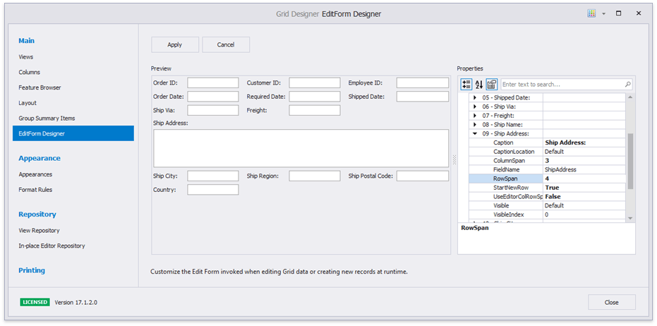
To modify this default layout, invoke the Data Grid Designer and switch to its “Edit Form Designer” tab. Here you can modify layout settings of every column editor.
Related API
API | Description |
|---|---|
Provides access to layout settings that affect how an editor for this specific column looks within an Edit Form (see below). | |
Disable this setting to set custom column and row spans for an editor. | |
OptionsColumnEditForm.ColumnSpan | Specify the number of Edit Form columns and/or rows across which an editor stretches. |
OptionsColumnEditForm.Caption | Allow you to modify the editor caption and its relative position. |
OptionsColumnEditForm.Visible | Use these properties to hide and re-arrange column editors. |
Set this option to true to move the editor to a new row. |
Create Custom Edit Forms
You can create your own User Control and utilize it instead of a default Edit Form.
- Create a User Control and inherit it from the EditFormUserControl class.
- If you have partial classes for this User Control, they must inherit the EditFormUserControl class as well.
- Design your custom User Control UI.
- Use the BoundFieldName and BoundPropertyName extender properties provided by the parent class to bind editors to data source fields.
- Assign an instance of the custom edit form to the Data Grid GridOptionsEditForm.CustomEditFormLayout property.
- To be able to use this custom form in detail Views, assign separate form instances to each detail View.
using DevExpress.XtraGrid.Views.Grid;
//custom edit form
public class AdvancedEditForm : EditFormUserControl {
    public AdvancedEditForm() {
        InitializeComponent();
        //bind the EditValue of the textEdit3 editor to the "Price" data field
        this.SetBoundFieldName(textEdit3, "Price");
        this.SetBoundPropertyName(textEdit3, "EditValue");
    }
}

//use the custom edit form in non-master-detail Data Grids
gridView1.OptionsEditForm.CustomEditFormLayout = new AdvancedEditForm();

//use custom edit forms for detail Views
void gridControl1_ViewRegistered(object sender, DevExpress.XtraGrid.ViewOperationEventArgs e) {
    GridView detailCloneView = e.View as GridView;
    if(detailCloneView.LevelName == "Order_Details")
        detailCloneView.OptionsEditForm.CustomEditFormLayout = new AdvancedEditForm();
}
Demos: Custom Edit Form | Inline Edit Form
Tip
You can also use a custom form to edit data. See how to implement a custom form in the Implementing CRUD operations in read-only data sources using XtraGrid KB article.
Manage End-User Input
Use Masks to Limit Data Input
Since DevExpress editors support Masks, you can prevent a user from entering invalid characters. The sample below illustrates how to allow users to enter 10-digit phone numbers with the automatically added “+1” country code.
repositoryItemTextEdit2.Mask.EditMask = "+1 (000) 000-00-00";
repositoryItemTextEdit2.Mask.MaskType = DevExpress.XtraEditors.Mask.MaskType.Numeric;
repositoryItemTextEdit1.Mask.UseMaskAsDisplayFormat = true; //optional
gridView.Columns["Phone"].ColumnEdit = repositoryItemTextEdit2;
Make Certain Grid Cells Non-Editable
To prevent users from editing cell values at runtime, utilize one of the following approaches:
- disable the ColumnViewOptionsBehavior.Editable option;
- enable the OptionsColumn.ReadOnly setting;
- disable the OptionsColumn.AllowEdit and OptionsColumn.AllowFocus options;
handle the ColumnView.ShowingEditor event and set its Cancel parameter to true. For instance, the code snippet below prohibits editing records whose “Country” field equals “Germany”.
using DevExpress.XtraGrid.Views.Grid;
// ...
private void gridView1_ShowingEditor(object sender, System.ComponentModel.CancelEventArgs e) {
   GridView View = sender as GridView;
   string cellValue = View.GetRowCellValue(View.FocusedRowHandle, colCountry).ToString();
   if (cellValue == "Germany")
       e.Cancel = true;
}
You can also check the Read-only mode for certain cells demo where you cannot edit the “ID” column cells for every even row.
These settings affect only your end-users and do not prevent you from modifying cell values in code.
Demos: Non editable mode | Prohibit editing certain GridView’s cells
Validate Cell Values
A cell is validated when a user has finished editing a value and presses Enter or moves focus to another cell within the same row. You can also forcibly trigger validation by calling the BaseView.PostEditor method in code. The diagram below illustrates this validation process.
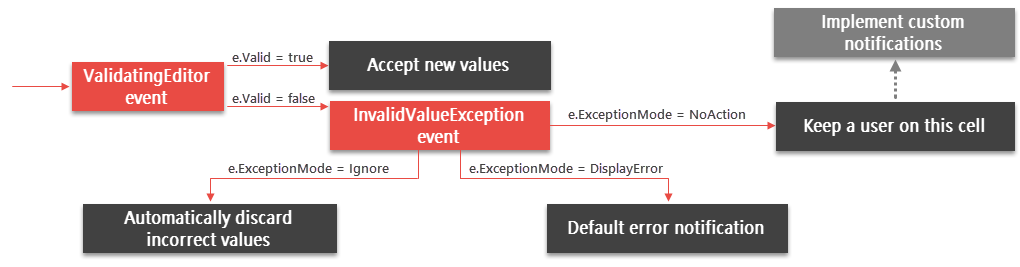
BaseView.ValidatingEditor - handle this event to check whether or not a new cell value is correct and set the boolean e.Valid parameter accordingly. End-users are unable to leave a cell with an incorrect value until the error is fixed or the “Esc” key is pressed to undo changes.
BaseView.InvalidValueException - raises if the e.Valid parameter of the previous event has been set to false and allows you to specify how the Data Grid responds to an invalid value. See the ExceptionMode enumerator values to see what options are available.
If the ExceptionMode parameter is set to NoAction, cells do not accept invalid values without notifying users. Use this approach if you want to implement custom notifications. For instance, you can provide default error icons for multiple columns at once by calling the ColumnView.SetColumnError method.
The code sample below checks the order shipping date, which cannot be earlier than the date this order was placed.
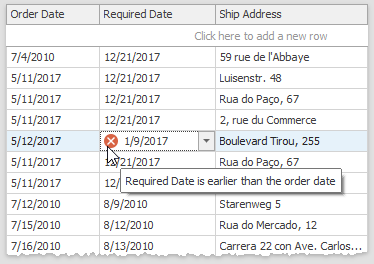
private void GridView1_ValidatingEditor(object sender, DevExpress.XtraEditors.Controls.BaseContainerValidateEditorEventArgs e) {
    GridView view = sender as GridView;
    if (view.FocusedColumn == colRequiredDate) {
        DateTime? requiredDate = e.Value as DateTime?;
        DateTime? orderDate = view.GetRowCellValue(view.FocusedRowHandle, colOrderDate) as DateTime?;
        if (requiredDate < orderDate) {
            e.Valid = false;
            e.ErrorText = "Required Date is earlier than the order date";
        }
    }
}
The Data Validation demo utilizes a different cell validation approach and employs the GridView.RowCellStyle event to highlight cells with values that are wrong initially, not after an end-user has modified them.
Demos: Data Validation | Validate the active editor’s value
Validate Rows
With the row validation feature, the Data Grid delays checking cell values to the point when a user moves focus to another row. This can be useful when each particular cell is valid, but the entire row with these values is incorrect. To manually trigger row validation, call the ColumnView.UpdateCurrentRow method.
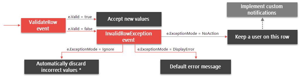
ColumnView.ValidateRow, ColumnView.InvalidRowException - similar to per-cell validation, these events allow you to validate new cell values and respond to invalid ones. If new cell values do not pass validation, end-users are kept on the current row to either correct all errors, or press Esc and undo the changes. Note that to revert row cell values back to correct ones, data source objects must implement the IEditableObject interface.
If a row is invalid, the Data Grid displays a message by default, permitting users to either correct or discard new values. You can suppress this default notification and call the ColumnView.SetColumnError method to manually mark specific cells (or the entire row) as invalid.
In the Data Validation demo, the ValidateRow event is handled to calculate values of the “Sub Total” column cells based on the “Unit Price”, “Quantity” and “Discount” column cells. Negative subtotal values are not accepted.
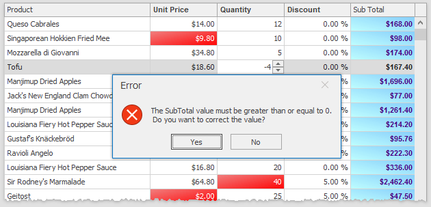
private void gridView1_ValidateRow(object sender, DevExpress.XtraGrid.Views.Base.ValidateRowEventArgs e) {
    GridView view = sender as GridView;
    float val = Convert.ToSingle(view.GetRowCellValue(e.RowHandle, gridColumn3)) *
        Convert.ToInt16(view.GetRowCellValue(e.RowHandle, gridColumn4)) *
        (1 - Convert.ToSingle(view.GetRowCellValue(e.RowHandle, gridColumn5))); //Total Sum
    if(val < 0) {
        e.ErrorText = string.Format("{0}\r\n", Properties.Resources.SubTotalGreaterEqual);
        e.Valid = false;
    }
}
Demos: Data Validation | Validate row data on losing focus