Understanding Axes and Panes
- 4 minutes to read
This topic provides general information about an XY-diagram’s axes and panes, and explains the difference between primary and secondary axes.
It consists of the following sections:
Understanding Axes
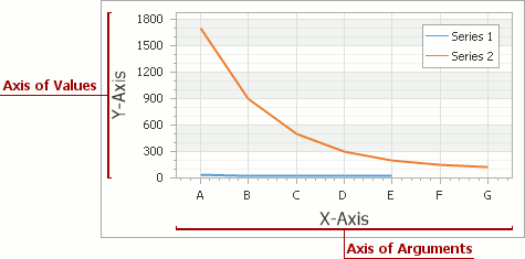
A diagram‘s axes are the essential grids of reference for series points, as they provide the coordinates for their arguments and values. Each diagram type represents them differently. Most charts use two axes: the axis of arguments (X-axis) and the axis of values (Y-axis). The following image demonstrates axes of the most popular diagram type (which is the XYDiagram2D).
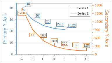
By default, each XY-diagram has only a single pair of the X and Y axis, which are called the primary axis. Additional (or, secondary) axes are supported, which is of great help when, for example, it’s required to simultaneously display series with a significant value range difference. For more information, refer to Primary and Secondary Axes.
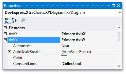
To access the primary axes options at design time, select the chart control, and in the Properties window, expand the ChartControl.Diagram property. You’ll see the XYDiagram.AxisX and XYDiagram.AxisY properties, which provide access to the options and elements of the appropriate axis.
To access the primary axes options at runtime, you should cast your Diagram object to the required diagram type, as the following code demonstrates.
XYDiagram diagram = chart.Diagram as XYDiagram;
if (diagram != null) {
    diagram.AxisX.Color = Color.FromArgb(237, 125, 49);
}
Likewise, secondary axes are specified via the XYDiagram.SecondaryAxesX and XYDiagram.SecondaryAxesY properties.
An important characteristic of an axis is its scale type. It determines how a chart interprets its underlying data: as numeric, date-time or qualitative. Each scale type assumes a specific representation of this data, and the specific options for customizing how this data is represented. An axis scale type is auto-determined by the scale type of series associated with this axis. So, an improper series scale type restricts the available set of axis options, and may cause the chart’s data representation to be a completely distorted. For more information, refer to Axis Scale Types.
The visible range of axis values is auto-determined (while the Range.Auto property is enabled). However, you can manually specify two axis values by which an axis should be limited, either in units appropriate for the axis scale type (via the Range.MinValue and Range.MaxValue properties).
In a similar way, when scrolling is enabled for both the diagram and the pane to which an axis belong, and the Range.Auto property is disabled, you also can manually specify two extreme axis values to which an axis can be scrolled. For more information, refer to Visual Ranges and Whole Ranges and Zooming and Scrolling (2D XY-Charts).
Along an axis, between pairs of its values, multiple scale breaks can be inserted, to allow compact representation of points with outsized values.
Axes additional elements are Axis Titles, Axis Labels, Grid Lines, Tickmarks and Interlacing, Constant Lines and Strips.
To learn more about axes and their functionality, refer to Axes.
Understanding Panes
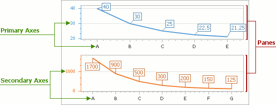
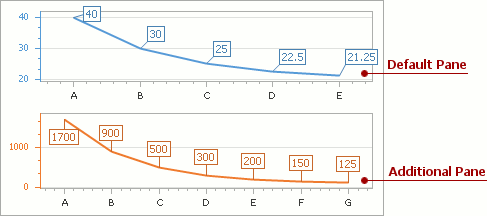
A diagram’s pane is a rectangular area used to plot series and their associated axes. In general, panes make it possible to distribute multiple series among different areas, which share (or not) their axes (both primary and secondary). Note that panes are available only for the XYDiagram2D type (which includes the XY-Diagram and Swift Plot Diagram).
By default, a chart displays its series in the default pane (represented by an XYDiagramDefaultPane object). Its options can be accessed via the XYDiagram2D.DefaultPane property.
To enable additional panes for a diagram, you can add them to the collection returned by the XYDiagram2D.Panes property. For more information, refer to Adding Panes.
When axes scrolling and/or zooming is enabled at the diagram’s level (via the XYDiagram2D.EnableAxisXScrolling, XYDiagram2D.EnableAxisYScrolling, XYDiagram2D.EnableAxisXZooming, and XYDiagram2D.EnableAxisYZooming properties), you can adjust the availability of axes scrolling and zooming individually for each pane (via the similar XYDiagramPaneBase.EnableAxisXScrolling, XYDiagramPaneBase.EnableAxisYScrolling, XYDiagramPaneBase.EnableAxisXZooming, and XYDiagramPaneBase.EnableAxisYZooming properties. For more information, refer to Visual Ranges and Whole Ranges and Zooming and Scrolling (2D XY-Charts).
If panes share the same X or Y axis, by scrolling this axis in one pane, other panes which use the same axis are also scrolled.
To learn more about panes and their functionality, refer to Panes.