Multiple Row and Cell Selection
- 12 minutes to read
The Grid Control supports single and multiple row/card selection in the GridView, BandedGridView, AdvBandedGridView, LayoutView, CardView and WinExplorerView. The GridView and BandedGridView additionally provide the multiple cell selection mode. This topic covers information on these modes and related API.
Online Video
DevExpress WinForms: Web Style Row Selection.
Single Row/Card Selection Mode
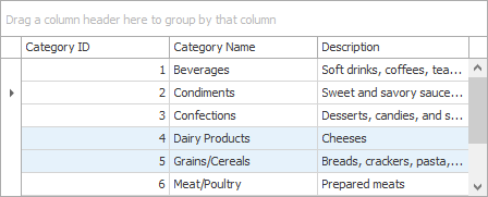
This is the default selection mode for all Views in which a row/card can only be focused (selected) one at a time.
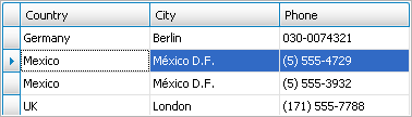
The table below lists members that can be used to focus (select) records, access the currently focused record and respond to the focus movement.
Member | Description |
|---|---|
Specifies the focused row handle. This property allows you to get the focused (selected) row/card. Assigning a value to this property focuses (selects) the specified row/card at a time. | |
Allows you to respond to a focus moving to another row. | |
In single row/card selection mode, returns 1. | |
In single row/card selection mode, returns an array that contains a single element that identifies the focused row handle (ColumnView.FocusedRowHandle). |
Multiple Row/Card Selection Mode
In this mode, multiple rows/cards can be selected at one time. By selecting rows, you visually mark them. You can then perform various operations on selected rows (copy to the Clipboard (as text), delete, drag, etc.).
By default, selected rows are painted using the same appearance settings as for the focused row, although it is possible to use different appearance settings to paint selected and focused rows. For the difference between focus and selection, see the Focused Row vs Selected Row subsection below.
To enable multiple row/card selection in all Views, set the ColumnViewOptionsSelection.MultiSelect property (accessible from the View’s ColumnView.OptionsSelection object) to true.
The GridView provides the additional GridOptionsSelection.MultiSelectMode property, with which you can select between two multiple row selection modes: GridMultiSelectMode.RowSelect (default) and GridMultiSelectMode.CheckBoxRowSelect.
In GridMultiSelectMode.RowSelect mode, an end-user can select rows with the keyboard and mouse.
In GridMultiSelectMode.CheckBoxRowSelect mode, the GridView displays an additional ‘Check’ column containing check boxes in each row. An end-user can toggle check boxes to change row selection. When using the Check column, you can bind row selection states to a data source field.
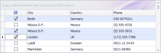
See the Multiple Row Selection via Built-In Check Column and Selection Binding topic to learn more.
Important
Data Grid cells can have interactive editors (for instance, check boxes or ButtonEdit buttons). In this case, if the Grid allows end-users to select multiple rows/cells, clicking such elements activates the cell but since the editor does not yet exist, it does not raise events (e.g., “Click” or “CheckedChanged”). To trigger these event, a user must click the element for the second time. To change this default behavior, set the ColumnViewOptionsBehavior.EditorShowMode property to the EditorShowMode.MouseDown value.
Focused Row vs Selected Row
The focused row/card is the row that accepts input from an end-user. There can only be one focused row in a View, regardless of selection mode. Compared to row focusing, row selection is only a visual feature designated for highlighting certain rows.
In multiple row/card selection mode, when an end-user focuses a new row with either the Arrow keyboard keys or using the mouse, then that row is selected (highlighted). When you focus a certain row in code (e.g., with the ColumnView.FocusedRowHandle property), this row is not automatically selected (highlighted). You can select/deselect the focused row in code when required. An end-user can also toggle the selected state for the focused row using the mouse and keyboard, as shown in the End-User Capabilities - Select Grid Rows and Cards topic.
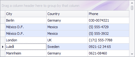
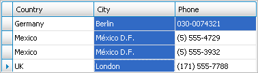
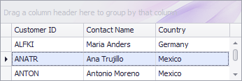
The following images demonstrate the selected and deselected states for a focused row.
Focused Row is selected
| The ColumnView.GetSelectedRows method will return three row handles, including the focused row handle. |
Focused Row is deselected
| The ColumnView.GetSelectedRows method will return two handles that correspond to selected rows. The focused row handle will not be included in the method’s resulting array. |
The table below lists members used in working with selection.
Member | Description |
|---|---|
Adds a row/card to the current selection. | |
Adds a range of rows/cards to the selection. | |
Removes a row/card from the current selection. | |
Unselects any selected rows/cards. | |
Specifies the focused row handle. In this mode, the property does not allow you to select rows/cards. | |
Returns the number of currently selected rows. | |
Returns an array of the handles of the selected rows. | |
Allows you to perform actions when the selection is changed. | |
This method pair prevents excessive updates when performing multiple successive selection modifications using code. See below. |
Each time the selection is changed in multiple selection mode, the ColumnView.SelectionChanged event is generated. You can handle it to perform specific actions. To respond to row focus moving from one row to another (even when multiple selection mode is not used), you can handle the ColumnView.FocusedRowChanged event.
When you make multiple successive calls to the methods that change selection, it is best to wrap such calls in calls to the BaseView.BeginSelection/BaseView.EndSelection methods. This prevents the ColumnView.SelectionChanged event from being fired repeatedly, and thus improves your application’s performance. See the Batch Modifications Overview topic for more information.
Multiple Cell Selection Mode
This selection mode, supported by GridView and BandedGridView, allows an end-user to select contiguous blocks of cells as well as individual cells within different rows. Multiple rows can also be selected in their entirety, for instance, by clicking the Row Indicator Panel.
To enable multiple cell selection mode, set the ColumnViewOptionsSelection.MultiSelect property to true and the GridOptionsSelection.MultiSelectMode property to GridMultiSelectMode.CellSelect.
Similar to the previous selection mode, in this mode, the focused row can be in the selected and deselected state.
The following table lists the methods to select/unselect cells.
| Member | Description |
|---|---|
| GridView.SelectCell | Selects a specific cell. |
| GridView.SelectCells | Selects a range of cells. |
| ColumnView.SelectAll | Selects all rows/cards within the View. |
| GridView.UnselectCell | Removes the specified cell from the current selection. |
| GridView.UnSelectCells | Removes the specified block of cells from the selection. |
| GridView.GetSelectedCells | Returns selected cells. |
| ColumnView.GetSelectedRows | Returns the handles of the rows that contain the selected cells. |
Also, see the list of methods for working with the selection provided in the previous section. When applied in multiple cell selection mode, these methods will affect all cells that belong to the specified row(s).
Common Methods to Work with Selection and Rows
Member | Description |
|---|---|
Copies the focused or selected record(s) to the Clipboard as text. | |
Deletes a specific row/card. | |
Deletes the focused or selected rows. | |
Returns an object that represents a specified row. | |
Returns a DataRow object that represents a specified row. | |
Gets the value in a row’s field. | |
Gets the text representation of a row’s value. | |
Assigns a value to a row’s cell. |
End-User Capabilities
An end-user can select rows/cards and cells with a mouse and keyboard. Please refer to the End-user Capabilities.Selecting Rows topic for more details.
Appearance Settings
By default, selected and focused rows are painted using the same appearance settings. To customize them, use the following properties that are available from a View’s Appearance object (GridView.Appearance, CardView.Appearance, etc.).
| Member | Description |
|---|---|
| GridViewAppearances.FocusedRow | Contains appearance settings used to paint the currently focused row. |
| GridViewAppearances.SelectedRow | Contains the appearance settings used to paint the selected rows. |
| GridViewAppearances.HideSelectionRow | Contains the appearance settings used to paint the selected rows when the grid control is not focused. |
| CardViewAppearances.FocusedCardCaption | Contains the appearance settings used to paint the caption of the focused card. |
| CardViewAppearances.SelectedCardCaption | Contains the appearance settings used to paint the captions of selected cards. |
| CardViewAppearances.HideSelectionCardCaption | Contains the appearance settings used to paint the captions of selected cards when the grid control is not focused. |
Row appearance settings initially have priority over column appearance settings (GridColumn.AppearanceCell). See this help article for more information: Application Appearance and Skin Colors. To prioritize column appearance settings, enable the GridColumn.AppearanceCell.Options.HighPriority option:
You can handle the following events to customize the appearance of cells in selected rows: GridView.RowStyle, GridView.RowCellStyle, and GridView.CustomDrawCell.
In specific instances, you may need to prevent the focused row from being highlighted in the GridView or its descendant. To do this, set the GridOptionsSelection.EnableAppearanceFocusedRow property to false. The coloring of a focused cell can be disabled using the GridOptionsSelection.EnableAppearanceFocusedCell option.
To prevent selected rows from being highlighted in a specific manner when the grid control is not focused, use the GridOptionsSelection.EnableAppearanceHideSelection property.
Example - Obtain the Selected Rows
This example demonstrates how to obtain selected rows, and then change values of their “Discounted” column cells.
If Grid data is sorted or filtered, changes made to one Grid row can make other rows change their order and, as a result, their row handles. For that reason you cannot access selected rows by their handles and process these rows right away. Instead, pass row handles retrieved by ColumnView.GetSelectedRows method to the ColumnView.GetDataRow method. This allows you to access underlying data source objects (in this example, DataRows), save them to an array, and safely change their values afterwards.
Each row modification forces the Grid View to update itself. Enclose your code with the BaseView.BeginUpdate and BaseView.EndUpdate method calls to avoid excessive updates. Refer to the Batch Modifications Overview document for details.
ArrayList rows = new ArrayList();

// Add the selected rows to the list.
Int32[] selectedRowHandles = gridView1.GetSelectedRows();
for (int i = 0; i < selectedRowHandles.Length; i++) {
    int selectedRowHandle = selectedRowHandles[i];
    if (selectedRowHandle >= 0)
        rows.Add(gridView1.GetDataRow(selectedRowHandle));
}
try {
    gridView1.BeginUpdate();
    for (int i = 0; i < rows.Count; i++) {
        DataRow row = rows[i] as DataRow;
        // Change the field value.
        row["Discontinued"] = true;
    }
}
finally {
    gridView1.EndUpdate();
}
Example - Highlight the Entire Focused Row
This example shows how to paint the focused cell using the same appearance as the entire focused row:
// Make the grid read-only.
gridView1.OptionsBehavior.Editable = false;
// Prevent the focused cell from being highlighted.
gridView1.OptionsSelection.EnableAppearanceFocusedCell = false;
// Draw a dotted focus rectangle around the entire row.
gridView1.FocusRectStyle = DevExpress.XtraGrid.Views.Grid.DrawFocusRectStyle.RowFocus;
Example - Select the Entire Column Whose Header is Clicked
The code below illustrates how to emulate the behavior seen in Microsoft Excel: when a user left-clicks a column header, all cells that belong to this column are highlighted.
using DevExpress.XtraGrid.Views.Grid;
using DevExpress.XtraGrid.Views.Grid.ViewInfo;
using System.Collections;
using System.ComponentModel;
using System.Windows.Forms;
using System.Drawing;
using DevExpress.Data;
using DevExpress.XtraGrid.Columns;
using DevExpress.Utils;

namespace DXApplication16 {
    public partial class Form1 : FluentDesignForm {
        //the list of selected columns
        ArrayList selectedColumns;

        public Form1() {
            InitializeComponent();
            gridView1.MouseDown += GridView1_MouseDown;
            this.Load += Form1_Load;
        }

        private void Form1_Load(object sender, System.EventArgs e) {
            selectedColumns = new ArrayList();
        }

        private void GridView1_MouseDown(object sender, MouseEventArgs e) {
            GridView view = sender as GridView;
            GridHitInfo info = view.CalcHitInfo(new Point(e.X, e.Y));

            if (info.InColumn & e.Button == MouseButtons.Left) {
                //Disable sort operations when a user left-clicks a header
                info.Column.OptionsColumn.AllowSort = DefaultBoolean.False;
                //check whether the clicked column is already in the list
                if (!selectedColumns.Contains(info.Column.FieldName)) {
                    //if not, custom draw its cells and add it to the list
                    info.Column.AppearanceCell.Assign(view.PaintAppearance.SelectedRow);
                    selectedColumns.Add(info.Column.Name);
                }
                else {
                    //otherwise, remove this column from the selected columns list
                    //and reset its cell appearances
                    selectedColumns.Remove(info.Column.Name);
                    info.Column.AppearanceCell.Reset();
                }
            }
            else {
                //if anything but a column header is clicked
                //reset all column cell appearances and clear the list
                if (selectedColumns.Count != 0) {
                    foreach (string name in selectedColumns)
                        view.Columns.ColumnByName(name).AppearanceCell.BackColor =
                            Color.Transparent;
                    selectedColumns.Clear();
                }
            }

            //Users can still right-click a header and choose sort options
            if (info.InColumn & e.Button == MouseButtons.Right) {
                info.Column.OptionsColumn.AllowSort = DefaultBoolean.Default;
            }
        }
    }
}