Cells
- 8 minutes to read
- Content Alignment
- Selection Modes
- Display Text and Cell Value
- Cell Icons
- Cell Merging
- Access Grid Cells in Code
- Data Editing: Modify and Validate Cell Values
Content Alignment
Data Grid cells that display numeric values align their content to the right. Cells that display data of other types arrange their content to the left. To change cell content alignment, handle the ColumnView.RowCellDefaultAlignment event.

Demo: Cell content alignment
Selection Modes
End-users can select (focus) only an entire row at once by the default. Set the GridOptionsSelection.MultiSelectMode to the GridMultiSelectMode.CellSelect value to allow selecting individual cells. In this mode, end-users can utilize “Ctrl” and “Shift” keys to select multiple cells at once.

Related API
GridView.SelectCell, GridView.SelectCells - methods that allow you to select individual cells and/or cell ranges.
GridView.GetSelectedCells - returns selected cells or Grid columns that own them.
Demo: Cell Selection
Display Text and Cell Value
A cell value is the value stored in a data source. A cell display text is a value shown to end-users. When the Data Grid sorts or filters data, it processes cell values by default. You can make the control sort and filter data by cell display values instead. To do so, utilize the GridColumn.SortMode and GridColumn.FilterMode properties.
Certain Grid features (e.g., formatting) alter the way actual cell values are shown to end-users. To manually modify a cell display text without changing an underlying value, handle the ColumnView.CustomColumnDisplayText event. In the following example, cells that belong to the “Length” column show nothing, if their actual values are greater than 20.
gridView.CustomColumnDisplayText += (sender, e) => {
        if(e.Column.FieldName == "Length") {
            double val = (double)e.Value;
            if (val > 20)
                e.DisplayText = string.Empty;
        }
    };
Cell Icons
There are multiple ways to supply Data Grid cells with icons.
Conditional formatting
This approach is recommended when you have a static icon set to visualize different values or value ranges. In this scenario, icons are displayed next to cell values.

Documentation: Appearance and Conditional Formatting
Demo: Excel Style Filtering
ImageComboBox in-place editor
This approach allows you to supply cell values with corresponding images or completely replace text entries with these images. The code below illustrates how to replace check boxes for a boolean “Read” column with letter icons.

//create a repository item
RepositoryItemImageComboBox riImages = new RepositoryItemImageComboBox();
    //set the column in-place editor
colRead.ColumnEdit = riImages;
    //remove the built-in editor drop-down button and disable editing
riImages.Buttons.Clear();
colRead.OptionsColumn.AllowEdit = false;
    //specify an image collection that will provide icons for editor items
riImages.SmallImages = imageCollection1;
    //set the GlyphAlignment to 'Center' to display icons only, with no text
riImages.GlyphAlignment = DevExpress.Utils.HorzAlignment.Center;
    //populate the repository with items
riImages.Items.AddRange(new ImageComboBoxItem[] {
    //first argument is the item description, visible to end-users
    //second argument is the item value that must match the data source value
    //third argument is the index of an image from an image collection, assigned to SmallImages
    new ImageComboBoxItem("Read", true, 0),
    new ImageComboBoxItem("Unread", false, 1)
});
Demo: Outlook Style Grouping
TextEdit context icons
The RepositoryItemTextEdit.ContextImageOptions group provides access to properties that allow you to assign a raster or vector icon to a RepositoryItemTextEdit object. By doing so, you can display the same icon for all cells that utilize this repository item. To display another icon for individual cells, create a separate RepositoryItemTextEdit and handle the GridView.CustomRowCellEdit event to assign this repository item. In the example below, the “Ship Country” column cells have no custom editor. A RepositoryItemTextEdit with an icon is assigned only for rows that display orders to Denmark.

private void GridView1_CustomRowCellEdit1(object sender, CustomRowCellEditEventArgs e) {
    if (e.RowHandle != GridControl.NewItemRowHandle && e.Column.FieldName == "ShipCountry" && e.CellValue.ToString() == "Denmark") {
        e.RepositoryItem = repositoryItemTextEdit2;
    }
}
Unbound columns
If you need a column with images, not associated with specific data source values, create an unbound column with a RepositoryItemPictureEdit object as an in-place editor. Handle the ColumnView.CustomUnboundColumnData event to supply this column with images.
Custom draw
Handling the GridView.CustomDrawCell event allows you to manually re-paint cells, and draw custom images and shapes. In this example, the “Ship Country” column cells have no custom editor. An editor icon is manually painted for rows that display orders to Denmark.
private void GridView1_CustomDrawCell(object sender, RowCellCustomDrawEventArgs e) {
    if (e.RowHandle != GridControl.NewItemRowHandle && e.Column.FieldName == "ShipCountry" && e.CellValue.ToString() == "Denmark") {
        e.DefaultDraw();
        //TODO: specify required offsets
        e.Cache.DrawImage(img, e.Bounds.X + offsetX, e.Bounds.Y + offsetY);
    }
}
Cell Merging
In GridView and BandedGridView Views, cells with the same values can automatically merge. Note that merging relies on cell values, not cell display text.

Merged cells impose the following limitations:
- end-users cannot edit merged cells;
- row multi-selection is disabled;
- merged rows can’t display the preview sections; if the GridOptionsView.ShowPreview option is set to true, the neighboring cells with identical values cannot be merged, regardless of the GridOptionsView.AllowCellMerge property’s value;
- appearance settings for focused rows and cells are ignored (the GridViewAppearances.FocusedRow and GridViewAppearances.FocusedCell properties);
- appearance settings used to paint the even and odd rows are ignored (the GridViewAppearances.EvenRow and GridViewAppearances.OddRow properties).
Related API
GridOptionsView.AllowCellMerge - enables automatic cell merging for the entire View.
OptionsColumn.AllowMerge - enables automatic cell merging for this column only. This property has a priority over the global GridOptionsView.AllowCellMerge setting.
GridView.CellMerge - this event allows you to implement your custom algorithm and manually merge cells.
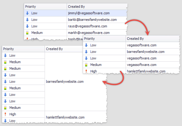
Show exampleIn this example, the Data Grid contains the “Created By” column that displays e-mail addresses. The ColumnView.CustomColumnDisplayText event is handled to trim these addresses to domain names. Since this event changes only cell display text, cell values remain intact and no merging occurs. To fix that, the GridView.CellMerge event is handled.
//trimming e-mail addresses
private void gridView1_CustomColumnDisplayText(object sender, DevExpress.XtraGrid.Views.Base.CustomColumnDisplayTextEventArgs e) {
    if (e.Column == colCreatorID) {
        string email = e.DisplayText;
        string domain = email.Substring(email.IndexOf('@') + 1);
        e.DisplayText = domain;
    }
}

//custom cell merging
private void gridView1_CellMerge(object sender, DevExpress.XtraGrid.Views.Grid.CellMergeEventArgs e) {
    GridView view = sender as GridView;
    if(view == null) return;
    if (e.Column == colCreatorID) {
        string text1 = view.GetRowCellDisplayText(e.RowHandle1, colCreatorID);
        string text2 = view.GetRowCellDisplayText(e.RowHandle2, colCreatorID);
        e.Merge = (text1 == text2);
        e.Handled = true;
    }
}
Demo: Cell Merging
Access Grid Cells in Code
ColumnView.GetRowCellDisplayText and ColumnView.GetRowCellValue
Return cell value and display text for any grid cell.
ColumnView.GetFocusedRowCellDisplayText and ColumnView.GetFocusedRowCellValue
Return cell value and display text for any cell that belongs to the currently focused row.
ColumnView.FocusedRowHandle and ColumnView.FocusedColumn
By setting the focused row and column, you can select a cell you want.
ColumnView.CellValueChanging and ColumnView.CellValueChanged
These events fire in response to end-users modifying cell values.