Scale Breaks
- 5 minutes to read
This document describes how an axis (as well as the diagram to which it belongs) can be broken into multiple scale ranges, separated by the so-called scale breaks. Before you proceed with this document, you may wish to review the basics of using axes.
This document consists of the following sections.
- Scale Breaks Overview
- Auto Scale Breaks
- Insert a Scale Break Manually
- Customize Scale Breaks’ Appearance
Scale Breaks Overview
A scale break is an area across an axis which is shown in place of a section of the axis’ range. It appears across the original axis as a ragged (or wavy or straight, depending on the desired appearance) line.
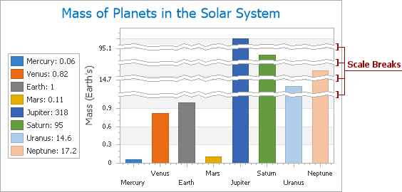
The most common reason for using scale breaks is when a chart has useless space, inevitable when the chart’s series represent data with great leaps in range. For example, when a series represents a continuous flow of values in both decimals and thousands, by default, this would cause the chart to be uneven, due to the large leap between these value levels. This data doesn’t provide any useful information, since neither series point has any value within this range, and the leap has no points. So, it is natural to replace these empty ranges with ragged lines - scale breaks.
Note
Scale breaks are supported for all series views that are compatible with the XY-Diagram.
Multiple scale breaks are supported, and it’s possible to add them to an axis of any scale type, whether or not this axis uses a logarithmic scale.
Note
At present, scale breaks can’t work simultaneously with scrolling. Scrolling has the higher priority. So, in a situation when both scale breaks and scrolling are enabled for any axis of the same diagram, scale breaks will be disabled, while scrolling will persist.
Adding scale breaks, it doesn’t matter whether their ranges intersect, or exceed the visible range of the axis. XtraCharts will automatically merge intersecting scale breaks, and adjust the axis range. Enabling scale breaks, keep in mind that they have to deal with axis scale and range, so the axis’ grid lines, tickmarks and interlacing, as well as the axis labels are also affected.
With XtraCharts, you have the capability to use either automatic or manual scale breaks, or both. These approaches are highlighted below in this document, in the corresponding sections.
Auto Scale Breaks
You can force XtraCharts to automatically insert scale breaks into an axis, via the Axis.AutoScaleBreaks property. To do this at design time, select an axis, and in the Properties window, expand the Axis.AutoScaleBreaks property, and set the AutoScaleBreaks.Enabled property to true.
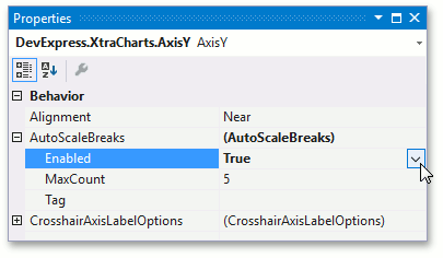
Then, if your chart’s data suggests using scale breaks, they will be created automatically.
You can limit the maximum number of automatic scale breaks, via the AutoScaleBreaks.MaxCount property, whose minimum value is 1.
Note that auto-calculated scale breaks and scale breaks added manually to the ScaleBreakCollection can co-exist.
For more information, refer to How to: Enable Automatic Scale Breaks for an Axis.
Insert a Scale Break Manually
Apart from automatic scale breaks, you have the capability to manually assign scale breaks to an axis.
A scale break is represented by an instance of the ScaleBreak class, which resides in the ScaleBreakCollection of an axis.
To access this collection at design time, click an axis to select it, and in the Properties window, locate the Axis.ScaleBreaks properties. Click its ellipsis button, to invoke the Scale Break Collection Editor.
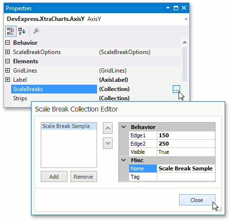
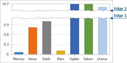
After a scale break is added to the collection, define the range which a scale break represents. The limits of that range are determined by two properties: the ScaleBreak.Edge1 and ScaleBreak.Edge2 properties.
The values of these properties should be defined in measurement units appropriate for the scale type of the axis.
Note
It doesn’t matter whether the value of the ScaleBreak.Edge1 property is less or greater than the value of the ScaleBreak.Edge2 property. It’s only important that their values are different, because if the values of these properties are equal, a scale break is considered invisible.
To define a custom name for a scale break, use its ChartElementNamed.Name property.
If the ScaleBreak.Visible property is enabled, the scale break is seen across the axis, and the dialog can be closed.
For more inforation, refer to How to: Manually Insert a Scale Break into an Axis or How to: Manually Insert a Scale Break into an Axis (Runtime Sample).
Customize Scale Breaks’ Appearance
To define the overall appearance for both automatic and manual scale breaks, use the Axis.ScaleBreakOptions property.
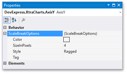
This property provides access to the following options:
- The ScaleBreakOptions.Color property determines the color of the scale breaks’ edges;
- The ScaleBreakOptions.SizeInPixels property determines the width of scale breaks, in pixels;
- The ScaleBreakOptions.Style property allows you to choose whether scale breaks should have their edges straight, wavy or ragged.