Application Appearance and Skin Colors
- 8 minutes to read
The look of any DevExpress control depends on Skin and Appearance objects.
- Appearance objects can be accessed through
Appearanceproperties. These objects store font settings, and background and foreground colors. - Skins store images drawn on top of visual elements (shadows, window corners, borders, etc.), colors that fill different control areas, default button icons, element sizes, and much more.
Custom Appearance settings can override Skin settings, work in combination with them, or be completely ignored. The behavior depends on the current Skin. If your custom appearance settings (for instance, BackColor or BorderColor) are ignored, run the Skin Editor tool and create a custom Skin. To locate the element you need to modify in the Skin Editor, hold the Ctrl key and click the preview area. The Editor then displays a list of all skin elements located under the mouse pointer.
Global settings
- Look-and-Feel
- Skins and Skin Palettes (separate article)
- Default application font (separate article)
Individual control appearance settings
- Appearance Objects
- Highlight Individual Controls
- Appearance Editor - Reuse appearance settings
- Appearance priority
- Print Appearances
Look-and-Feel
The Look-and-Feel settings are global style settings such as the default application font and skin. You can use the following approaches to specify these settings.
Use the Project Settings dialog (the recommended approach). To invoke this dialog, right-click a project in Visual Studio’s Solution Explorer and select “DevExpress Project Settings”.

Call UserLookAndFeel class methods in code.
using DevExpress.LookAndFeel;
//apply raster skin
UserLookAndFeel.Default.SetSkinStyle(SkinStyle.Office2016Colorful);
//apply vector skin and choose a palette
UserLookAndFeel.Default.SetSkinStyle(SkinStyle.Bezier, SkinSvgPalette.Bezier.CherryInk);
//disable skinning, apply the "Flat" style
//note that several DevExpress controls (for example, the Ribbon) cannot be displayed without a skin
UserLookAndFeel.Default.SetStyle(LookAndFeelStyle.Flat, false, true);
Individual controls inherit global Look-and-Feel settings from their parents (forms, user controls, panels, etc.). You can override these inherited settings if you access these controls’ LookAndFeel properties in code (hidden in the VS Property Grid). However, only override global Look-and-Feel settings to change a control’s background (DevExpress controls v18.1 or older).
Appearance Objects
Individual controls provide Appearance properties that store AppearanceObject or AppearanceObjectEx class objects. These objects specify background, foreground, and font settings that affect their parent controls only.
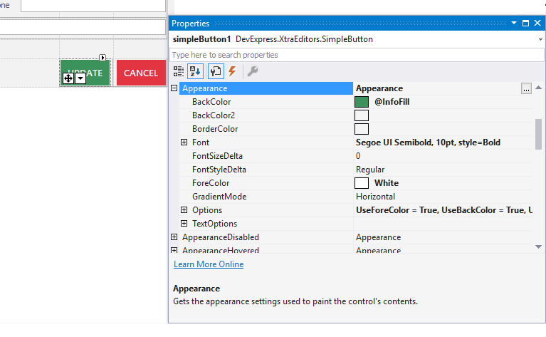
For each supported visual state (normal, disabled, hovered, etc.), a control may provide individual Appearance settings. Note that if your application uses DevExpress skins, you can set custom background colors (Appearance.BackColor and Appearance.BackColor2 properties) only for the Normal state.
Tip
The StyleController component allows you to specify Appearance settings for multiple editors at once.
Highlight Individual Controls
You can change an individual controls’ background, foreground and border colors to highlight these controls. For raster skins, custom background colors will blend in with element skin bitmaps. For vector skins, custom colors will be displayed “as is”.
Use the following code to highlight a control in v18.2 and higher:
Use the following code to highlight a control in v18.1 and older:
//disable element skin to see custom colors
simpleButton1.LookAndFeel.UseDefaultLookAndFeel = false;
simpleButton1.LookAndFeel.Style = DevExpress.LookAndFeel.LookAndFeelStyle.Flat;
simpleButton1.Appearance.BackColor = Color.Crimson;
See the WindowsFormsSettings.BackgroundSkinningMode topic for more information on UI element highlighting.
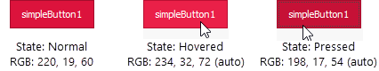
You can set a custom color for the Normal element state only; other element states (Pressed, Hovered, Disabled) will automatically receive slightly different hues of the same color. Additionally, starting with v18.2, when you change an element background color, this element automatically adjusts its foreground to increase contrast and improve readability. Use the WindowsFormsSettings.AutoCorrectForeColor setting to disable this behavior.
Note
Not all DevExpress control backgrounds are modified through the Appearance.BackColor settings. For example, to highlight a GroupControl you need to change its Appearance.BorderColor property instead. Refer to control-specific documentation to check whether this control can be highlighted with a custom background color and to find out which Appearance setting you need to modify in order to do so.
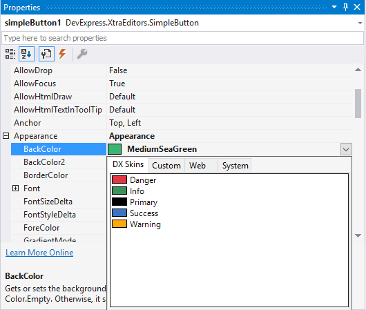
Skin Colors
You can assign Skin Colors to background and foreground color properties. At design time, switch to the “DX Skins” tab to choose a Skin Color.
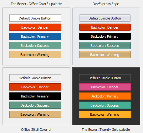
The same Skin Color may vary in different skins and vector skins palettes (see the figure below).
Skin Colors are available for the following controls:
- GridColumn and GridBand headers (BackColor)
- TreeListColumn and TreeListBand headers (BackColor)
- PivotGridControl columns headers (BackColor)
- LayoutView card captions (BorderColor)
- tab headers and captions for Application UI Manager documents and Dock Manager panels (BorderColor)
- NavigationPane tabs (BorderColor)
- GroupControl (BorderColor)
- LayoutControl group headers (BorderColor)
- SimpleButton (BackColor)
- Ribbon - Page Header Items
To assign Skin Colors in code, retrieve them from the DevExpress.LookAndFeel.DXSkinColors.FillColors (for background only) or DevExpress.LookAndFeel.DXSkinColors.ForeColors (for foreground only) classes.
simpleButton1.Appearance.BackColor = DXSkinColors.FillColors.Danger;
//or
simpleButton1.Appearance.ForeColor = DXSkinColors.ForeColors.Warning;
The following example demonstrates how to obtain a Skin Color based on the active skin and color palette:
using DevExpress.LookAndFeel;
using DevExpress.Utils.Colors;

//...
Color warningColor = DXSkinColorHelper.GetDXSkinColor(DXSkinColors.FillColors.Warning, LookAndFeel.ActiveSkinName, LookAndFeel.ActiveSvgPaletteName);
Appearance Editor - Reuse appearance settings
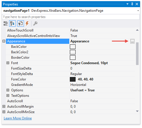
The Appearance Editor allows you to customize, save, and apply appearance settings to objects at design time. Click the ellipsis button next to a control’s Appearance property to invoke the Appearance Editor.
Customize the appearance settings and click the “Save As…” button to save these settings as a template.
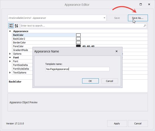
You can access saved templates from the drop-down selector when you invoke the Appearance Editor for a control/visual element. To apply these settings to the current AppearanceObject, select a template and click “Apply”.
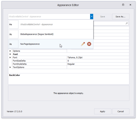
Appearance styles are saved as .xml files to the “C:\Users\Public\Documents\DevExpress\AppearanceTemplates” folder. You can reuse saved appearance settings in other Visual Studio projects.
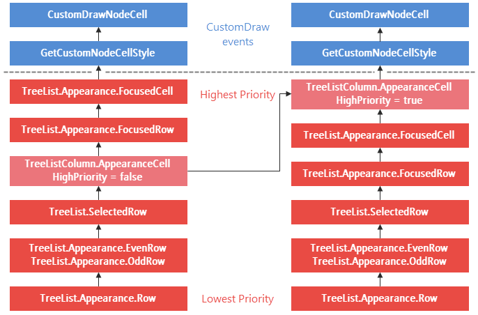
Appearance Priority
Data Grid, Tree List and Vertical Grid appearance properties return the AppearanceObjectEx class objects. This class provides the AppearanceOptionsEx.HighPriority property that allows you to change the Appearance priority. For instance, the following code sample prioritizes cell appearance settings.
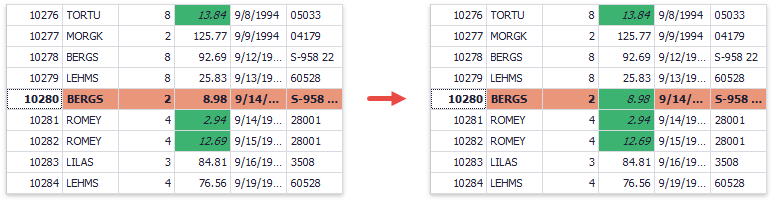
The following example demonstrates how to prioritize the appearance of a Conditional Formatting rule and override the appearance of selected and focused cells in a data grid.
using DevExpress.XtraEditors;
using DevExpress.XtraGrid;
using DevExpress.XtraGrid.Views.Grid;
using System.Drawing;

GridFormatRule freightRule;

public Form1() {
    InitializeComponent();
    // . . .

    //selected row appearance
    gridView1.Appearance.FocusedRow.BackColor = Color.DarkSalmon;
    gridView1.Appearance.FocusedRow.FontStyleDelta = FontStyle.Bold;
    //rule condition and condition settings
    FormatConditionRuleValue freightRuleCondition = new FormatConditionRuleValue();
    freightRuleCondition.Condition = FormatCondition.Less;
    freightRuleCondition.Value1 = 20;
    freightRuleCondition.Appearance.BackColor = Color.MediumSeaGreen;
    freightRuleCondition.Appearance.Options.UseBackColor = true;
    freightRuleCondition.Appearance.Options.UseFont = true;
    freightRuleCondition.Appearance.FontStyleDelta = FontStyle.Italic;
    freightRuleCondition.Appearance.Options.UseBackColor = true;
    //override default appearances for focused and selected rows
    freightRuleCondition.Appearance.Options.HighPriority = true;
    //format rule
    freightRule = new GridFormatRule() { Column = colFreight, Rule = freightRuleCondition };
    gridView1.FormatRules.Add(freightRule);
}
Since custom draw and custom style events (GridView.RowStyle, GridView.RowCellStyle, GridView.CustomDrawCell, etc.) have the highest priority, you can use them more effectively instead of changing the appearance priority.
GridFormatRule freightRule;

private void GridView1_RowCellStyle(object sender, DevExpress.XtraGrid.Views.Grid.RowCellStyleEventArgs e) {
    GridView view = sender as GridView;
    if (view.IsRowSelected(e.RowHandle) && e.Column.FieldName == "Freight" &&
        freightRule.IsFit(e.CellValue, view.GetDataSourceRowIndex(e.RowHandle))) {
            e.Appearance.Assign((freightRule.Rule as FormatConditionRuleAppearanceBase).Appearance);
    }
}
Reset Appearance Settings
The following example demonstrates how to reset the button’s appearance settings to their defaults.
// Resents all appearance settings to their defaults.
simpleButton1.Appearance.Reset();

// Resets the button's background color.
simpleButton2.Appearance.BackColor = Color.Empty;
Print and Export Appearances
DevExpress controls expose AppearancePrint properties that store appearance settings applied when the control is printed and/or exported. The AppearancePrint settings provide properties that specify whether printed/exported controls should use these unique appearances.
- GridOptionsPrint.UsePrintStyles
- TreeListOptionsPrint.UsePrintStyles
- PivotGridOptionsPrint.UsePrintAppearance
If these properties are set to false, printed and/or exported controls are the same as those that appear on-screen. See the following help topic for more information: Printing and Exporting.
Cheat Sheets and Best Practices
DevExpress WinForms UI controls share the same appearance customization techniques. Read the following quick-reference guides for detailed information:
- Appearances and Skins - DevExpress WinForms Cheat Sheet
- Skins and Skin Editor - DevExpress WinForms Troubleshooting