Layout View
- 7 minutes to read
This document outlines features specific to LayoutView only. For information on common card and selection features, refer to the root Card and Layout Views article.
- Template Card
- View Designer
- Card Layout Modes
- Stretching Cards
- Panning
- Runtime Customization
- Example - Create Layout in Code
Template Card
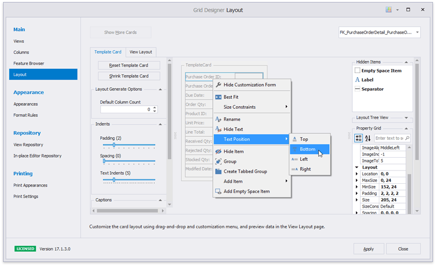
The Layout View employs the Layout Control to arrange content inside cards. For every grid column, a LayoutViewField object is generated. Switch to the “Layout | Template Card” tab in the Data Grid Designer to re-arrange data fields, rename field captions, add separators and empty space items, set up card alignment options, etc.
Related API
LayoutView.TemplateCard - provides access to the template card and allows you to modify it in code.
LayoutView.Items - provides access to both visible and hidden card layout items (fields, empty space items, separators, etc.).
LayoutView.HiddenItems - provides access to hidden card layout items only.
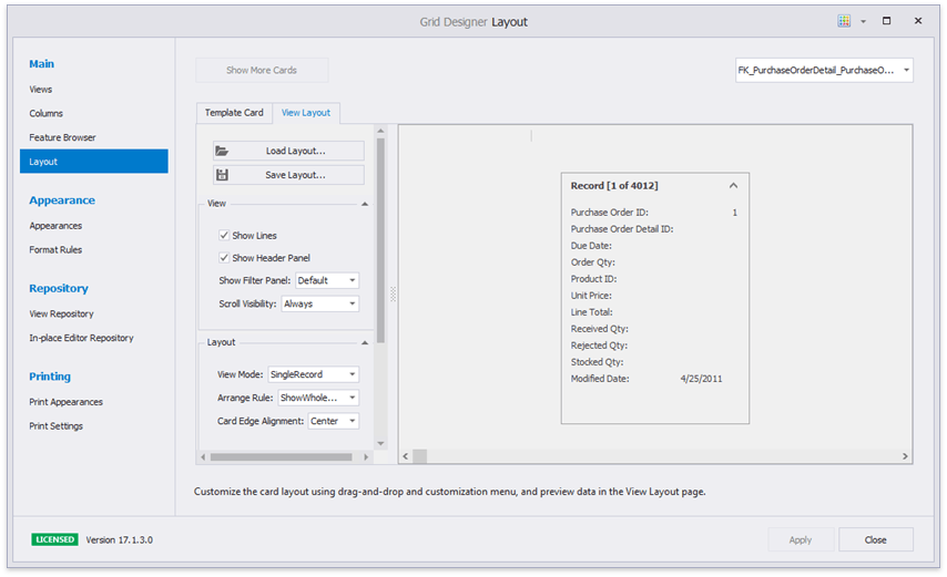
View Designer
In the Data Grid designer, switch to the “ Layout | View Layout” tab to set up most significant View options - card layout mode, card intervals, header visibility, availability of expand/collapse buttons, etc.
Card Layout Modes
There are six card layout modes available. You can set the required mode by changing the LayoutViewOptionsView.ViewMode property, while at runtime, end-users can switch between these modes by clicking the top View panel (see below).
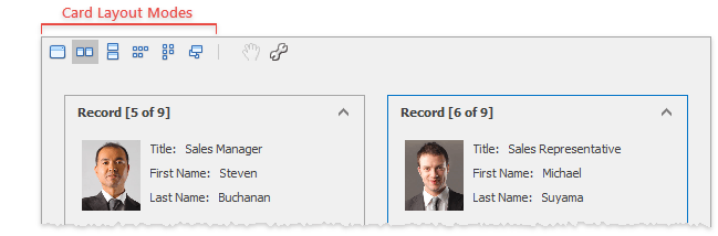
You can either disable specific buttons on this panel (modify properties accessed through the LayoutView.OptionsHeaderPanel collection), or hide the panel entirely (disable the LayoutViewOptionsView.ShowHeaderPanel property).
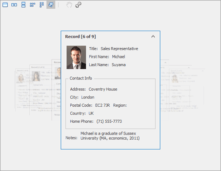
Single Record
- The View displays only one card at a time.
- If a card occupies less space than the View’s client area, card position is managed by the LayoutViewOptionsSingleRecordMode.CardAlignment property.
Single Row
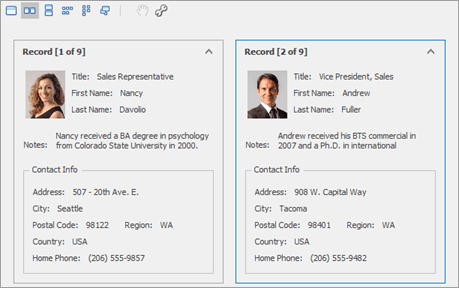
- All cards are aligned vertically in a single row.
- The maximum number of simultaneously visible cards is managed by the LayoutViewOptionsMultiRecordMode.MaxCardColumns property.
Single Column
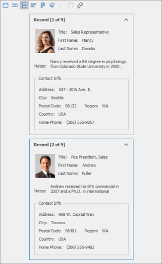
- Cards are arranged vertically in a single column.
- The maximum number of simultaneously visible cards is managed by the LayoutViewOptionsMultiRecordMode.MaxCardRows property.
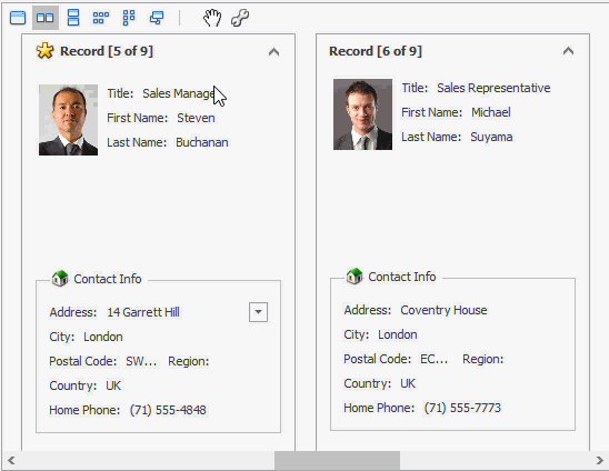
Multi Row and Multi Column
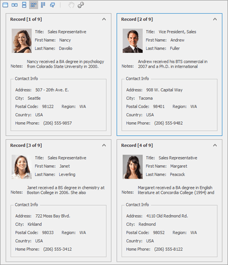
- In Multi Row mode, cards are arranged across multiple columns, then down. In Multi Column mode in turn, cards are placed one below another in multiple rows, then across.
- You can limit the number of simultaneously visible cards by using LayoutViewOptionsMultiRecordMode.MaxCardRows and LayoutViewOptionsMultiRecordMode.MaxCardColumns settings.
- Both layouts support vertical and horizontal orientation modes. To change that and rotate the embedded scroll bar, utilize the LayoutViewOptionsMultiRecordMode.MultiRowScrollBarOrientation or LayoutViewOptionsMultiRecordMode.MultiColumnScrollBarOrientation property.
Carousel
- Cards are arranged along an elliptical path. The currently selected card is displayed at the middle of a curve and neighboring cards gradually fade out.
- Access properties are provided by the LayoutView.OptionsCarouselMode object to modify the curve.
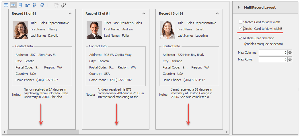
Stretching Cards
You can stretch cards vertically or horizontally to fit them in a current View client area. To do so, enable required StretchCardToView… properties.
- For single record mode - LayoutViewOptionsSingleRecordMode.StretchCardToViewHeight, LayoutViewOptionsSingleRecordMode.StretchCardToViewWidth.
- For multi-record modes - LayoutViewOptionsMultiRecordMode.StretchCardToViewHeight, LayoutViewOptionsMultiRecordMode.StretchCardToViewWidth.
- For carousel mode - LayoutViewOptionsCarouselMode.StretchCardToViewHeight, LayoutViewOptionsCarouselMode.StretchCardToViewWidth.
Run the Layout View demo to test this feature.
Panning
The Layout View does not provide embedded scroll buttons to scroll cards that are larger than a View client area. Instead, end-users can click the hand icon in the top panel to enter the Panning mode. In this mode, users click anywhere inside a View and drag it in the required direction, much like on touch-input devices.
Related API
LayoutViewOptionsBehavior.AllowPanCards - gets or sets whether or not end-users can activate Panning mode.
LayoutView.PanModeSwitch - toggles Panning mode on or off.
LayoutViewOptionsHeaderPanel.ShowPanButton - displays or hides the “Panning” button.
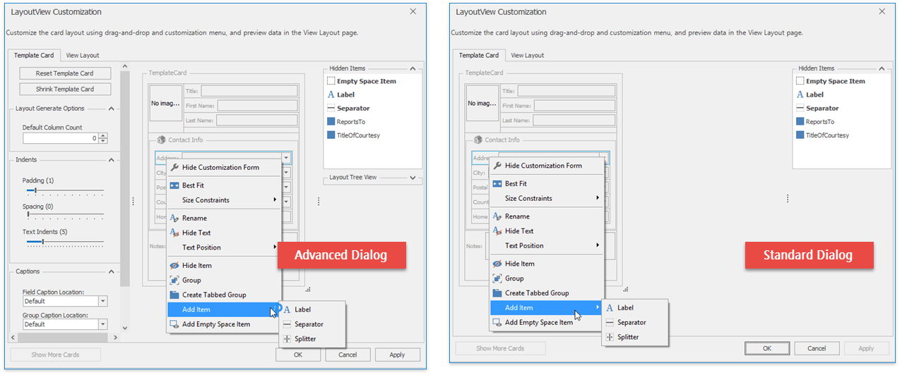
Runtime Customization
End-users can click the “Customization” button in the top panel to re-arrange fields, add secondary UI elements (labels, empty spaces and separators), modify card sizes and indents, etc. The amount of available options depends on whether the invoked dialog is standard or the advanced one.
Related API
LayoutViewOptionsBehavior.AllowRuntimeCustomization - specifies whether or not end-users are allowed to customize the default layout.
LayoutViewOptionsHeaderPanel.ShowCustomizeButton - displays or hides the “Customization” button.
LayoutViewOptionsCustomization.UseAdvancedRuntimeCustomization - activates the advanced customization mode.
LayoutView.OptionsCustomization - provides access to the set of customization-related properties. Those with names starting with “Show…” allow you to choose what settings end-users can change in advanced customization mode.
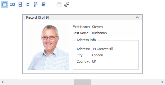
Example - Create Layout in Code
The following example shows how to create and customize a Layout View in code. In the example, a template card is created, consisting of six fields arranged as in the image below:
Before arranging layout fields in code, ensure that corresponding columns are visible (see LayoutViewColumn.Visible and GridColumnCollection.AddVisible).
using DevExpress.XtraGrid;
using DevExpress.XtraGrid.Views.Layout;
using DevExpress.XtraGrid.Columns;
using DevExpress.XtraLayout;
using DevExpress.XtraLayout.Customization;
using DevExpress.XtraLayout.Utils;
using DevExpress.XtraEditors.Repository;
using DevExpress.XtraEditors.Controls;

GridControl grid = new GridControl();
LayoutView lView = new LayoutView(grid);
grid.MainView = lView;
lView.OptionsBehavior.AutoPopulateColumns = false;

grid.DataSource = employeesBindingSource;
this.Controls.Add(grid);
grid.Dock = DockStyle.Fill;

// Create columns.
LayoutViewColumn colFirstName = lView.Columns.AddVisible("FirstName") as LayoutViewColumn;
LayoutViewColumn colLastName = lView.Columns.AddVisible("LastName") as LayoutViewColumn;
LayoutViewColumn colAddress = lView.Columns.AddVisible("Address") as LayoutViewColumn;
LayoutViewColumn colCity = lView.Columns.AddVisible("City") as LayoutViewColumn;
LayoutViewColumn colCountry = lView.Columns.AddVisible("Country") as LayoutViewColumn;
LayoutViewColumn colPhoto = lView.Columns.AddVisible("Photo") as LayoutViewColumn;

// Access corresponding card fields.
LayoutViewField fieldFirstName = colFirstName.LayoutViewField;
LayoutViewField fieldLastName = colLastName.LayoutViewField;
LayoutViewField fieldAddress = colAddress.LayoutViewField;
LayoutViewField fieldCity = colCity.LayoutViewField;
LayoutViewField fieldCountry = colCountry.LayoutViewField;
LayoutViewField fieldPhoto = colPhoto.LayoutViewField;

// Position the FirstName field to the right of the Photo field.
fieldFirstName.Move(new LayoutItemDragController(fieldFirstName, fieldPhoto,
    InsertLocation.After, LayoutType.Horizontal));

// Position the LastName field below the FirstName field.
fieldLastName.Move(new LayoutItemDragController(fieldLastName, fieldFirstName,
    InsertLocation.After, LayoutType.Vertical));

// Create an Address Info group.
LayoutControlGroup groupAddress = new LayoutControlGroup();
groupAddress.Text = "Address Info";
groupAddress.Name = "addressInfoGroup";

// Move the Address, City and Country fields to this group.
groupAddress.AddItem(fieldAddress);
fieldCity.Move(fieldAddress, InsertType.Bottom);
fieldCountry.Move(fieldCity, InsertType.Bottom);

lView.TemplateCard.AddGroup(groupAddress, fieldLastName, InsertType.Bottom);

// Assign editors to card fields.
RepositoryItemPictureEdit riPictureEdit = grid.RepositoryItems.Add("PictureEdit") as RepositoryItemPictureEdit;
riPictureEdit.SizeMode = PictureSizeMode.Squeeze;
colPhoto.ColumnEdit = riPictureEdit;

// Customize card field options.
colFirstName.Caption = "First Name";
colLastName.Caption = "Last Name";
// Set the card's minimum size.
lView.CardMinSize = new Size(250, 180);

fieldPhoto.TextVisible = false;
fieldPhoto.SizeConstraintsType = SizeConstraintsType.Custom;
fieldPhoto.MaxSize = fieldPhoto.MinSize = new Size(150, 150);