Scheduler Report Controls and Components
- 6 minutes to read
This document introduces the Scheduler report controls, used to display various information in a Scheduler report. They are only available if you own both the XtraScheduler and XtraReports Suites (they use functionality from each product library). All these controls can be added to a report, at either Visual Studio design time or in the End-User Report Designer. You can programmatically add the controls to a report created at runtime, as well.
What is a Scheduler Report Control?
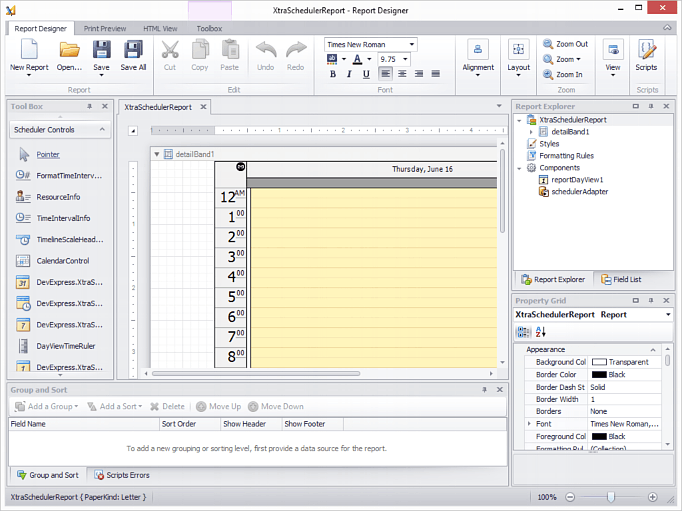
A Scheduler Report Control represents a specific report element which can be inserted into a report. It descends from the XtraReport class called XtraSchedulerReport. This class has the normal banded report designer, used in the XtraReports Suite.
Note
Current implementation requires that report controls reside inside the DetailBand only, and not in the other report bands.
The Scheduler Report Controls require the Scheduler Report View Components for their operation. This is much like the view that exists in the XtraScheduler control, so there are ReportDayView, ReportWeekView, ReportMonthView and ReportTimelineView components. They are responsible for composing the data obtained via the SchedulerControlPrintAdapter or SchedulerStoragePrintAdapter, and providing the data to the Scheduler Report Controls.
The appearance and behavior of a report control is defined by its type. See the section below to learn more about different report control types available in the current version of XtraScheduler Reporting.
Note
Report controls can be used only in XtraScheduler Reports, and they automatically populate the Visual Studio toolbox when the report designer becomes active. However, these controls can’t be added to a Form instance, and are missing in the Visual Studio toolbox if the Windows Forms designer is active.
Controls
All report controls are inherited from the base DevExpress.XtraScheduler.Reporting.ReportRelatedControlBase class. This class provides the basic functionality that is required by the objects that display and handle information in Scheduler reports.
Below is a list of basic report controls available in XtraSchedulerReports.
| Scheduler Report Control | Description |
|---|---|
 DayViewTimeCells DayViewTimeCells |
A time cells control representing the Scheduler’s Day View. It can be used to print one or more days, which do not have to be consecutive. |
 HorizontalWeek HorizontalWeek |
A time cells control representing the Scheduler’s Month View. It can be used to print a week or several weeks. |
 FullWeek FullWeek |
A time cells control representing the Scheduler’s Week View. It can be used to print one or more weeks in a compact style. |
 TimelineCells TimelineCells |
A time cells control representing the Scheduler’s Timeline View. It can visualize appointments using different time scales. |
 HorizontalDateHeaders HorizontalDateHeaders |
A header control used to print dates for the columns of time cells . |
 DayOfWeekHeaders DayOfWeekHeaders |
A header control used to print days of the week for the HorizontalWeek control. |
 TimelineScaleHeaders TimelineScaleHeaders |
A header control used to print time scales for the ReportTimelineView. |
 HorizontalResourceHeaders HorizontalResourceHeaders |
A header control used to print resources for the columns of time cells. |
 VerticalResourceHeaders VerticalResourceHeaders |
A vertical header control used to print resources for the rows of time cells. |
 DayViewTimeRuler DayViewTimeRuler |
A control used to print a time ruler on the left side of the linked DayViewTimeCells control. |
 TimeIntervalInfo TimeIntervalInfo |
A control used to print a textual representation of the time interval. |
 FormatTimeIntervalInfo FormatTimeIntervalInfo |
A control used to print a textual representation of the time interval using a wide range of available formats. |
 ResourceInfo ResourceInfo |
A control used to print a list of resources. |
Components
| Scheduler Report Component | Description |
|---|---|
| ReportDayView |
A View component for a daily style report. |
 ReportWeekView ReportWeekView |
A View component for a week-style report. |
 ReportMonthView ReportMonthView |
A View component for a monthly (multi-week) style report. |
 ReportTimelineView ReportTimelineView |
A View component for a timeline style report. |
 SchedulerControlPrintAdapter SchedulerControlPrintAdapter |
Scheduler print adapter bound to the SchedulerControl. |
 SchedulerStoragePrintAdapter SchedulerStoragePrintAdapter |
Scheduler print adapter bound to the SchedulerStorage |
Bands
The Scheduler Report control displays report content in the Detail report band.
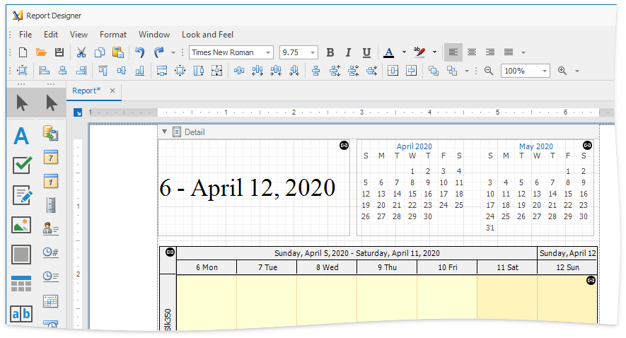
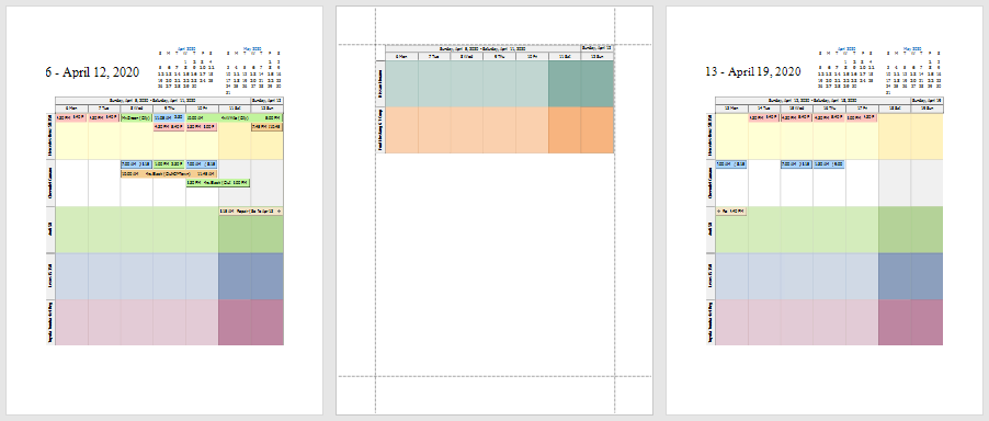
You can also add the Group Header report bands to display headers on every page or at the start of a group.
Use the context menu in the Report Designer to add group headers.
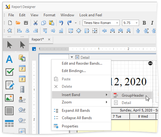
Then, place report elements inside the headers. Click the group header’s smart tag and select “Repeat Every Page“ to show group headers on every page.
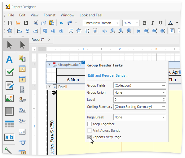
Group headers specified to repeat every page are displayed on every page, other group headers are added when a new group starts.
Using Controls
Report controls can be added to a report at design time or in code. These methods are illustrated below:
Design time.
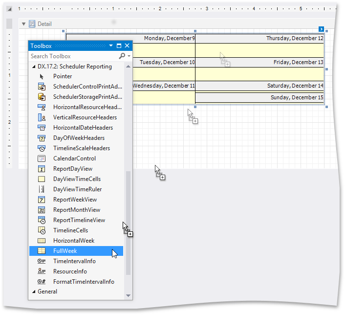
To add report controls at design time, drag an appropriate item from the DX.19.2: Scheduler Reporting tab of the Visual Studio toolbox, and drop it onto a report.
The control links itself to an appropriate View automatically. You can use smart tags to specify a link to the View component, and to another scheduler report control. The link sign
 indicates that the control is linked.
Runtime.
To add a report control to a report at runtime, create it, and add it to the DetailBand of the report via the XRControlCollection.Add method. Make sure that the DevExpress.XtraReports.UI namespace is included in your code.
The following code snippet illustrates how you can add controls at runtime to create a daily report.
To create a report, a minimal set of controls, which includes the DayViewTimeCells, HorizontalDateHeaders, DayViewTimeRuler and a corresponding ReportDayView component, is used. They are added to the report’s DetailBand, positioned and linked as required. Then, an end-user designer is invoked to display and edit the resulting report.
Note
A complete sample project is available at https://github.com/DevExpress-Examples/how-to-construct-an-xtraschedulerreport-at-runtime-e1390
using DevExpress.XtraReports.UI;
using DevExpress.XtraScheduler;
using DevExpress.XtraScheduler.Reporting;
using DevExpress.XtraScheduler.Reporting.UI;
using System;
using System.Windows.Forms;
            XtraSchedulerReport xr = new XtraSchedulerReport();
            // Add a Day View to the Report.
            ReportDayView repDayView = new ReportDayView();
            xr.Views.Add(repDayView);
            // Start modifications.
            repDayView.BeginInit();
            // Specify the scheduler data source.
            xr.SchedulerAdapter = new SchedulerStoragePrintAdapter(storage);
            // Create the controls
            DayViewTimeCells dayCells = new DayViewTimeCells();
            DayViewTimeRuler repTimeRuler = new DayViewTimeRuler();
            HorizontalDateHeaders repDateHeaders = new HorizontalDateHeaders();
            // Find the report's Detail band and add controls.
            xr.Bands.Add(new DetailBand());
            Band band = xr.Bands.GetBandByType(typeof(DetailBand));
            band.Controls.Add(repDateHeaders);
            band.Controls.Add(dayCells);
            band.Controls.Add(repTimeRuler);
            // Place each day on a separate page.
            band.PageBreak = PageBreak.AfterBand;
            // Position the controls.
            repTimeRuler.Location = new System.Drawing.Point(0, 0);
            repDateHeaders.Location = new System.Drawing.Point(repTimeRuler.Width, 0);
            dayCells.Location = new System.Drawing.Point(repTimeRuler.Width, repDateHeaders.Height);
            // Specify the View.
            dayCells.View = repDayView;
            repTimeRuler.View = repDayView;
            repDateHeaders.View = repDayView;
            // Link the controls.
            dayCells.HorizontalHeaders = repDateHeaders;
            repTimeRuler.TimeCells = dayCells;
            // Adjust the time ruler to fill the corner's gap.
            repTimeRuler.Corners.Top = repDateHeaders.Height;
            // Adjust the report height.
            dayCells.HeightF = 800F;
            repTimeRuler.HeightF = dayCells.HeightF + repTimeRuler.Corners.Top;
            // Set the half-hour time scale.
            dayCells.TimeScale = new TimeSpan(0, 30, 0);
           // Specify the time interval for the report.
            xr.SchedulerAdapter.TimeInterval = new TimeInterval(new DateTime(2010, 07, 14), new DateTime(2010, 07, 21));
            // Finalize the modifications.
            repDayView.EndInit();

            // Invoke the Report Designer and load the report for editing.
            SchedulerReportDesignTool tool = new SchedulerReportDesignTool(xr);
            tool.ShowRibbonDesignerDialog();