Nodes
- 3 minutes to read
Tree List nodes are data rows organized into a tree-like hierarchy.
- Add New Nodes
- Access Nodes
- Node Icons
- Node Indents
- Node Checking with Checkboxes and Radio Buttons
- Preview Sections
- Using the Nodes Iterator
- Custom Nodes
Examples
- How to: Iterate through nodes and calculate the number of nodes at a specific level
- How to: Iterate through nodes and collapse specific nodes
- How to: Create custom nodes and specify height for individual nodes
- How to: Enable Automatic Height Adjustment
API Demos
- Append new nodes
- Remove a focused node when Ctrl+Delete is pressed
- Change Node height dynamically
- Assign node images dynamically
- Display node checkboxes
- Nodes iterator: Allow only one expanded node at each level
- Nodes iterator: Set child nodes’ value when a parent node’s value changes
Add New Nodes
Nodes (the TreeListNode class objects) are generated automatically if a Tree List has a data source. To add nodes in Unbound Mode, invoke the Tree List Designer dialog and switch to its “Nodes” tab .
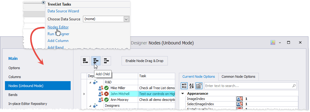
Refer to the Unbound Mode article for information on how to add custom nodes in code.
Access Nodes
The TreeList.Nodes property allows you to access nodes from the control’s root level.
//get a second node by indexer
TreeListNode node = treeList1.Nodes[1];
//get all nodes whose caption has "R&D" in it
var nodes = treeList1.Nodes.Where(n => n.GetDisplayText("Department").Contains("R&D"));
Every node has a TreeList.Nodes collection that stores child nodes. You can use the nodes iterator or the following API to retrieve nodes in these collections:
- TreeList.FocusedNode - Gets or sets the focused node.
TreeList.FindNodeByFieldValue - Returns a node by its field value.
- TreeList.FindNodeByKeyID - Returns the node by its key field value.
- TreeList.FindNodeByID - Returns the node specified by its identifier.
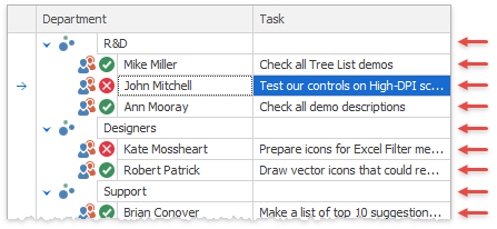
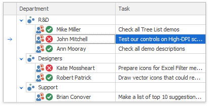
Node Icons
Every node can have select and state icons.
Icon Name | Image | Description |
|---|---|---|
Select icon |
| The main node image. Use the TreeListNode.ImageIndex property to choose an icon from the TreeList.SelectImageList collection assigned to the Tree List. The optional TreeListNode.SelectImageIndex property allows you to specify another icon for the same node. This image is shown when the node is focused (selected). |
State icon |
| State icons are shown next to select icons and indicate a node’s state. These icons are stored in a separate TreeList.StateImageList collection. Use the TreeListNode.StateImageIndex property to choose a state image from this collection. |
If the TreeListOptionsView.RowImagesShowMode property is set to InCell, icons are shown inside node cells.
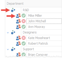
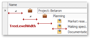
Node Indents
A node indent is a distance between the control’s border and the border of a first cell in this node. The TreeList.TreeLevelWidth property specifies this distance for root nodes.
Node Checking with Checkboxes and Radio Buttons
The TreeList’s node checking feature allows you to enable check boxes or radio buttons for certain tree levels.
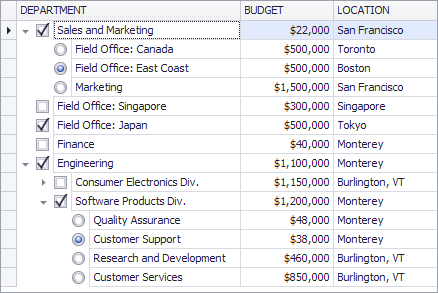
You can set or retrieve the nodes’ check states using the API the TreeList control provides. In bound mode, it is possible to sync node check states with a field in the data source. See Node Checking - Checkboxes and Radio Buttons for more information.
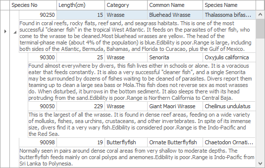
Preview Sections
Preview sections are non-editable regions display large memo text or custom data. They are displayed under nodes’ data cells across all columns.
See the Preview Sections article for more information.