Group Row
- 2 minutes to read
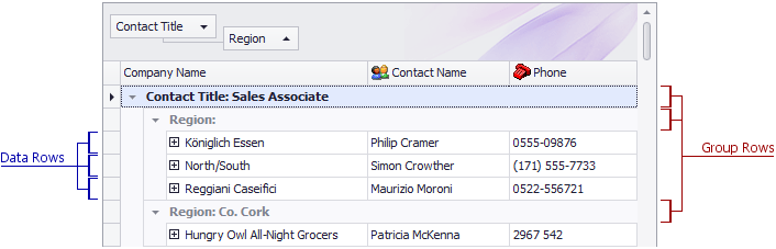
Group rows are used to organize data rows into a tree when data grouping is applied. A group row contains a group expand button that enables end-users to expand and collapse a group row, and thus show or hide its child rows. Group rows can also display group summary values.
The table below lists the main properties that affect element appearance.
Appearance | The GridViewAppearances.GroupRow property. The GridView.RowStyle event. To specify different styles for group rows displayed at different nesting levels, handle the GridView.GroupLevelStyle event. When the View has focus, and a group row (as well as a data row) is focused or selected, the row’s appearance is determined by either the GridViewAppearances.FocusedRow or GridViewAppearances.SelectedRow property, respectively. When the View loses focus, the focused and selected rows are painted using the GridViewAppearances.HideSelectionRow property’s settings. |
Paint Style | |
Custom Draw Event | |
Hide group rows if they contain only a single data row | |
Align group summaries in group rows | |
Anchor the top visible group row to the top of the grid | |
Contents |
GridView.GetGroupRowDisplayText Custom text can be displayed in group rows via the GridView.CustomDrawGroupRow event. HTML tags can be used to format text in group rows, provided that the GridOptionsView.AllowHtmlDrawGroups option is enabled. |