Appearances
- 3 minutes to read
XtraBars provides design time and runtime facilities for modifying the styles of its elements. This implies modifying attributes such as the background and foreground colors, background images, font, etc.
Appearance Customization Methods
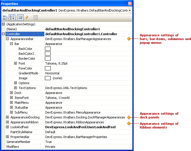
The easiest way to customize the appearance of controls and visual elements provided by the DevExpress Ribbon, Menu and Docking Library is to use a BarAndDockingController component. It contains various appearance options that allow you to specify the background and foreground colors, font settings, gradient mode, background image, etc for painting XtraBars visual elements. These settings have the Appearance… prefix. The following image shows the appearance settings provided by the DefaultBarAndDockingController:
Note
For most XtraBars visual elements, changing the background color(s) is not in effect in skinning paint schemes. For information on changing a paint scheme, see Look And Feel and Skinning.
To customize the appearance settings of XtraBars visual elements for all forms in your application, use the DefaultBarAndDockingController component. It allows you to customize the appearance settings that will be used, by default, by all XtraBars visual elements within all forms in your application.
To customize the appearance settings of XtraBars controls for individual forms independently, add a BarAndDockingController component to each form and customize their appearance settings as required. To learn more about the difference between the DefaultBarAndDockingController and BarAndDockingController components, see Bar and Docking Controllers (Customizing Default View and Behavior Settings).
Appearances of Individual XtraBars Visual Objects
Some elements provide their own appearance options and these, if set, will override the appearance settings provided by the DefaultBarAndDockingController or the BarAndDockingController. For instance, each Bar object provides the Bar.Appearance property, which, if used, overrides the BarAndDockingController.AppearancesBar.Bar property.
The following table lists the appearance settings provided by individual XtraBars controls and objects:
XtraBars Control/Object | Property | Description |
|---|---|---|
Specifies a specific bar’s appearance settings. Appearance settings that are set via this property will override the appearance settings provided by the BarAndDockingController.AppearancesBar.Bar property. | ||
Specifies the appearance settings used to paint a specific item. The font attributes that are set via the Appearance.Font property will override the font attributes provided by the BarAndDockingController.AppearancesBar.ItemsFont property. | ||
Specifies the appearance settings used to paint a bar dock control. Appearance settings that are set via this property will override the appearance settings provided by the BarAndDockingController.AppearancesBar.Dock property. | ||
Specifies the appearance settings of a specific sub-menu. Appearance settings that are set via this property will override the appearance settings provided by the BarAndDockingController.AppearancesBar.SubMenu property. | ||
Specifies the appearance settings of a specific popup menu. Appearance settings that are set via this property will override the appearance settings provided by the BarAndDockingController.AppearancesBar.SubMenu property. | ||
Specifies the appearance settings of a specific dock panel’s client region. Appearance settings that are set via this property will override the appearance settings provided by the BarAndDockingController.AppearancesDocking.Panel property. | ||
Specifies the appearance settings used to paint the MDI client. | ||
Provides properties that control the appearance of pages that belong to the current XtraTabbedMdiManager component. | ||
Provides properties that are used to paint Ribbon gallery elements. | ||
Provides properties that control the appearance of an alert window’s contents. |
Appearance Objects
To learn about classes that encapsulate appearance settings, see the Appearances topic.