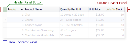
Header Panel Button
The header panel button belongs to both the column header panel and row indicator panel elements. By default, the header panel button has no special functionality. When a View is used to represent detail data, the header panel button serves as a zoom button.
The table below lists the main properties affecting element appearance.
Appearance | GridViewAppearances.HeaderPanel. This style is also applied to column headers and the row indicator panel. Note: the style is not in effect if the View is painted using a Windows XP theme (see the BaseView.PaintStyleName property). |
Custom Draw Event | The GridView.CustomDrawRowIndicator event. |
Visibility | The element is visible if both the GridOptionsView.ShowIndicator and GridOptionsView.ShowColumnHeaders properties are set to true. |