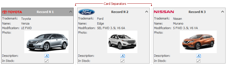
Card Separator
Card separators are vertical lines between adjacent cards.
The dragging of card separators allows end-users to change card width. Note: this feature is only enabled while CardOptionsBehavior.Sizeable is set to true and CardOptionsBehavior.AutoHorzWidth is set to false.
In several skins, the card separator color matches the View’s background color, so the card separators are not visible. If this is an issue for you, consider modifying the corresponding colors using the CardViewAppearances.SeparatorLine and/or CardViewAppearances.EmptySpace properties.
The following table lists the main properties affecting element appearance.
Appearance | |
Visibility |
See Also