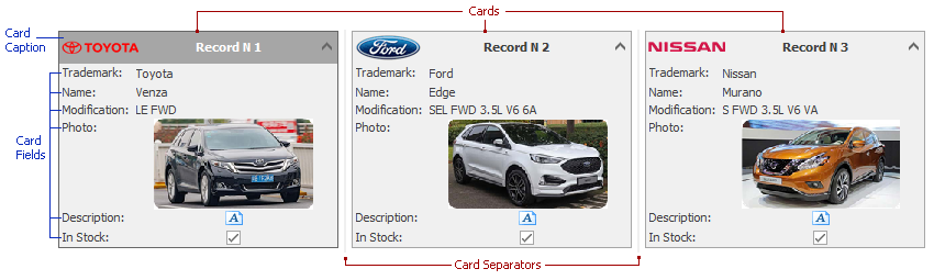
Card
In a Card View, data source records are rendered as cards. Adjacent cards are separated by card separators that end-users can drag to change card width.
Each card consists of vertically arranged card fields, which display field captions and values. Cards can have customizable card captions that by default show card ordinal numbers.
The following table lists the main properties that affect element appearance.
Appearance | The BorderColor properties of the CardViewAppearances.CardCaption and CardViewAppearances.FocusedCardCaption objects specify card border colors. See also the card caption, card field caption and card field value cell topics. |
Custom Draw Event | See the card caption, card field caption and card field value cell topics. |
Width | If the CardOptionsBehavior.AutoHorzWidth property is set to false, card width is specified by the CardView.CardWidth property. Otherwise, the width is calculated based upon a View’s width and the CardView.MaximumCardColumns value. |