Data Layout Control
- 4 minutes to read
The DataLayoutControl extends the layout management functionality provided by the Layout Control with tools that help you to:
- Connect to a data source.
- Choose target data source fields.
- Specify editors to edit the chosen fields.
- Specify the editors’ bindable properties.

Online Video
The following tutorial shows how to get started with the DataLayoutControl.
Step 1. Bind to Data Source
First off, drop a DataLayoutControl onto the form and bind the control to a target data source. This can be accomplished in a number of ways:
Using the Data Source Configuration Wizard, which makes it easy to bind to various data sources. To invoke the wizard, click the control’s smart tag and select Data Source Wizard in the Tasks pane that will appear.

Using the popup window invoked on clicking the dropdown button next to the Choose Data Source command.

With the DataLayoutControl.DataSource and DataLayoutControl.DataMember properties in the Properties window.

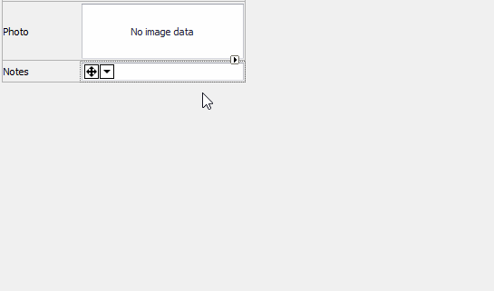
Once the DataLayoutControl has been bound to a data source, the control remains empty, since no field has been retrieved from the data source as yet.
Step 2. Retrieve Fields
Click the control’s smart tag and select Retrieve Fields.

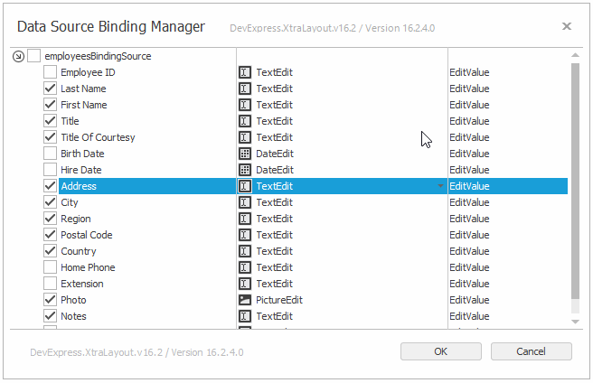
The following wizard will be opened. Its first page allows you to confirm the target data source (or provide another one) and specify binding settings.

Click Next to switch to the next page, which allows you to:
- Select the data source fields to be retrieved from the data source
- Specify the editors that will be used for editing the data source fields
- Specify editor properties to create bindings.
- Specify the layout column count for the created layout. By default, the “Column Count” setting equals 1, and thus all editors will be arranged in one column.

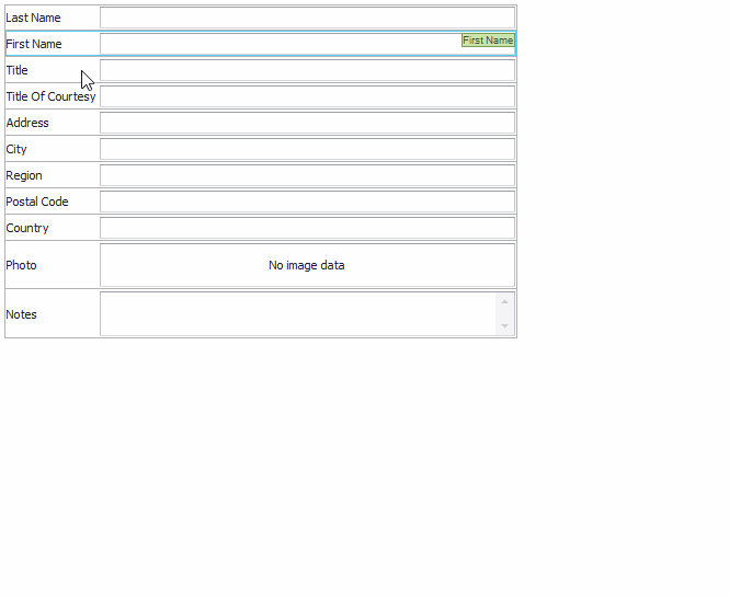
Click Finish to generate the layout.

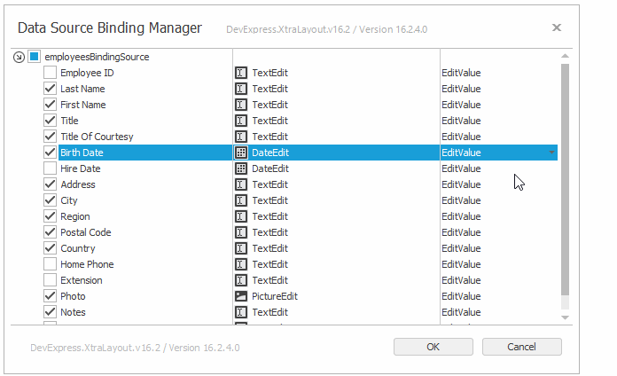
Step 3. Replace Editors and Change Bindable Properties
If you need to replace a generated editor with another one, you can do this using one of two approaches.
Click the generated editor, invoke its smart tag and select a new editor in the Change Editor Type dropdown.
Click the DataLayoutControl’s smart tag and select Edit Fields.

In the invoked dialog, locate the target field and change the editor type in the second column.
This dialog also allows you to specify a custom bindable property if the default one does not satisfy your needs.
Step 4. Customize Layout
After the initial layout has been created, you can customize it as needed.
- Add new controls
- Delete controls (by selecting them and pressing the DELETE key).
- Rearrange and resize layout items using drag-and-drop.
- Combine items into regular and tabbed groups.
- Modify item properties in the Properties window.
Note
LayoutControl items tend to occupy all available space, and have Size Constraints that limit maximum and minimum item sizes. Use the Control.MinimumSize and Control.MaximumSize properties to set these constraints.
- Specify the
Control.MinimumSizeproperty to limit the minimum control size and display scrollbars when this size becomes larger than the available visible area. - Specify the
Control.MaximumSizeproperty to limit the maximum control size. You can also add Empty Space Items that occupy remaining free space when the avialable area becomes larger than this maximum size. This allows you to limit the size of one item, while other items can be freely resized. - Specify the
Control.MaximumSizeproperty to limit the maximum control size. You can also add Empty Space Items that occupy remaining free space when the avialable area becomes larger than this maximum size. This allows you to limit the size of one item, while other items can be freely resized. - Remove Size Constraints and add Empty Space Items to freely resize controls.
For more information on design-time and runtime customizations, see the Customization Capabilities and Customizing a Layout In Code topics.