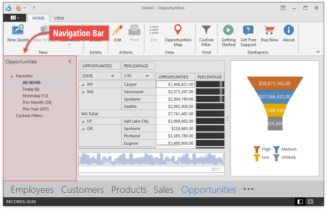
Navigation Bar
- 3 minutes to read
The Navigation Bar (NavBarControl) is a side navigation control with expandable groups.
- Add Groups
- Add Items
- Change Captions and Icons
- Add Separators
- Add External Controls to Groups
- Items and Item Links
- Clickable and Selectable Items
- Drag-and-Drop Operations
- Views
Add Groups
Drop a NavBarControl onto a form and use the control’s smart tag to add new groups.
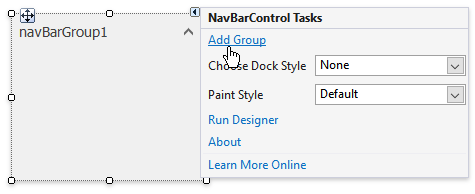
Each group is an instance of the NavBarGroup class. In code, groups are stored within the NavBarControl.Groups collection.
Add Items
Right-click a group and select “Add item” to populate this group.
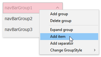
By doing so, you create NavBarItem objects and place them into the NavBarControl.Items collection. To do the same in code, call the NavBarGroup.AddItem method.
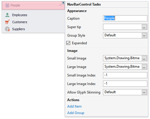
Change Captions and Icons
To rename an item or a group, use smart tags to modify the NavElement.Caption property. Utilize the NavElement.SmallImage and NavElement.LargeImage properties to provide 16x16 and/or 32x32 pixel icons for groups and items. To switch between small and large icons, use the NavBarGroup.GroupStyle and NavBarGroup.GroupCaptionUseImage properties.
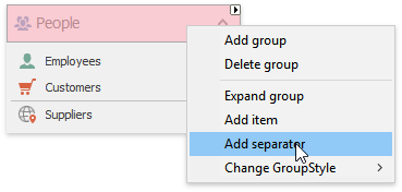
Add Separators
You can visually detach items in a group by adding separators.
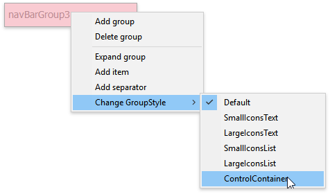
Add External Controls to Groups
Change the NavBarGroup.GroupStyle property of a group to NavBarGroup.ControlContainer.
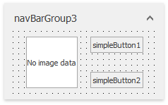
In this mode, a group can display auxiliary controls that reside inside an associated NavBarGroupControlContainer object. At design time, drag and drop controls onto the dotted container area.
The sample below illustrates how to do the same in code.
navBarControl1.BeginUpdate();
navBarGroup3.ControlContainer.Controls.Add(new XtraUserControl1() {
    Dock = DockStyle.Fill
});
navBarControl1.EndUpdate();
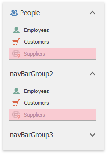
Items and Item Links
Navigation Bar groups cannot host NavBarItem objects directly. When you add items at design time, an item link for each item is automatically created and placed into the NavBarGroup.ItemLinks collection of a group. An item link is a visual representation of a NavBarItem that allows you to repeat this item across multiple groups (toolbars and Ribbons utilize the same concept).
To understand how this concept works, invoke the NavBarControl smart tag and click “Run Designer”. In the designer’s “Groups/Items/Links” tab, click the “Show Item List” button and drag existing items to an empty group.
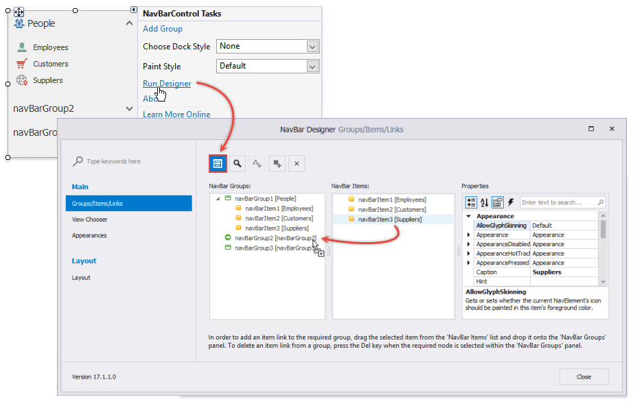
You now have two copies of the same item hosted within different groups.
Note that these copies always look identical and you cannot modify the appearance of an individual link.
Clickable and Selectable Items
By default, all NavBarItem objects (and their links) act as push buttons. Handle the NavBarControl.LinkClicked and NavBarControl.LinkPressed events to perform specific actions when end-users click these items.
If you switch NavBarControl.LinkSelectionMode to a value different from “None”, items will start acting as check buttons that support normal and pressed states. Depending on the exact NavBarControl.LinkSelectionMode property value, there can be one or multiple simultaneously selected item links.
LinkSelectionModeType.OneInControl
Only one link can be selected throughout the Navigation Bar at a time.
LinkSelectionModeType.OneInGroup
Each group is allowed to have one selected item link.
LinkSelectionModeType.OneInGroupAndAllowAutoSelect
Each group must have a selected link. If a group has no selected links, the first link will be selected automatically. To prevent a specific item or link from being selected automatically, utilize the NavBarItem.AllowAutoSelect and NavBarItemLink.AllowAutoSelect properties.
To select a link in code, use the NavBarGroup.SelectedLinkIndex, NavBarGroup.SelectedLink or NavBarControl.SelectedLink properties. Changing a link state raises the NavBarControl.SelectedLinkChanged event.
Drag-And-Drop Operations
By default, end-users can drag item links to rearrange these links and/or move them from one Navigation Bar group to another. With the “Ctrl” key pressed, end-users can also copy item links to multiple locations.
This behavior is managed by the NavBarControl.DragDropFlags and NavBarGroup.DragDropFlags properties. If these properties allow the NavBarDragDrop.AllowOuterDrop flag, end-users will be able to move/copy item links from one Navigation Bar to another.