Hints
- 2 minutes to read
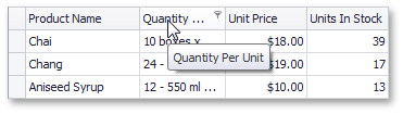
When an end-user hovers with the mouse over a visual element (e.g. column or band header) that displays truncated captions, an appropriate hint is displayed. The image below shows the hint that is shown for the Category column’s header whose caption is truncated.
Using the ToolTipController
The ToolTipController component provides settings that enable you to customize the appearance and behavior of hints displayed for controls or their elements. You can customize hint appearance, specify the icon displayed within hints and customize the time intervals that must pass before a hint is invoked or hidden, etc. To make use of the tooltip controller’s settings, you should bind it to a grid control via the EditorContainer.ToolTipController property.
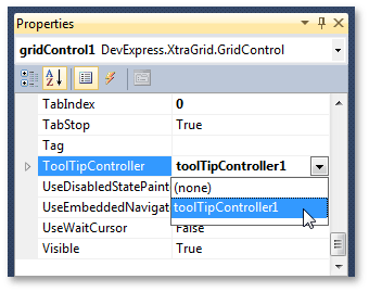
The image below shows how to bind a tooltip controller to Grid Control at design time.
If the ToolTipController component isn’t used, hint settings are specified by the default tooltip controller. These default hint settings can be accessed using the ToolTipController.DefaultController property. For more information on using the ToolTipController component, see the Tooltip Management document.
Hint Options
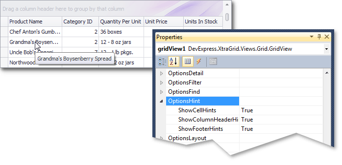
Grid Views provide their own hint options that can be accessed via the GridView.OptionsHint property. This property returns a GridOptionsHint object that provides a set of Boolean properties that specify which View elements display hints when their content is truncated. The image below shows how these options can be accessed at design time.
The hint options of Banded Grid Views can be accessed via the BandedGridView.OptionsHint property. If you are using a Card View you should use the View’s CardOptionsView.ShowFieldHints option to enable or disable hints for card fields with truncated content.