Layout Control
- 8 minutes to read
The LayoutControl is the main component of the DevExpress Layout Manager Library. It allows you to arrange any controls within a form without them being overlapped and misaligned. The Data Layout Control is a data-aware version of the Layout Control, which provides tools for connecting to a data source, choosing editors for displaying data, specifying bindings, etc.
Both the Layout Control and Data Layout Control share the same layout features, covered in this topic.
Compared to manually positioning controls within a form, the Layout Control has the following advantages.
- Automatic maintaining of a consistent layout of controls.
- No need to tediously align controls within a form.
- Embedded controls never overlap when the font settings are changed or the form is resized.
- The layout is not corrupted when new controls are added or existing controls are removed or rearranged.
- Easy design-time customization.
- Displaying labels for embedded controls.
- Automatic control alignment.
- Built-in support for groups, tabbed groups, splitters, labels and separators.
- Options to customize size constraints, control alignment, label visibility, item appearance, etc.
- Flow Layout mode
- Table Layout mode
- Runtime customization capability and the ability to save/restore layouts to/from data storage.
The sections below provide more information on these features.
Consistent Layout Management
The main advantage to the Layout Control is its capability to automatically maintain a consistent layout of controls within a form. Whether you resize the form or change the font settings of the controls, the layout will never break and the controls will never overlap.
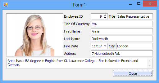
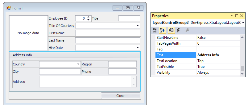
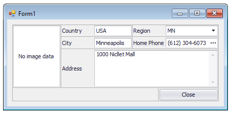
Consider the following form that contains a Layout Control with a few controls on it.
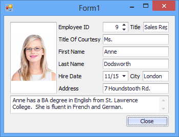
If you try to resize this form, the control layout will not be corrupted, instead, it will be proportionally resized.
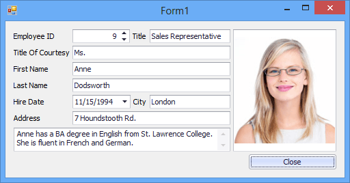
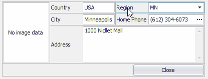
Even if you rearrange the controls, the layout will remain consistent. In the following image, the photo has been moved to the right side of the form using drag-and-drop, and the other controls still retain their positions and order.
Although the size of controls can change after specific controls are moved or added to the layout, this can be easily corrected by resizing the controls using the mouse.
On-the-Fly Layout Design-Time Customization
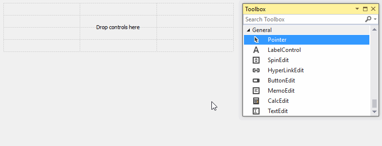
The Layout Control allows you to create an attractive layout within a few seconds. Controls can be added to the layout in an intuitive manner using drag-and-drop. After the controls have been dropped, you can easily rearrange and resize them using the mouse.
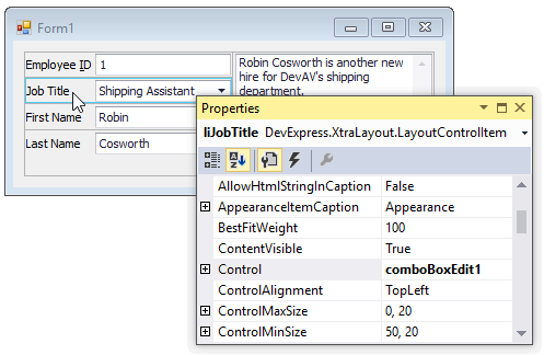
Actually, when a control is dropped onto the Layout Control, a new layout item is created that displays this control. A layout item is a visual component that can display any control and a text label. You can click any layout item on a form to select it and list its settings in the Properties grid. This allows you to quickly customize the layout as your needs dictate. For instance, you can specify the caption, caption’s position, indents and size constraints.
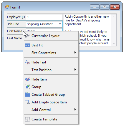
In addition to these customization features, the Layout Control provides a quick Customization Menu that significantly simplifies the process of customizing the existing layout. The Customization Menu can be opened by right-clicking a layout item’s region that is not occupied by embedded controls (note that different commands are available, depending upon the type of element that has been right-clicked):
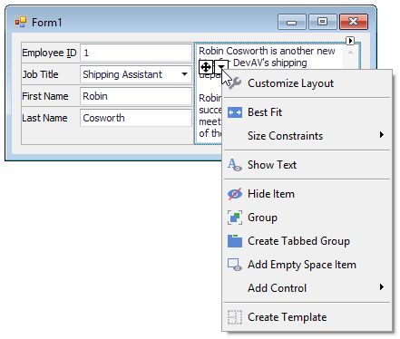
If a control occupies the layout item almost entirely (for instance, when the item’s label is too small or hidden), you can invoke the Customization Menu by clicking the embedded control and then clicking the  icon that will appear.
Built-In Support for Groups and Tabbed Groups
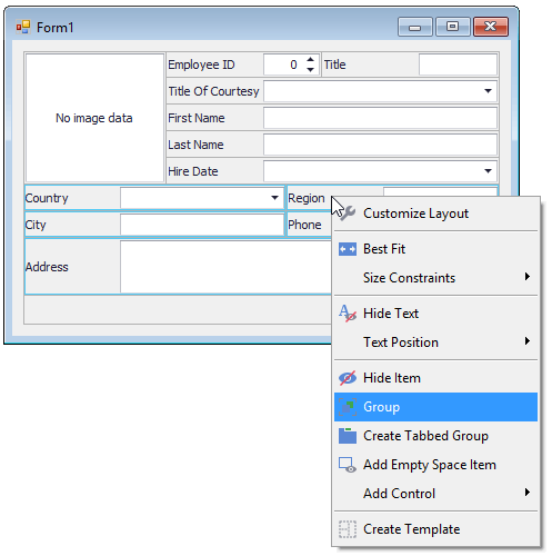
Sometimes you may need to combine the controls that have common functionality into panels or a tabbed UI. With the Layout Control, you do not need to add external panels (e.g., PanelControl and GroupControl), as the Layout Control provides built-in support fornested groups and tabbed groups. To combine neighboring items into a group, select the items and invoke the Group command from the Customization Menu.
As with any layout item, you can give a meaningful name to the created layout group using the Properties grid or with the Rename command from the group’s context menu.
To provide a more compact data representation, you can place layout items into tabbed groups.
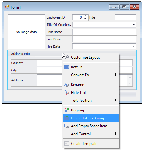
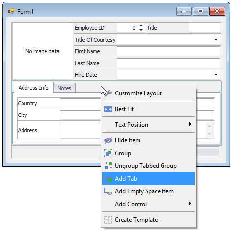
The Create Tabbed Group command from the Customization Menu creates a tabbed group from the selection. After the tabbed group is created, you can add more tabs with the Add Tab context menu command and by dragging other groups to the tab header region.
Automatic Alignment
The smart control arrangement algorithm implemented by the Layout Control automatically aligns controls within the form, so you’ll never need to tediously line them up to create a polished layout. Controls within certain groups can be aligned independently of other groups.
The Layout Control supports a complex arrangement of layout items - they can be lined up horizontally and vertically, with multiple items within a single row and multiple items along the edge of another item.
The automatic sticking feature allows items displayed one under another to snap during resize operations. Once items are snapped, they are resized as a whole.
Size Constraints
When the Layout Control’s size is changed, its layout items and controls are resized proportionally. In specific instances, you may need to limit the ranges in which the size of controls can be adjusted or completely prevent the controls from being resized. To address these tasks, the Layout Control introduces a flexible mechanism for setting size constraints. It allows you to specify that a control’s width/height can only vary within a particular range, allow free sizing for the control vertically and/or horizontally or lock it to the current size.
There are default size constraints applied by the Layout Control to certain embedded controls. For instance, for embedded SimpleButton and TextEdit controls, their width can be freely changed, while their height is locked to a specific default value. If the default size constraints do not suit your needs, you can remove these constrains or apply custom ones using the settings of layout items.
To perform common size constraints customization tasks, the Layout Control provides dedicated commands under the Size Constraints submenu in the Customization Menu.
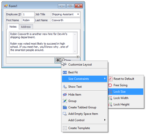
For instance, selecting the Free Sizing command allows you to remove the size constraints, so this item can then be freely resized. The opposite command is Lock Size which applies the size constraints that prevent the current layout item and control from being resized.
For more information on this feature, refer to the Size Constraints topic.
Flow Layout Mode
The Layout Control supports Flow Layout mode for groups, in which items are arranged back-to-back in rows, automatically wrapping at the parent group’s right edge. When a group width is changed, items are automatically re-positioned to fit the new space.
Flow layout mode can be enabled for any group nested within the root group. See Flow Layout to learn more.
Table Layout Mode
The Table Layout mode allows you divide a group’s area into rows and columns and then place controls into created cells by specifying row and column indexes and span values. This mechanism is like the one you use when creating an HTML table.
See Table Layout for more information.
Runtime Customization
The Layout Control implements the Runtime Customization feature. If you are using the Layout Control in your project, end-users of your application will be able to fully customize the layout at runtime. For instance, they will be able to hide specific controls or reorder them on the form as required. No additional code is required to enable this functionality.
Note that changes made to the layout at runtime are not automatically saved between application runs. However, this task can easily be accomplished by calling the Layout Control’s dedicated methods to save the current layout to and restore it from an XML file.
Refer to the Runtime Customization Overview topic for more details.
Customizing a Layout in Code
Designing a layout at design time is an easy and intuitive process, but designing a layout in code requires more effort for a first-time user. To better understand the Layout Control’s infrastructure and easily develop your own layouts in code, see the following topics: Layout Hierarchical Structure, Layout Item, Layout Groups and Tabbed Group. These explain how the Layout Control is organized. Also, see the Customizing a Layout In Code topic for examples and methods that you can use to build layouts in code.