The Layout Manager enables you to quickly and easily create forms that can be customized by end-users. The Layout Manager helps save you time by moving away from traditional pixel-oriented form design, and utilizing convenient features such as automatic control resizing and alignment, as well as horizontal and vertical item alignment. It also provides a flexible runtime customization tool, to allow end-users to manage their own UI. Like other DevExpress controls, a form’s appearance settings can be modified using themes.
The Layout Manager is a common name for three separate components, available from your Visual Studio’s toolbox: two main controls (LayoutControl and DataLayoutControl) and a utility control (LayoutConverter).
Learn the Basics
Layout Control An overview article that outlines main Layout Manager advantages.
Main Features A list of the Layout Manager’s essential features, followed by short descriptions.
This section includes information on the three separate components included in the Layout Manager.
Layout Hierarchical Structure Main Layout Manager’s component. The Layout Control allows you to manually build the desired form layout from DevExpress or third-party controls.
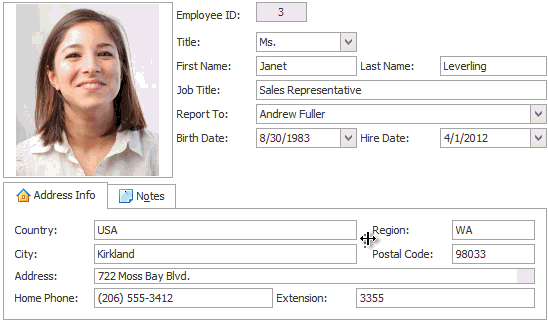
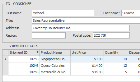
Data Layout Control A data-aware version of the Layout Control. Hooks up to a data source, chooses appropriate DevExpress editors, depending on data field types, and uses these editors to automatically generate a layout to display data.
Layout Converter A utilility control that converts a regular layout to a Layout Control-based layout.
UI Elements
Articles in this section describe layout UI elements, common to both Layout and Data Layout Controls.
Layout Item Basic Layout and Data Layout Control elements. Layout items wrap external form UI elements and optionally add text labels to them. When an element lies within a layout item, all the element properties (alignment, size, dock style etc.) are managed by this layout item.
Layout Groups Containers for layout items capable of displaying the caption and border.
Tabbed Groups Layout containers that present regular layout groups as tabs.
Empty Space Items Empty elements that add whitespaces to your layout. These item can be resized and fill all available space between other UI elements.
Splitters Solid bars that detach neighboring layout elements. End-users can drag splitters to resize content areas.
Separators Dividers that visually separate neighboring layout elements.
Layout Modes
By default, Layout and Data Layout Controls operate in Free Layout mode. This mode provides the capability to resize and re-arrange your layout UI elements as required. Additionally, you can switch to Table or Flow Layout modes that provide specific patterns, according to which UI elements are arranged.
Table Layout Implements a grid-like mark-up for the content area. Form elements use row and column indexes to occupy specific grid cells. Row span and column span values allow you to stretch elements across multiple cells.
Flow Layout In this mode, layout group regions are divided into multiple blocks of the specific size. Layout elements are arranged one after another and are wrapped at the group’s right edge if there are insufficient free blocks to host the wrapped element.
Customizing Layout
This section provides information on customizing form layouts at both design an runtime.
Layout Templates Templates are the quickest way to create a simple form or user control layout. You can also create your own templates to copy a custom layout utilizing multiple identical forms.
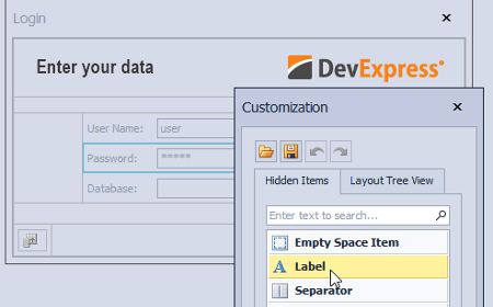
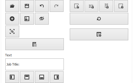
Customization Form Describes the Customization Form, used in both design and runtime customizations.