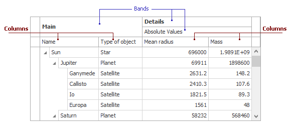
Columns
- 9 minutes to read
The TreeList displays data in nodes and columns. If the control is bound to a data source, columns correspond to fields while nodes correspond to records.
Tip
This topic contains information about the TreeList, which is a data-aware control. All DevExpress data-aware controls behave identically and expose similar APIs. Refer to the following topics for information about the same functionality in other data-aware controls:
The TreeListColumn class describes a column in the TreeList. You can use this object to specify the column’s visibility, display caption, width, in-place editor, appearance and format settings, etc.
TreeListColumn objects are components — if columns are created in the designer, you can access them by name in code. If you create columns in the designer, you can also access these objects in the Properties window.
The control stores columns in the TreeList.Columns collection. You can also access columns in the collection by index or bound data field name.
Generate Columns Automatically Based on the Data Source
If you assign a data source to the DataSource property and do not populate the Columns collection with columns, the control generates columns automatically based on the data source fields.
The FieldName property specifies the name of the bound data field. You can use this value to identify a column. For example, you can pass the field name to the TreeListNode.GetValue(System.Object) method to get the column’s value.
Ensure the AutoPopulateColumns option is enabled to allow the control to generate columns automatically. You can also call the PopulateColumns() method to force the control to create columns.
Note
The control does not create columns for data fields that contain information about the tree structure and node icons. You can enable the PopulateServiceColumns option to create these columns.
For more information on how the control retrieves fields in the data source, see the following topic: Obtaining Fields Available in Data Source.
Code-First Data Sources
For code-first data sources (for example, Entity Framework models), you can mark a property with the Display attribute and disable its AutoGenerateField parameter to skip column generation for this property. The Display attribute in the code below prevents a TreeList from generating a column for the AdditionalInfo data field.
[Display(AutoGenerateField = false, Description = "This column isn't created")]
public string AdditionalInfo { get; set; }
Tip
You can use many more attributes to rearrange columns, modify their captions, change default in-place editors, etc. Refer to the following topic for more information: Data Annotation Attributes.
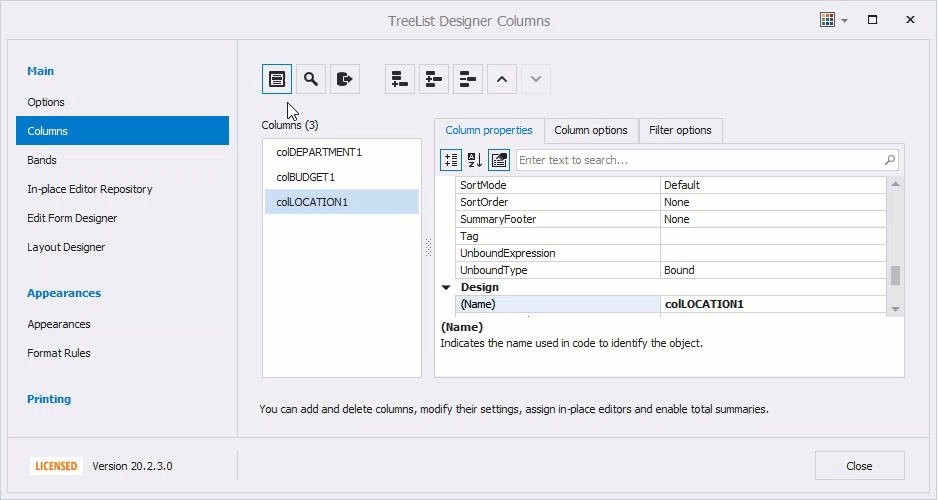
Change the Data Source
If you have replaced the data source in the designer, the control does not automatically regenerate columns. To force the control to regenerate columns, click Retrieve Fields in the designer.
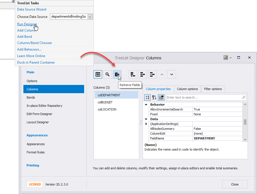
Call the PopulateColumns() method to regenerate columns in code. You can call it in a DataSourceChanged event handler.
Tip
The TreeList also supports columns that are not bound to a data source field. See the following help topic for more information: Unbound Mode.
Add and Remove Columns
In the designer, you can remove the automatically created columns and create new columns based on fields in the data source. Click Show Field List and use drag-and-drop operations to create a column automatically based on a data field. To remove a column, press Delete on the keyboard or click Remove Column.
Click Add Column or Insert Column to create a column manually. To bind the created column to a data field, specify its FieldName property.
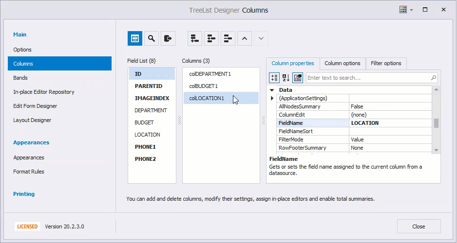
If the data field is not specified, the column is not bound to a data field. You can display calculated or any other values in this column. See the following topic for more information: Unbound Mode.
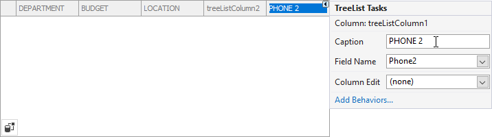
To create a column in code use the TreeList.Columns collection’s Add or Insert(Int32) method. The example belows shows how to create a column in code and bind it to a data source field.
using DevExpress.XtraTreeList.Columns;

TreeListColumn phoneColumn = treeList1.Columns.Add();
phoneColumn.FieldName = "PHONE1";
phoneColumn.Caption = "Phone";
phoneColumn.VisibleIndex = 1;
Column Layout
The VisibleIndex property specifies the column’s visual position in the control relative to other columns. You can use this value to rearrange columns in the control. Set this property to -1 to hide the column.
Note that the AbsoluteIndex property specifies the TreeListColumn object’s position in the Columns collection. You can use this value to index objects in the collection. An object’s position in the collection does not affect the column’s position in the control.
End-User Capabilities
Users can customize the layout of columns at runtime — rearrange, hide, and restore columns. To rearrange columns, they can drag column headers. The AllowMove property specifies whether the column can be dragged to a new position.
The Customization Form allows users to hide and then restore specific columns — users can drag columns from the control to the Customization Form, and vice versa. Note that when a column is moved to/from the Customization Form, its VisibleIndex property value is modified.
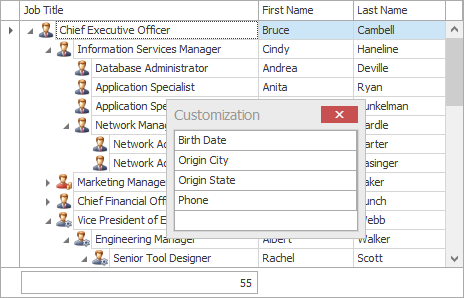
Use the following properties to specify column settings that relate to the Customization Form:
- AllowMoveToCustomizationForm — specifies whether the column can be hidden to the Customization Form.
- ShowInCustomizationForm — specifies whether the column, when it’s hidden, is listed in the Customization Form.
Column Header
If a column is generated automatically, its caption corresponds to the field name. Use the Caption property to customize the caption. If the AllowHtmlDrawHeaders option is enabled, you can also use HTML-inspired tags to format captions. In the designer, you can use a column’s smart tag menu to specify the caption.
Use the following properties to customize headers:
- ImageOptions — allow you to display an image in a header.
- ColumnHeaderAutoHeight — enable this option to arrange the header text in multiple lines and automatically enlarge the header height.
- CopyColumnHeaders — use this option to specify whether to copy column headers to the clipboard. See the following topic for more information: Clipboard.
- HeaderFilterButtonShowMode — specifies the button that invokes the column filter. See the following topic for more information: Filtering.
You can also set the ShowColumns option to false to hide the headers.
To specify a column’s header appearance, use the AppearanceHeader property. The HeaderPanel property specifies appearance settings for all headers. See the following help topic for more information: Appearances.
Column that Displays the Expand/Collapse Buttons
The control displays the expand/collapse buttons in the first column. Use the HierarchyColumn property to specify the column that displays the expand/collapse buttons. You can also use the HierarchyFieldName property to specify the column by the name of the bound data field.
Hide Vertical Lines
Disable the ShowVertLines option to hide vertical grid lines.
To hide the vertical grid line in the first column, disable the ShowFirstLines option. This option is only in effect if the expand/collapse buttons are displayed in the first column.
Column Width
Users can resize a column (except for the last one), but the total width of the columns always matches the control width. The control never displays a horizontal scroll bar.
You can use a column’s FixedWidth option to fix the column width to prevent the column from being changed in auto-width mode.
Disable the AutoWidth option to allow columns to transcend the control bounds. The control displays a horizontal scroll bar if necessary.
The AutoFillColumn property specifies the column whose width is automatically increased if the total column width is less than the control width. You can also use the AutoFillFieldName property to specify the column by the name of the bound data field.
You can also use the following properties to specify column widths:
- TreeListColumn.Width — specifies the column width. If the control calculates column widths automatically, the actual width may be adjusted. Use the VisibleWidth property to get the actual width.
- TreeList.MinWidth, TreeListColumn.MinWidth, MaxWidth — specify the minimum and maximum column widths.
- AllowSize — specifies whether the column can be resized.
The ColumnWidthChanged event fires when a column width is changed — a user modified a width, you changed a property value in code, or the best-fit width is applied. This event does not fire if a column width is changed due to changes in the control width.
Best-Fit Width
Users can click Best Fit (or Best Fit (all columns)) in a column header’s context menu to ensure a column has enough width for its cells to display their content.
You can also call the TreeList.BestFitColumns or TreeListColumn.BestFit method to apply the best-fit width to all or specific columns.
Use the following properties to specify how to calculate the best-fit widths:
- BestFitNodes — specifies nodes that are taken into account when searching for the widest column cell.
- BestFitMode — specifies whether to prioritize precision or speed.
- BestFitMaxNodeCount — specifies the number of nodes whose content is used to calculate the best fit width.
- BestFitUseErrorInfo — specifies whether cell error icons are taken into account when calculating the best-fit width.
Fixed Columns
The TreeList can display fixed columns — columns that are anchored to the control’s left or right edge. When a column is anchored, its content is not scrolled horizontally.
Fixed columns make sense only if the total width of columns exceeds the control’s width. If the AutoWidth option is enabled, the total column width matches the control width — the control cannot be scrolled horizontally.
Set the TreeListColumn.Fixed property to Left or Right to anchor a column to the control’s left or right edge, respectively. Use the TreeList.FixedLineWidth property to specify the width of the vertical lines that separate fixed columns from the others.
Miscellaneous Column Options
Use the TreeListColumn.OptionsColumn property to access the following options:
- AllowEdit — specifies whether the column is editable. In this mode, users cannot invoke the cell editor and copy a value. The control’s Editable property disables edit functionality for all columns in the control.
- ReadOnly — specifies whether the column is read-only. In this mode, users can invoke the cell editor and copy a value, but cannot edit it.
- AllowFocus — specifies whether the column can be focused. The TreeList.FocusedColumn property specifies the focused column.
- AllowSort — specifies whether column values can be sorted.