Tree List Designer
- 4 minutes to read
The Tree List control provides a designer that allows you to create and customize Tree List columns and bands, manipulate in-place editors for columns, modify the control’s layout and appearance, and set the print options. The designer contains a number of pages that relate to different aspects of the Tree List control. This topic provides a brief description of each designer page.
There are several ways to open the Tree List Designer. The first is to right-click the Tree List control to invoke the context menu, and choose the Run Designer item. You can also focus the control and click the Run Designer link within the Properties window.
The Tree List Designer contains the Main, Appearances and Printing sections. The following sub-topics describe each section separately.
The Main Section
The Main section allows you to manage the column and band collections, customize the Tree List’s internal repository and change the Tree List’s layout.
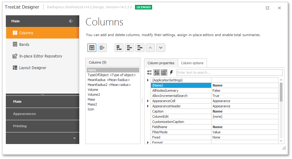
The Columns page provides column management facilities that include buttons for adding and removing the columns, list boxes which display the names of the fields in the bound data source and Tree List columns, and a property grid which provides access to the selected column’s properties. This page is shown in the image below.
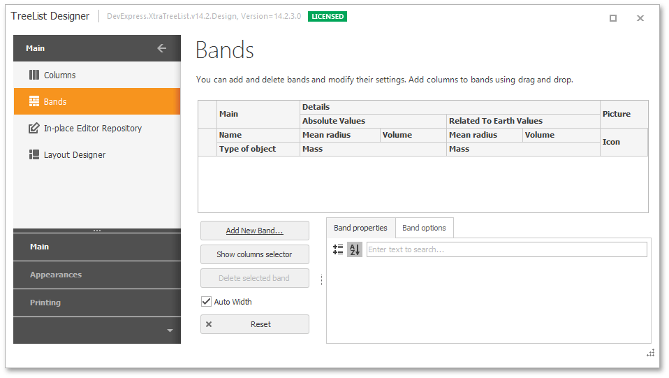
The Bands page provides design-time facilities for adding and deleting bands, customizing band settings and changing the layouts of bands and columns. This page contains a preview section, the Properties grid used to access the selected band’s settings and a set of buttons that provide customization actions. The image below demonstrates the Bands page.
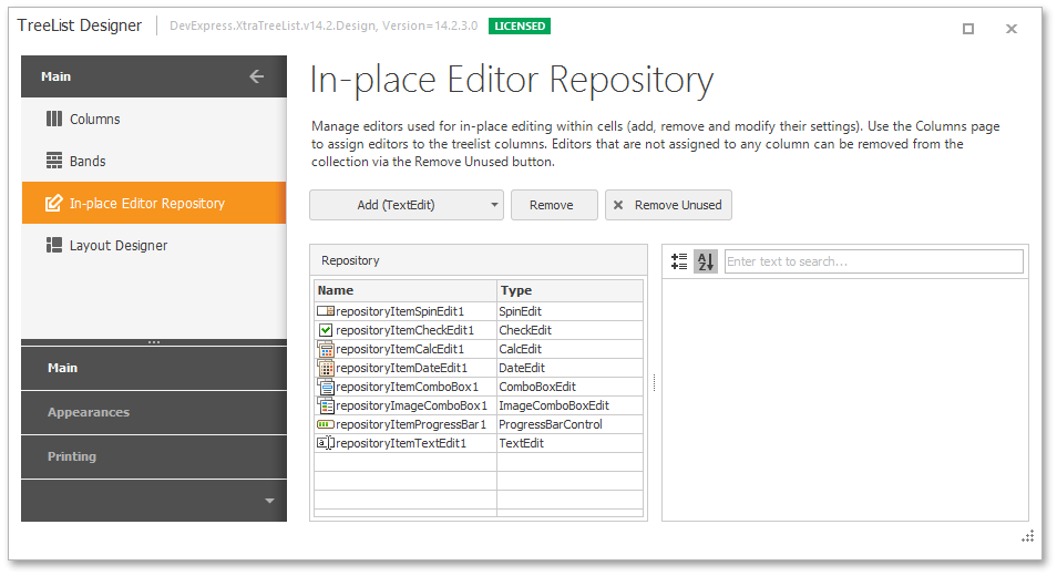
The In-place Editor Repository page enables you to manage the Tree List’s internal repository (i.e., customize the collection of in-place editors). The repository items collection can be managed using the buttons located at the top of the page. The selected item’s settings can be changed using the property grid. This page is shown in the following image.
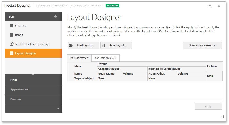
The Layout Designer page provides design-time facilities to customize, save and restore the Tree List’s layout. The page enables you to change the Tree List’s layout in the same way as it is accomplished at runtime. This includes applying sorting and modifying the layout of the columns. After the Tree List’s layout has been customized, it can be saved to the specified XML file. Once saved, it can be applied to another Tree List control(s).
The Appearances Section
The Appearances section allows the Tree List’s appearance to be customized.
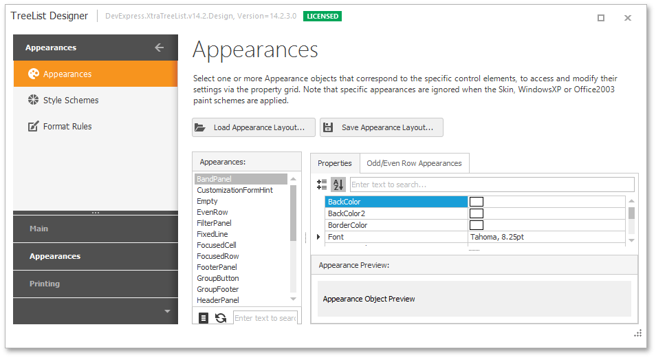
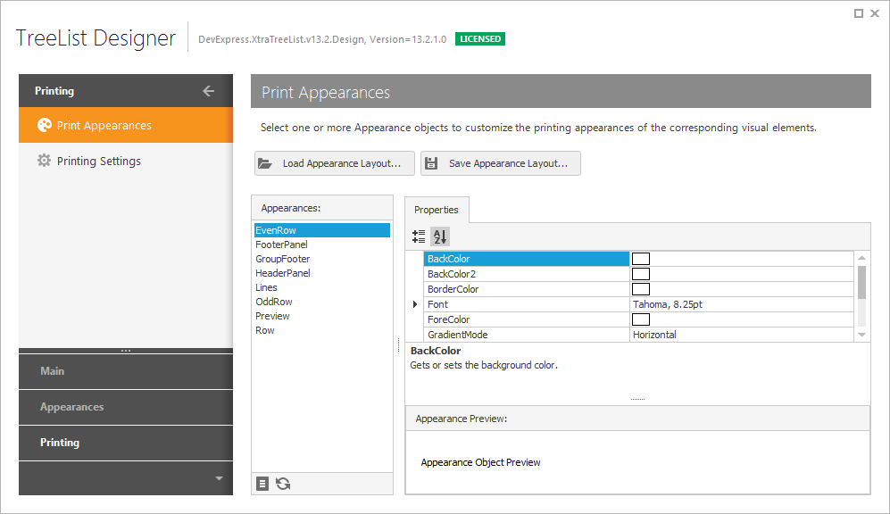
The Appearances page provides design-time facilities for customizing the appearance settings used to paint the Tree List’s elements (cells, column headers, buttons etc.). It provides access to the Tree List’s TreeList.Appearance collection. The available appearances are listed in the list box. The selected appearance’s settings are listed by the property grid within the Properties tabbed page. All the changes are immediately reflected in the Appearance preview section.
The appearance layout (the settings of all the AppearanceObject objects) can be saved to an XML file and then applied to other Tree List control(s). To do this, use the buttons located at the top of the page.
This page is shown in the image below.
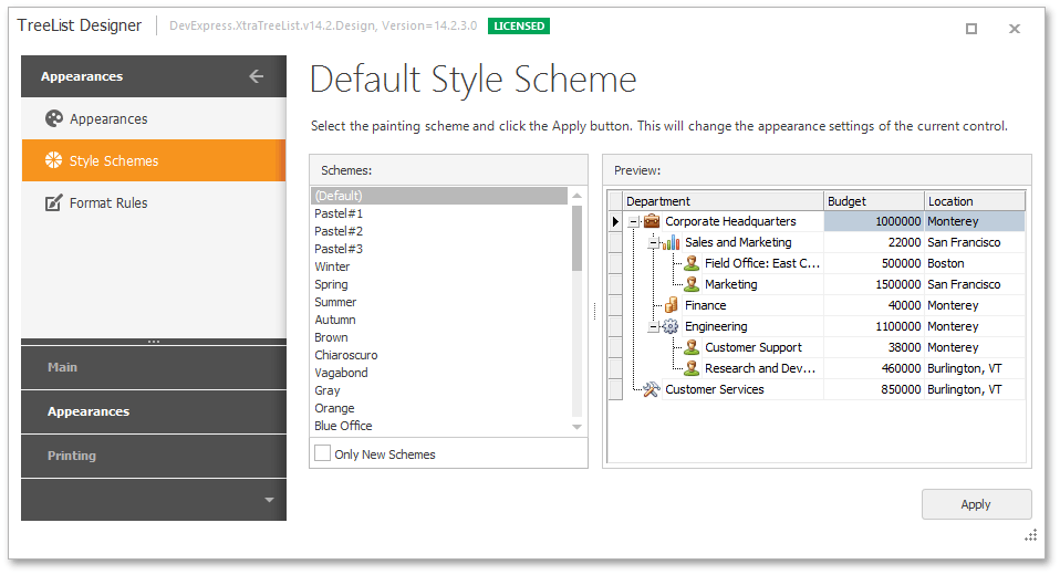
The Style Schemes page allows the style schemes to be applied to the Tree List, and its paint style to be changed. After a style scheme and paint style have been chosen, press the Apply button to apply them to the Tree List. This page is shown below.
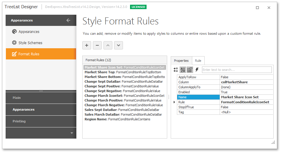
The Format Rules page provides design-time access to the TreeList.FormatRules collection. Objects in this collection specify conditional formatting rules, which allow you to apply formats to column cells that match specified criteria. Each object identifies the target column, the rule type and other options.
The Printing Section
The Printing section is used to customize the control’s print and export settings.
The Print Appearances page provides design-time tools for customizing the appearances used to paint the Tree List’s elements when it is printed and exported. It provides design-time access to the TreeList.AppearancePrint collection.
Note that these appearance options are in effect if the TreeListOptionsPrint.UsePrintStyles option is enabled. You can also enable this option on the Printing Settings page.
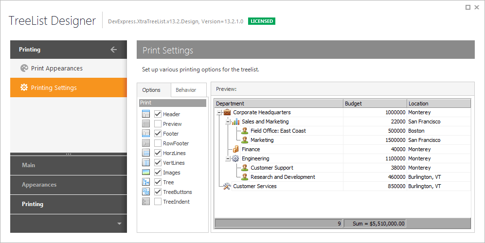
The Printing Settings page provides design-time capabilities to customize the print/export options that can also be accessed via the TreeList.OptionsPrint object. These options specify which Tree List elements have to be printed/exported, whether all nodes must be expanded before printing/exporting, etc. This page is shown in the image below.