Dropdown Galleries
- 5 minutes to read
Dropdown galleries are displayed within popup windows when clicking dropdown buttons of In-Ribbon Galleries. Typically, dropdown galleries are extended versions of In-Ribbon Galleries.
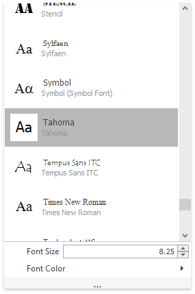
A gallery popup window displaying a dropdown gallery is represented by the GalleryDropDown control. The dropdown gallery itself is specified by the GalleryDropDown.Gallery property, which is of the InDropDownGallery type (a descendant of the StandaloneGallery and BaseGallery classes).
The figure below illustrates a dropdown gallery.

The current topic covers the specifics of gallery popups and their embedded galleries. To learn about customizing gallery items, see Gallery Items.
The GalleryDropDown control is a descendant of the PopupMenu class, and thus it can be invoked as a standalone context menu. Use the GalleryDropDown.ShowPopup method to accomplish this.
Automatically Generated Gallery Popup
Each In-Ribbon Gallery contains a Dropdown button, which when clicked, invokes an automatically generated or custom gallery popup window - a GalleryDropDown control with an embedded gallery. By default, a gallery popup is automatically generated on clicking the In-Ribbon gallery’s dropdown button, as follows:
- A new GalleryDropDown control is automatically created.
- The contents of the source In-Ribbon gallery are copied to the dropdown gallery (GalleryDropDown.Gallery). Gallery groups and items are copied by references.
- The InRibbonGallery.InitDropDownGallery event fires. The e.PopupGallery event parameter allows you to access and customize the current dropdown gallery. The e.PopupGallery.GalleryDropDown event parameter allows you to customize the current GalleryDropDown control.
- The GalleryDropDown control is displayed onscreen as a popup window.
Gallery items can be checked and unchecked. This feature is controlled by the BaseGallery.ItemCheckMode property. By default, changing the check states of items in the automatically generated dropdown gallery does not affect the check states of corresponding items in the In-Ribbon Gallery. To enable check state synchronization, set the InDropDownGallery.SynchWithInRibbonGallery property to true. You can access and enable this property using the InitDropDownGallery event’s e.PopupGallery.SynchWithInRibbonGallery parameter. The InDropDownGallery.SynchWithInRibbonGallery property is not supported for custom gallery popups.
Custom Gallery Popup
In specific instances, you may wish to display a custom gallery popup (instead of the automatically generated gallery popup) on clicking the In-Ribbon Gallery’s Dropdown button. To accomplish this:
- Manually create a GalleryDropDown control at design time (by dropping it from the Toolbox, or in the Ribbon Designer Gallery Page), or at runtime.
- Bind the GalleryDropDown control to the RibbonGalleryBarItem.GalleryDropDown property.
Creating a custom gallery is useful if you want to implement a popup version of an In-Ribbon gallery beforehand; for instance, at design time.
The following happens when clicking the In-Ribbon gallery’s dropdown button, provided that a custom GalleryDropDown control is specified.
- The InRibbonGallery.InitDropDownGallery event fires; its PopupGallery parameter refers to the gallery of the bound GalleryDropDown control, and the PopupGallery.GalleryDropDown parameter refers to the control itself. You can handle the InitDropDownGallery event to dynamically customize the gallery popup (for instance, add additional commands below the embedded gallery; see the last section on this page to learn more).
- The GalleryDropDown control appears onscreen.
Embedded Gallery Options
Like an In-Ribbon Gallery, a gallery embedded in the GalleryDropDown control (GalleryDropDown.Gallery) consists of groups of items. For gallery items which represent images, it’s possible to display captions and descriptions, implement hints and hover images. A click on a gallery item fires the BaseGallery.ItemClick event. You need to handle this event, or alternatively, the GalleryDropDown.GalleryItemClick event, to respond to item clicking. See Gallery Items for more information.
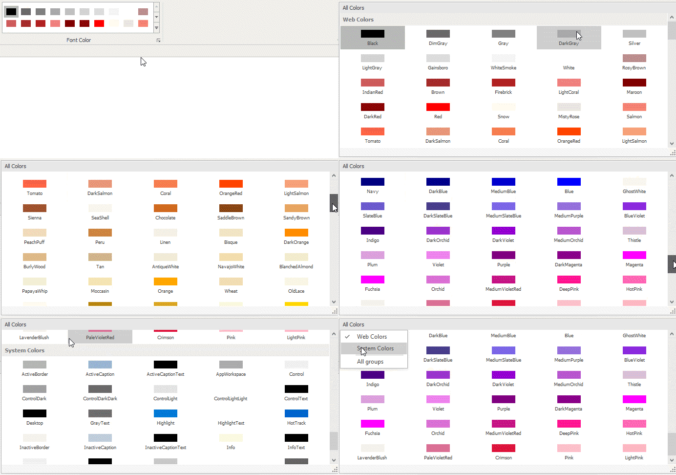
If a dropdown gallery contains two or more groups (BaseGallery.Groups), the group filtering feature is enabled by default. In this mode, the Group Filter panel is displayed at the top of the GalleryDropDown control. When this panel is clicked, a Group Filter menu is opened, which by default contains check boxes that correspond to the existing gallery groups and which control the visibility of the groups. Unchecking a check box hides a corresponding group; checking the check box makes the group visible:

To specify the text displayed within the Group Filter panel, use the gallery’s StandaloneGallery.FilterCaption inherited property. If you need to add custom menu items to the Group Filter menu, you can handle the BaseGallery.FilterMenuPopup event. This event fires before the menu is displayed onscreen, and it allows you to access and customize the menu.
In specific instances, you may want to disable the group filtering feature. To do this, set the StandaloneGallery.AllowFilter property to false.
The initial size of the GalleryDropDown control is calculated based upon the values of the embedded gallery’s BaseGallery.RowCount and BaseGallery.ColumnCount properties. These properties specify the number of rows and columns of gallery items.
An end-user is not able to resize the GalleryDropDown control by default. To enable this feature, use the InDropDownGallery.SizeMode property.
Custom Menu Items in Gallery Popups
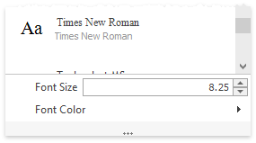
A gallery popup (GalleryDropDown) can display custom menu items (bar items) below the embedded gallery: buttons, check items, submenus, static text, editors, etc.

To add these commands to the automatically generated gallery popup, handle the InRibbonGallery.InitDropDownGallery event and add specific bar items to the ItemLinks collection of the e.PopupGallery.GalleryDropDown event parameter.
For a custom GalleryDropDown control, the ItemLinks collection can be populated at design time using the Sub Menus and Popup Menus Page page of the RibbonControl’s Designer. If you need to add bar items to the collection dynamically, handle the InRibbonGallery.InitDropDownGallery event.