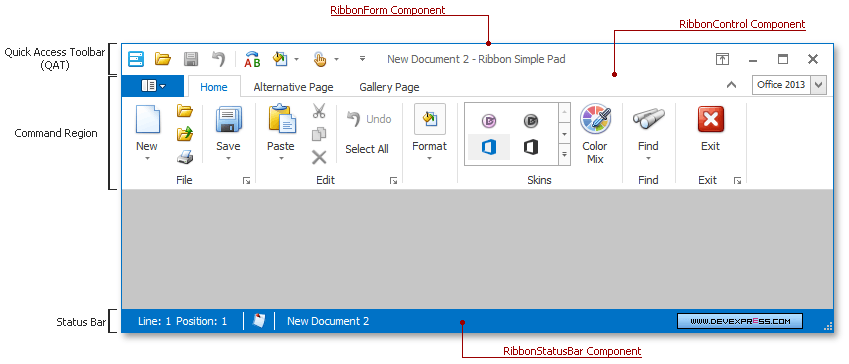
Visually, the Ribbon interface consists of four main regions:
- Command Region - displays various commands combined into Ribbon Groups and Pages.
- Quick Access Toolbar (QAT) - a region within the Ribbon Control that displays frequently used commands. Users can add commands to this bar at runtime.
- Status Bar - a bar displayed at the bottom of a form. Represented by a stand-alone RibbonStatusBar component should be used with the parent Ribbon Control component.
- Ribbon Form - a DevExpress form designed for the Ribbon Control. When you use this form type, the Ribbon QAT is integrated into the form’s title bar. The Ribbon Form also supports the semi-transparent Aero interface for machines that run Windows Vista/7. If you use the Form Assistant component to convert a blank form to the Ribbon Form, the Ribbon Control and Ribbon Status Bar components are added automatically.
The following figure illustrates all these regions in one form:
The command region is entirely implemented by the Ribbon Control. All Ribbon UI elements except for standalone Ribbon Status Bar and Ribbon Form components, belong to this control. This component provides the following elements.
| Ribbon Pages
Ribbon Pages are Ribbon Page Group containers that are represented as tabs at runtime. End-users click these tab headers to browse commands. There are two types of Ribbon Pages:
- Regular Pages - always visible to your end-users.
- Contextual Pages - visible only upon certain events (e.g., when an end-user selects a text block).
|
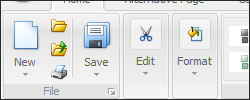
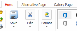
| Page Groups
A Ribbon Page Group represents a group of bar item links and/or galleries within a Ribbon Page. Page Groups are designed to combine commands have something in common (e.g., modifying the current font or applying different document formats).
|
| Context Categories
Page Categories are the topmost containers that host Ribbon Pages. Again, two types of Page Categories are available - regular categories that host regular pages and context categories for context pages. Custom categories can be highlighted with custom colors.
|
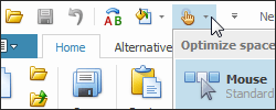
| Quick Access Toolbar
The Ribbon Quick Access Toolbar (QAT) is a customizable element which is designed to provide end-users with one-click access to the most important and used features. QAT is integrated into the form title bar when using the Ribbon Form and is unavailable if the ‘Office Universal’ Ribbon Style is applied.
|
| Page Header Items
Bar items that are embedded into the tab header area. Any bar item type (a button, editor, static text, gallery item, etc) can be embedded.
|
| Application Button
A button that invokes an application’s main menu. The main menu typically contains commands such as New, Open, Print and Exit. However, you can place any command in the main menu if required. By default, clicking on this button does nothing. You need to assign a required control or menu to the RibbonControl.ApplicationButtonDropDownControl property to specify the displayed object. This topic contains the list of all controls that can be assigned to the Ribbon Application Button.
|
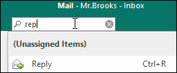
| Search Menu
The ribbon can display a search box that allows a user to find a bar item by its caption or custom keyword. You can also exclude or add bar items to the search results.
|
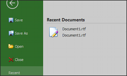
| BackstageView Control
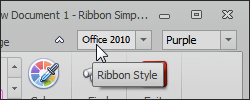
The most modern main menu type, seen in Microsoft Office 2010 (and newer) applications. Typically, this control is not used as standalone and is assigned to the Application Button. The Backstage View’s appearance and behavior may differ, depending on the currently applied Ribbon Style.
|
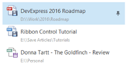
| Recent Item Control
RecentItemControl is a separate control designed to simplify building content for the BackstageView control’s tab items. This control provides the large variety of UI elements - buttons, tabs, separators, hyperlinks, pin items, etc. Mixing these items allows you to emulate the most complex menus similar to those provided in the latest Microsoft Office applications.
|