Best Practices
- 2 minutes to read
When designing toolbars in your application, you have a variety of choices to create items, arrange them within the group, etc. This determines the look and feel and usability of your application. However, there is no toolbar customize strategy that is suitable for all situations. This document gives some practical hints on how to create Ribbon toolbars.
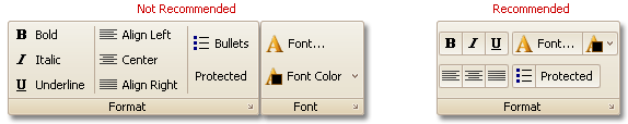
Don’t Use Large Groups
We suggest that you don’t have large groups - groups that contain more that 10 item links. In this instance, it’s better to arrange links into several logical groups.
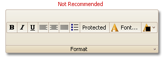
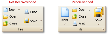
Combine Small and Large Images
The maximum allowed number of item links that can be displayed vertically within a group is 3. So, if the number of links within a group isn’t divisible by 3, it’s better to display large and small images. For instance, if a group contains 5 item links it’s better to display them as shown in the image below.
Note
Ribbon elements can display only 16x16 (small) and 32x32 (large) images. Images with custom size, will be stretched to the appropriate size. For instance, if a 24x24 image is used as a small image, it is reduced to the 16x16 size. Using this image as a large image will stretch it to the 32x32 size.
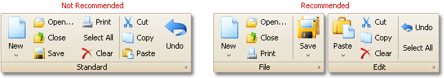
Use Button Groups
In some instances it’s better to use button groups instead of displaying individual bar item links.
When you create button groups, avoid long button groups - groups that contain more than 5 item links. We suggest that you split such groups into smaller groups as it is shown in the image above: