Bar Item Display Options
- 2 minutes to read
Bar Item Display Options
For bar items that represent regular buttons, check buttons and menus you can specify display captions, and both small and large images. Use the BarItem.Caption property to assign a caption to the item. Images can be assigned to bar items in two ways:
- assigning images directly to the BarItem.Glyph and BarItem.LargeGlyph properties;
- assigning the image lists which contain small and large images to the RibbonControl.Images and RibbonControl.LargeImages properties and then assigning indexes of the required images to the BarItem.ImageIndex and BarItem.LargeImageIndex properties.
If both large and small images are assigned to a bar item, the large image is used by default. However, if the RibbonControl’s width doesn’t allow large images to be displayed entirely, small images will be used instead. Also, if there is not enough space to display the item’s caption, it will be automatically hidden.
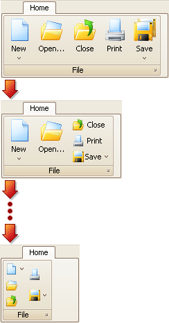
The following image shows how the appearance of bar item links changes when reducing the width of the RibbonControl:
If you want to control how bar item links are displayed onscreen, use the BarItem.RibbonStyle property. It allows you to specify whether large images and small images with or without text are used to draw bar item links. For instance, using this property you can prevent small images without text from being used, but allow large images and small images with text to be used.