The List of Bar Items and Links
- 7 minutes to read
The DevExpress Ribbon, Menu and Docking Library provides a number of bar items that you can add to toolbars, submenus, popup menus and Ribbon controls. This document provides a list of the available bar items and corresponding bar item links.
Bar Item and Link Types
Each bar item is represented by a specific class derived from the BarItem, which is the base class for all items. When you place a bar item onto a bar or submenu or add it to a Ribbon Control a link is created, and its type corresponds to the item’s type. The base class for bar item links is the BarItemLink.
The following sections cover the available bar items and corresponding links.
BarButtonItem
Item Link: BarButtonItemLink

The BarButtonItem item allows you to create:
- a standard button;
- a check button (set the BarButtonItem.ButtonStyle property to Check);
- buttons with dropdown menus (set the BarButtonItem.ButtonStyle property to DropDown);
- a check drop-down button (set the BarButtonItem.ButtonStyle property to CheckDropDown);
- groups of check buttons (use the BarBaseButtonItem.GroupIndex property to combine items into check groups).
Handle the BarItem.ItemClick or BarBaseButtonItem.DownChanged event to define a button’s action.
Note
BarButtonItem supports large images in the Ribbon Control. Large images are not supported for links displayed in toolbars and popup menus.
BarLargeButtonItem (for Toolbars only)
Item Link: BarLargeButtonItemLink

A large button that inherits all the functionality provided by the BarButtonItem class (see above). In addition, it allows you to specify the position of the item’s caption relative to the image.
In a popup menu, BarLargeButtonItems are represented using small images. If a small image is not assigned to an item, only the item’s caption is displayed.
To add a large button to a Ribbon, create a regular BarButtonItem object and set its BarItem.RibbonStyle property to Large.
BarCheckItem
Item Link: BarCheckItemLink

A button which can have the checked and unchecked states. Handle the BarCheckItem.CheckedChanged event to respond to the check state being changed.
It’s also possible to implement check buttons using the BarButtonItemtype. Set the item’s BarButtonItem.ButtonStyle property to Check to allow the button to have the checked and unchecked states.
Note
Large images for BarCheckItems are only supported in Ribbon Controls.
BarToggleSwitchItem
Item Link: BarToggleSwitchItemLink

A Windows UI-style check button, which can have the checked and unchecked states. Handle the BarToggleSwitchItem.CheckedChanged event to respond to the check state being changed.
BarSubItem
Item Link: BarSubItemLink

An item that contains other items, a submenu. Use the BarCustomContainerItem.ItemLinks collection to add child items to the item.
Note
Large images for BarSubItems are only supported in Ribbon Controls.
BarStaticItem
Item Link: BarStaticItemLink

An item of this type is used to represent static text on toolbars and Ribbon Controls. Such items can be used as captions for any bar item link. This item cannot be selected and has no shortcuts. Clicking on the item, however, invokes the BarItem.ItemClick event.
BarHeaderItem
Item Link: BarHeaderItemLink
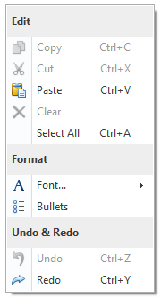
Displays static text using a heading style which is determined by the current skin. The text is typically painted bold against a background that is different from the background of regular buttons. Use BarHeaderItem to add headers to a PopupMenu or BarSubItem (sub-menu) to separate sets of items.
BarEditItem
Item Link: BarEditItemLink

This item allows you to display editors from the XtraEditors Library within bars and Ribbon Controls. Use the BarEditItem.Edit property to specify the type of editor to display. Use the BarEditItem.EditValue property to specify the initial value for the editor. To perform specific actions when the edit value is changed, handle the BarEditItem.EditValueChanged event.
Note
An in-place editor (BaseEdit descendant) within a Bar, Menu or Ribbon Control is created from a RepositoryItem descendant and activated only when a corresponding edit box is focused. If the edit box is not focused, the editor doesn’t exist at this point in time. When the edit box loses focus, the corresponding editor is automatically destroyed. So, it’s not possible to access an editor displayed within a Bar/Menu/Ribbon Control unless this editor has focus.
To access and customize a specific in-place editor, first activate the editor via the BarEditItemLink.ShowEditor method. To access the editor, use the BarManager.ActiveEditor property (for the RibbonControl, use the RibbonControl.Manager.ActiveEditor property).
Specific dropdown editors allow their items to be populated from a data source (e.g., a LookUpEdit or CheckedComboBoxEdit). If this editor is embedded into a Bar or Ribbon Control and the corresponding edit box is not focused, changes made to the data source are not reflected by the edit box. To update the edit box, you can use the BarItem.Refresh method.
BarLinkContainerItem
Item Link: BarLinkContainerItemLink

Represents a group of links. Create a BarLinkContainerItem, populate it with links via the BarCustomContainerItem.ItemLinks property and then add it to a menu(s). At runtime, the menu will contain the links owned by the BarLinkContainerItem. This can be useful if you need to display the same group of bar items within multiple menus. You can also use the container item to implement the functionality of the Favorites folder in Microsoft® Internet Explorer.
If a BarLinkContainerItem is placed onto a toolbar or Ribbon Control, it is represented as a submenu.
BarListItem
Item Link: BarListItemLink

A list of text strings. For instance, this item allows you to implement a list of recently used files.
Create a BarListItem, populate it with strings using the BarListItem.Strings property and then add it to a menu(s). At runtime the menu will contain the list of the strings owned by the BarListItem. Use the BarListItem.ListItemClick event to respond to clicking on the list’s item.
If a BarListItem item is placed on a toolbar or Ribbon Control, it appears as a submenu.
BarMdiChildrenListItem (for Bars only)
Item Link: BarMdiChildrenListItemLink

Represents a list of all open MDI child windows. This item’s functionality is similar to the BarListItem but it is designed to display only the active MDI windows. Clicking a specific item will activate the corresponding window. It’s not possible to add items to the BarMdiChildrenListItem explicitly.
If a BarMdiChildrenListItem is placed onto a toolbar, it is represented as a submenu.
BarDockingMenuItem
Item Link: BarDockingMenuItemLink

A sub-menu with a set of commands to manipulate documents provided by the Document Manager component.
BarWorkspaceMenuItem
Item Link: BarWorkspaceMenuItemLink
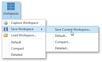
A sub-menu with a set of commands to apply, capture, save and restore application workspaces provided by the Workspace Manager component.
BarToolbarsListItem (for Bars only)
Item Link: BarToolbarsListItemLink

Displays a list of existing bars and dock panels. Toggling a check box of any menu item will change the visibility of the corresponding bar/dock panel.
If a BarToolbarsListItem is placed onto a toolbar, it is represented as a submenu.
SkinBarSubItem (for Bars only) and SkinRibbonGalleryItem (for Ribbons only)
Item Link: SkinBarSubItemLink and SkinRibbonGalleryItemLink, respectively.

Display all available DevExpress Skins as a sub-menu (in toolbars and menus) or a gallery (in Ribbon). End-users can apply these skins by choosing related menu/gallery items.
BarButtonGroup (for Ribbons only)
Item Link: BarButtonGroupLink

A group of buttons within a Ribbon Control. Button groups are never broken when a Ribbon Control is resized. You can add any items to a BarButtonGroup using the BarButtonGroup.ItemLinks property. Links that are displayed within button groups support small images only.
RibbonGalleryBarItem (for Ribbons only)
Item Link: RibbonGalleryBarItemLink

An in-Ribbon gallery that can display multiple gallery items, which are visually represented by images. Optionally, captions and descriptive text can be displayed for each gallery item.