Ribbon
- 6 minutes to read
The Ribbon Control implements the Ribbon UI, which was first introduced in Microsoft Office 2007. The Ribbon UI is an alternative to the standard bars and hierarchical menu model in applications. It is designed to improve application usability by grouping menu commands into pages and categories.
When compared with the standard bars and menu model, the Ribbon Control has the following advantages.
- Simplified user interface.
- Easy and quick access to commands.
- The new UI is more compact than the equivalent interface implemented using traditional bars.
Note
Using regular bars (a BarManager component) and a RibbonControl within the same form/user control is not recommended, since Bar Manager and Ribbon Control components may conflict with each other. Use either a Bar Manager or a Ribbon Control in a single form/user control.
Get Started
The Ribbon UI
Four separate solutions that when used together, create a solid user interface that fully emulates the MS Office experience.
- Ribbon Control
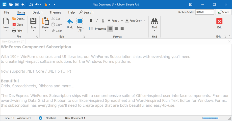
- A control with tabbed pages, divided into groups that contain buttons, editors, check boxes and other UI elements.
- Ribbon Form
- A DevExpress form specially designed to be used along with the Ribbon Control.
- Ribbon Status Bar
- A thin bar docked to the form’s bottom. Typically displays status information, zoom controls, etc.
- Ribbon Styles
- The Ribbon Control supports a set of styles that differ in appearance as well as behavior.
Visual Elements
The list below enumerates visual elements provided by the Ribbon Control.
- Page Categories
- Page Categories are the topmost containers that host Ribbon Pages. Two types of Page Categories are available - regular categories that host regular pages and custom categories for contextual pages (see below). Custom categories can be highlighted with custom colors.
- Pages
- Ribbon Pages are tabs divided into page groups. There can be regular pages visible to end-users at all times, and contextual pages shown only upon certain events (e.g., when an end-user selects an image).
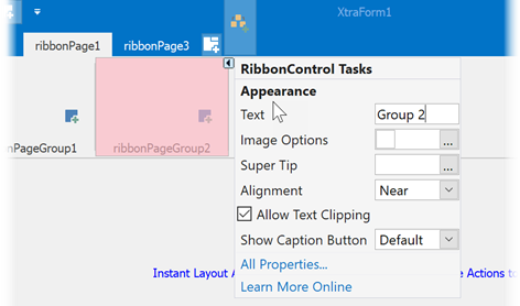
- Page Groups
- A page group is a group of bar item links and/or galleries within a Ribbon Page. Page Groups are designed to combine commands have something in common (e.g., modifying the current font or applying different document formats).
- Quick Access Toolbar
- The Ribbon Quick Access Toolbar (QAT) is a customizable element which is designed to provide end-users with one-click access to the most important and used features. QAT is integrated into the form title bar when using the Ribbon Form and is unavailable if the ‘Office Universal’ Ribbon Style is applied.
- Page Header Items
- Bar items that are embedded into the tab header area. Any bar item type (a button, editor, static text, gallery item, etc) can be embedded.
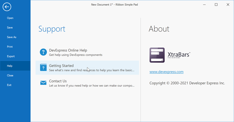
- Application Button
- A button that invokes an application’s main menu.
Items and Links
DevExpress Ribbon shares the item - item link concept introduced in the Bar Manager. This concept allows you to create each element (command, check button, label, editor, sub-menu item, etc.) just once, and if needed, add links to this item to other page groups and menus without the necessity to create duplicate elements for each new location.

- What are Bar Items and Bar Item Links?
- The overview article that explains in detail the difference between items and links.
- The List of Bar Items and Links
- A complete item/item link list.
- Accessing Bar Items and Links
- Explains how to manage items and item links at both design time and runtime.
- Button Groups
- Demonstrates how to break down a page group into multiple sub-groups that contain individual item links.
- Bar Item Display Options
- Enumerates item display variations.
- Bar Item Behavior Options
- Explains how to respond to end-user clicks on item links depending on the parent bar item’s type.
Galleries
Ribbon galleries are designed to display image lists within a Ribbon Control. Gallery items behave similarly to items in a regular menu: a click on a gallery item invokes a specific event, which you can handle to implement custom logic. For each gallery item, it’s also possible to provide text descriptions. In addition, galleries support hover images and tooltips.
- Gallery Controls
- An overview article that briefly describes all gallery types included in the XtraBars Library.
- Gallery Items
- Another overview document that outlines concepts shared by all gallery items.
- Customizing Galleries at Design Time
- Demonstrates how to modify galleries at design time.
- In-Ribbon Galleries
- In-Ribbon galleries are displayed directly within Ribbon Page Groups.
- Dropdown Galleries
- Displayed as popup windows, these galleries are shown when end-users click drop-down buttons displayed by In-Ribbon Galleries.
Main Menus
End-users invoke main application menus by clicking the Ribbon’s Application Button. You may choose one of two menu types, depending on the style applied.
- Application Menu
- A simple pop-up menu seen in Microsoft Office 2007 products.
- BackstageView Control
- A main menu variation introduced by Microsoft in Office 2010. Comes with two embedded styles that affect the menu appearance and behavior.
- Recent Item Control
- A satellite control for building complex content within BackstageView Controls.
Ribbon Designer
The Ribbon Control provides an advanced Designer dialog which allows you to customize Ribbon items, a Quick Access Toolbar, status bar, menus, gallery controls, etc. The designer provides several pages which relate to particular aspects of the control. This section combines articles that describe each of these pages.
Runtime Capabilities
This section groups articles dedicated to runtime features provided by the Ribbon.
- Key Tips
- Key tips are keyboard shortcuts shown on screen when end-users press Alt or F10. These elements provide quick keyboard access for Ribbon pages, commands and menus.
- Runtime Customization
- End-users are allowed to customize a Ribbon at runtime. Customized layout variations can be saved to local storage and re-used later.
- Ribbon Merging
- Parent and child MDI forms can contain their own Ribbon Controls and RibbonStatusBars that provide specific bar items. The merging feature allows the Ribbon Control and status bar of a child MDI form to be merged into the main form’s Ribbon Control and status bar.
- Touch Support
- An article dedicated to built-in support for touch-input devices.
Miscellaneous
- Best Practices
- Contains recommendations on creating a thorough and good-looking Ribbon UI.
- Converting Bars to Ribbon
- Demonstrates how to upgrade traditional toolbars to Ribbon.
- Office Inspired UI
- An overview article that lists other Office-inspired controls by DevExpress.
- Examples
- A set of task-based how-to’s.