Ribbon Page
- 3 minutes to read
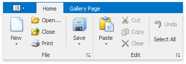
Ribbon pages are represented as tabs. They are structurally and visually split into groups that display various commands, static items, editors and galleries. The following image shows a Ribbon Control containing two pages (Home and Gallery Page). The Home page, which is active, consists of two groups (File and Edit):
Regular and Contextual Pages
In addition to regular tab pages, the Ribbon Control allows contextual tab pages to be implemented. Regular tab pages, which are considered to be a Ribbon application’s main part, are used to display context independent commands. Unlike regular pages, contextual tab pages should provide context specific commands and so they only need to be displayed in particular situations (for instance, when a specific object is selected). The following image shows a Ribbon Control displaying three regular (Home, Alternative Page and Gallery Page) and two contextual (Format and Clipboard) tab pages:
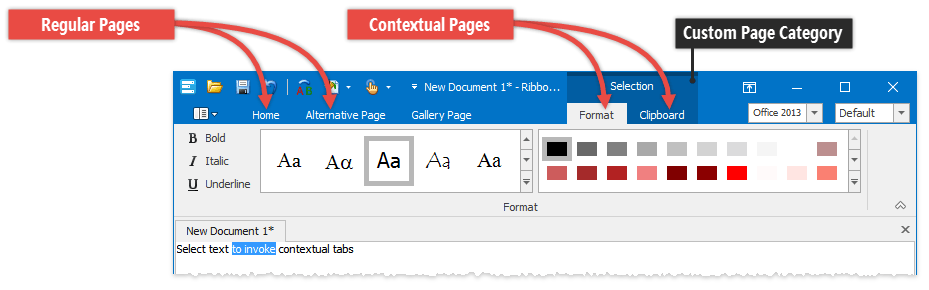
Each Ribbon page in the Ribbon Control belongs to either the default or a custom page category, and this affects how pages are painted on screen. All regular pages belong to the default page category. These are displayed at the left edge of the RibbonControl. Contextual pages belong to specific custom page categories. They follow regular pages, and above their captions the category’s caption is always visible (in the image above the Format and Clipboard pages are combined into the Selection category).
To implement a contextual tab page with the RibbonControl, first a custom page category must be created. Then a page(s) that will represent the contextual page, needs to be created and added to this category.
See Categories and Contextual Tabs to learn more.
Accessing Pages
Ribbon pages are represented by the RibbonPage class objects. RibbonPage objects are components. So if pages are created at design time, they can be referred to in code by their names.
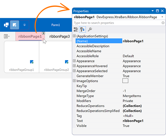
Like other RibbonControl’s elements, a Ribbon page’s settings can easily be accessed at design time by clicking the page’s caption.
To get a Ribbon page’s groups, use the RibbonPage.Groups collection. You can add, remove and obtain individual groups using this property. Refer to the Ribbon Page Group topic to learn more about groups.
All regular Ribbon pages are stored in the RibbonControl.Pages collection. These pages are all associated with the default page category via the RibbonPage.Category property.
To add a regular page, add a RibbonPage object to the RibbonControl.Pages collection.
Custom page categories are stored in the RibbonControl.PageCategories collection. Initially this collection is empty. You need to manually add categories to this collection when implementing contextual pages. The collection’s elements are RibbonPageCategory objects. Once you obtain a page category, you can access all pages that are associated with this category via the RibbonPageCategory.Pages property.
For any page, you can read the RibbonPage.Category property to identify the page’s category.
Navigating Pages and Controling Page Visibility
Use the RibbonControl.SelectedPage property to identify the selected page, and assign a page to this property to activate this page. To respond to page selection changes (SelectedPage property), handle the RibbonControl.SelectedPageChanged event
It’s possible to hide a particular page via its RibbonPage.Visible property. If a page belongs to a custom category, you can hide all pages in this category by setting the RibbonPageCategory.Visible property to false.