Ribbon Page Group
- 2 minutes to read
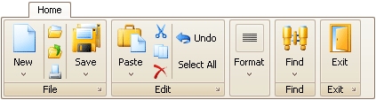
A Ribbon Page Group represents a group of bar item links within a Ribbon Page. The following image shows a sample “Home” page which contains five groups: File, Edit, Format, Find and Exit. Each of these groups combines commands that have some features in common.
A Ribbon Page Group is represented by the RibbonPageGroup component. The collection of groups displayed within a page is specified by the RibbonPage.Groups property. You can use this property to add, remove and access specific groups at runtime. To add groups at design time use the RibbonControl’s Designer.
For each bar item you can assign large and small icons. Large icons are used by default if there is enough space within a group. However, when the group’s region becomes smaller, large icons are automatically replaced with small icons and text is hidden if necessary. If the group’s size is reduced so it can no longer display all its links at a time, the group is collapsed (see the Format group in the image above). To prevent a page group from being collapsed, set its RibbonPageGroup.State property to Expanded.
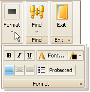
Clicking a collapsed group’s Dropdown button invokes the popup which contains the group’s contents:
Bar Item Link Arrangement Rules
There are several bar item link arrangement principles used by the RibbonControl. You will want to familiarize yourself with these principles to better arrange bar item links in your application:
- For each bar item, which represents a button or sub-menu, you can assign both large and small images. By default, such an item can be displayed using the large image with text, small image with text and small image without text. The BarItem.RibbonStyle property allows you to control which of these options are available.
- If both large and small images are assigned to a bar item, the large image is used by default (if there is enough space to display it). Small images are used when the group’s region is too small to display large images.
- If a bar item link is represented by a large image, no other link can be displayed above or below it.
- Only one, two or three bar item links with small images can be arranged vertically within a group.
See Best Practices for tips on arranging bar item links.