Filter Editor
The Filter Editor allows end-users to build filter criteria in the Tree-like and/or IntelliSense text-based form.
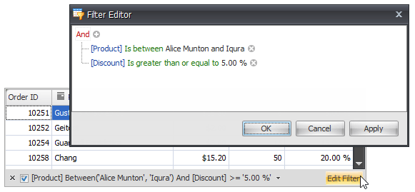
Tree-like Filter Editor:
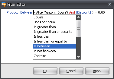
IntelliSense text-based Filter Editor:
The table below lists the main properties that affect an element’s appearance.
Look And Feel | The BaseView.PaintStyleName, GridControl.LookAndFeel and GridControl.FormsUseDefaultLookAndFeel properties. |
Availability | The ColumnViewOptionsFilter.AllowFilterEditor option. End-users can invoke the Filter Editor using the Edit filter button that is displayed within the filter panel. The Filter Editor is also invoked when choosing the (Custom…) item from the filter dropdown, provided that the custom filter dialog cannot display a filter condition that is applied to the corresponding column or card field. |
Customization | The ColumnView.FilterEditorCreated event. Handle this event to access the Filter Control and customize its additional settings. For example:
|
Select Tree-like or Text-based filter editing style | The ColumnViewOptionsFilter.DefaultFilterEditorView property. |