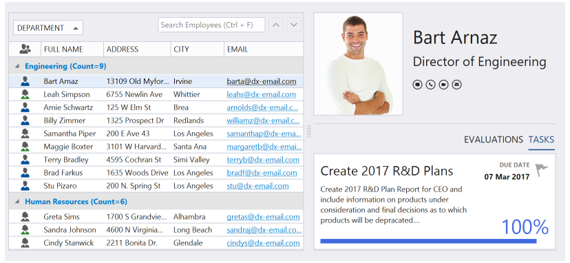
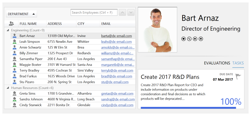
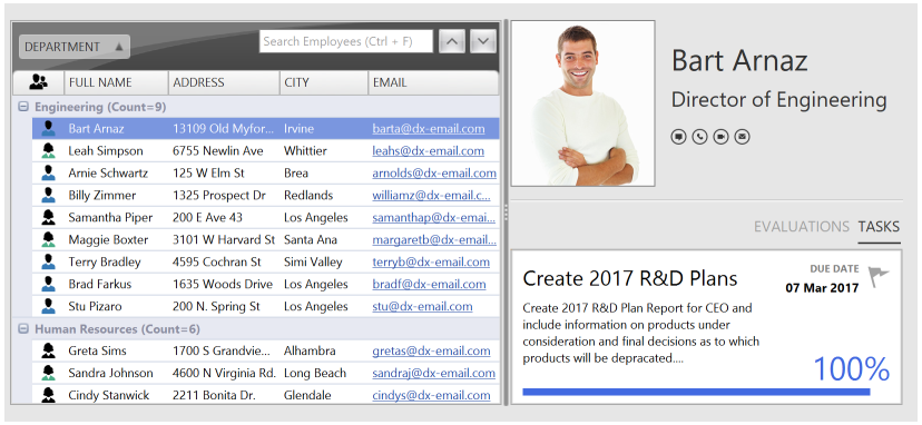
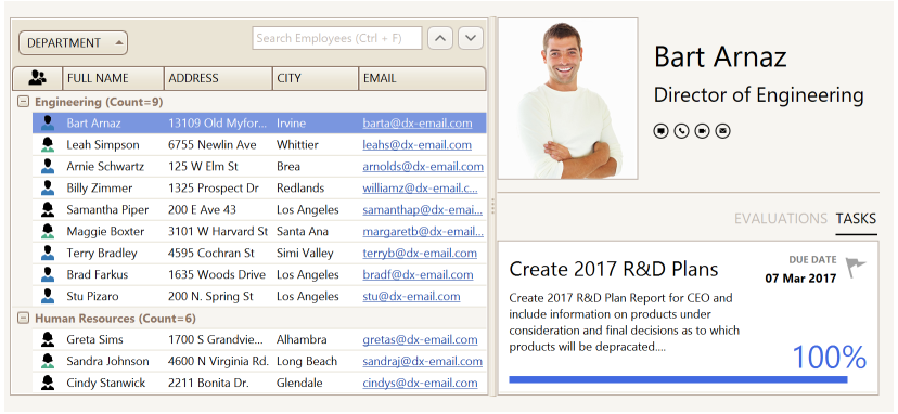
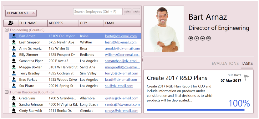
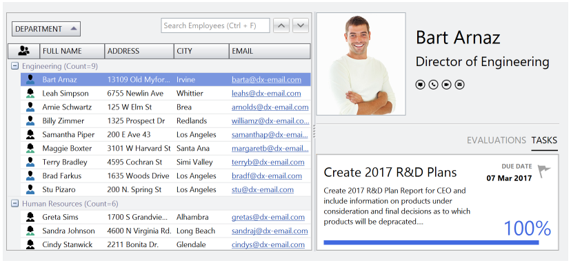
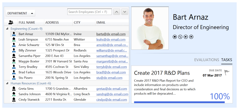
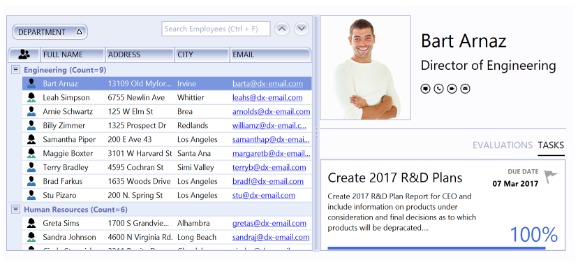
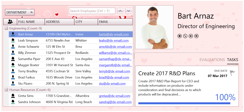
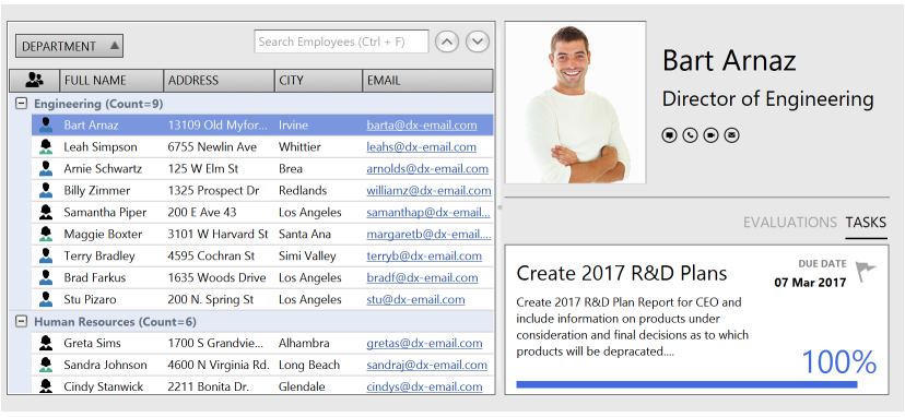
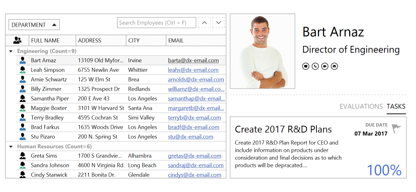
Skins
- 9 minutes to read
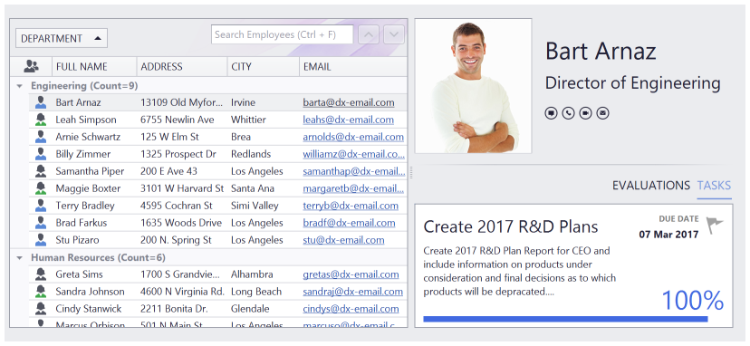
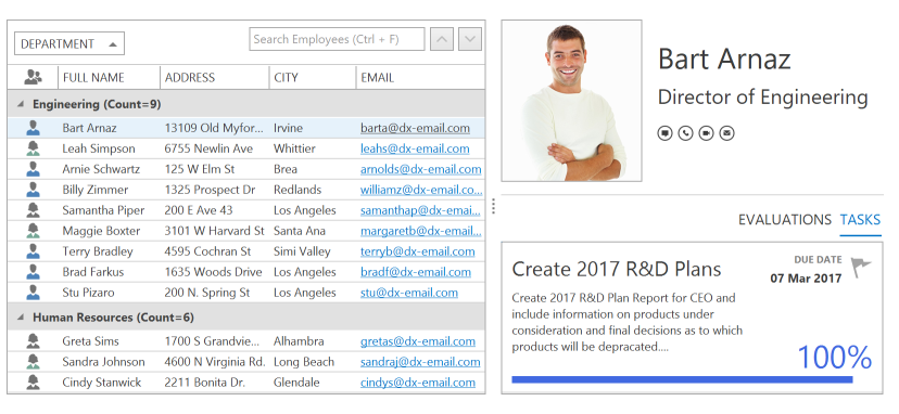
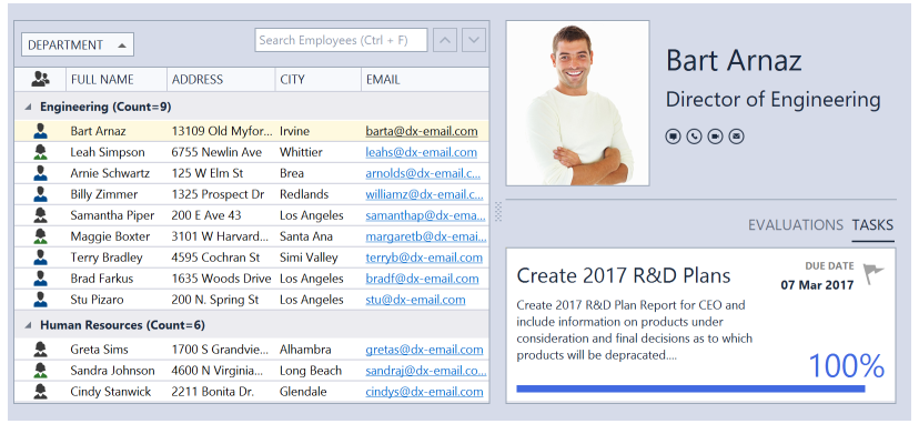
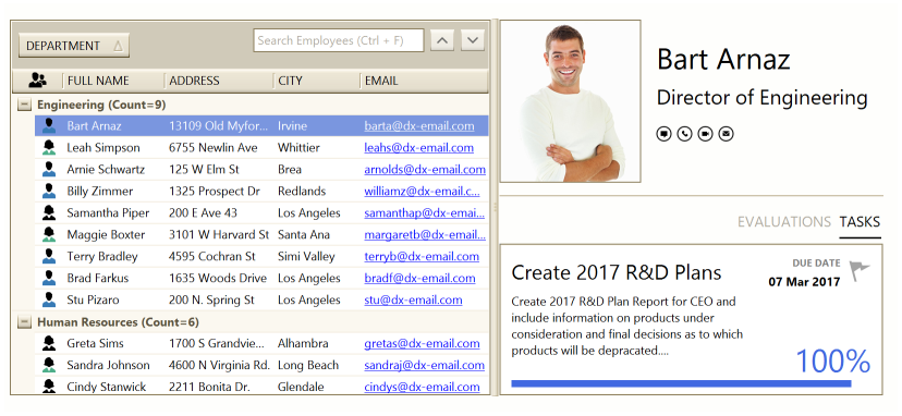
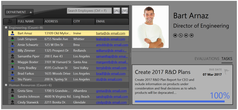
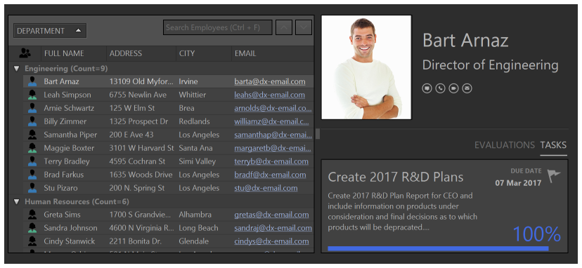
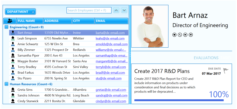
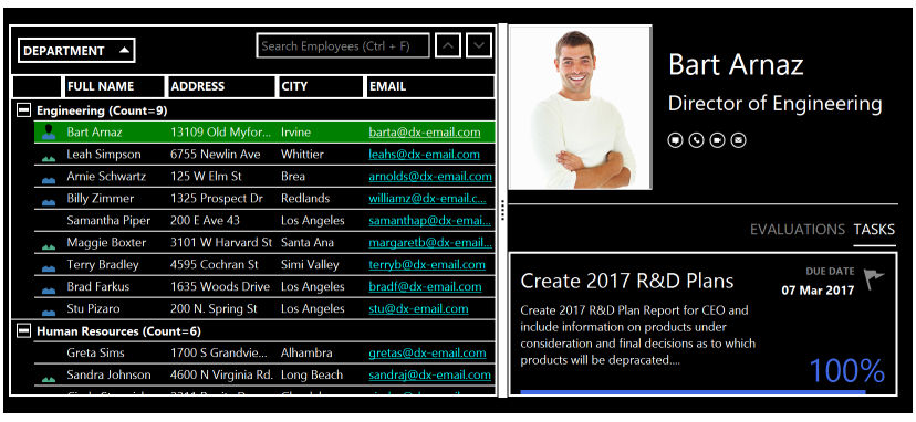
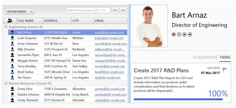
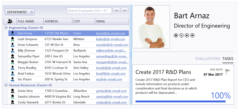
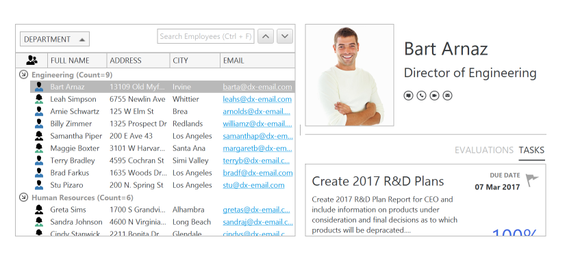
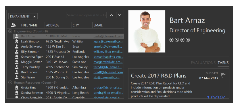
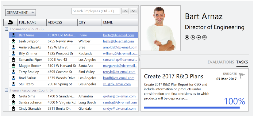
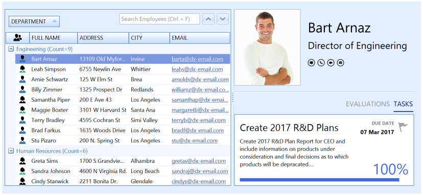
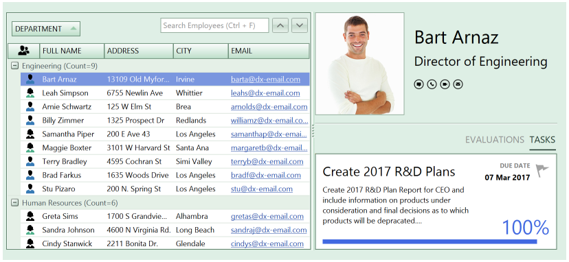
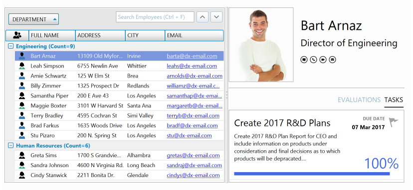
DevExpress WinForms controls include many ready-to-use paint themes (or skins) for changing DevExpress forms’ and controls’ appearance. You can see the different skins by running WinForms Demo Applications and switching between the available themes using a Skin Selector.

This topic describes the available raster and vector skins, how to apply a skin to the entire application and individual controls, how to alter a skin’s color palette and how to create a custom skin.
- Vector Themes
- Basic Raster Skin Set
- Additional Raster Themes
- Apply Themes to Entire Application
- Form Title Bar and Border Skinning
- Provide Runtime Skin Selector UI for End-Users
- Color Mixer: Adjust Raster Skin Colors
- Skin Editor: Modify and Re-Package Skins
Vector Themes
Vector skins utilize vector images for all UI elements to improve the display quality on high-resolution devices.
Each vector skin can have multiple palettes (swatches) that are skin color themes. RibbonControl provides the “Skin Palette Gallery” item that allows users to switch palettes at runtime.
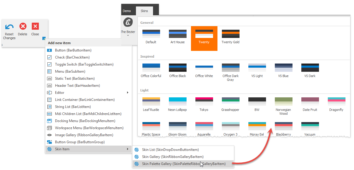
The following code illustrates how to modify the default palette and\or create additional ones:
//obtain a vector skin
var commonSkin = CommonSkins.GetSkin(LookAndFeel);
//create a new palette
SvgPalette svgPalette = new SvgPalette();
//set up palette colors
svgPalette.Colors.Add(new SvgColor("Paint", Color.FromArgb(242, 242, 242)));
svgPalette.Colors.Add(new SvgColor("Paint High", Color.FromArgb(255, 255, 255)));
svgPalette.Colors.Add(new SvgColor("Paint Shadow", Color.FromArgb(222, 222, 222)));
svgPalette.Colors.Add(new SvgColor("Brush", Color.FromArgb(80, 80, 80)));
svgPalette.Colors.Add(new SvgColor("Brush Light", Color.FromArgb(150, 150, 150)));
svgPalette.Colors.Add(new SvgColor("Brush High", Color.FromArgb(80, 80, 80)));
svgPalette.Colors.Add(new SvgColor("Brush Major", Color.FromArgb(180, 180, 180)));
svgPalette.Colors.Add(new SvgColor("Brush Minor", Color.FromArgb(210, 210, 210)));
svgPalette.Colors.Add(new SvgColor("Accent Paint", Color.FromArgb(23, 107, 209)));
svgPalette.Colors.Add(new SvgColor("Accent Paint Light", Color.FromArgb(191, 224, 255)));
svgPalette.Colors.Add(new SvgColor("Accent Brush", Color.FromArgb(255, 255, 255)));
svgPalette.Colors.Add(new SvgColor("Accent Brush Light", Color.FromArgb(81, 148, 224)));
svgPalette.Colors.Add(new SvgColor("Key Paint", Color.FromArgb(71, 71, 71)));
svgPalette.Colors.Add(new SvgColor("Key Brush", Color.FromArgb(255, 255, 255)));
svgPalette.Colors.Add(new SvgColor("Key Brush Light", Color.FromArgb(150, 150, 150)));
svgPalette.Colors.Add(new SvgColor("Red", Color.FromArgb(226, 54, 66)));
svgPalette.Colors.Add(new SvgColor("Green", Color.FromArgb(60, 146, 92)));
svgPalette.Colors.Add(new SvgColor("Blue", Color.FromArgb(58, 116, 194)));
svgPalette.Colors.Add(new SvgColor("Yellow", Color.FromArgb(252, 169, 10)));
svgPalette.Colors.Add(new SvgColor("Black", Color.FromArgb(122, 122, 122)));
svgPalette.Colors.Add(new SvgColor("Gray", Color.FromArgb(190, 190, 190)));
svgPalette.Colors.Add(new SvgColor("White", Color.FromArgb(255, 255, 255)));
//replace the default color palette with a custom one
commonSkin.SvgPalettes[Skin.DefaultSkinPaletteName].CustomPalette = svgPalette;
LookAndFeelHelper.ForceDefaultLookAndFeelChanged();
//or
//add a new swatch
commonSkin.CustomSvgPalettes.Add(new SvgPaletteKey(commonSkin.CustomSvgPalettes.Count, "PALETTE_NAME"), svgPalette);
Tip
Starting with version 19.1, you can also use the Project Settings Page to create custom palettes.
You can repaint vector skins and change their palettes in the updated WinForms Skin Editor. See the Working with Vector Skins article to learn more.
Basic Raster Skin Set
The following gallery demonstrates the default skins that are part of the DevExpress.Utils library (all projects that use DevExpress WinForms controls require this library):
Additional Raster Themes
Add the DevExpress.BonusSkins assembly to your project to use additional skins that are not included in the basic set described above.
Bonus skins are divided into the following two categories:
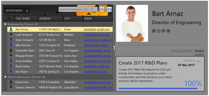
Bonus Skins
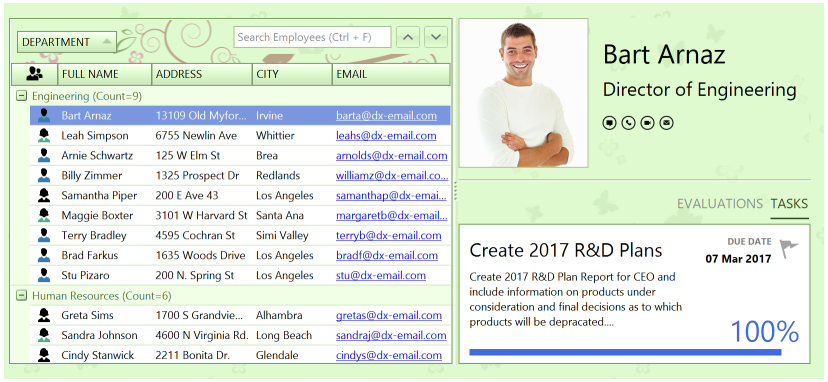
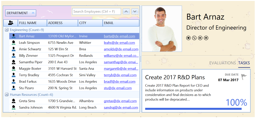
Theme Skins
To access bonus skins at design time, select Register BonusSkins from the DefaultLookAndFeel component’s smart tag. If this command is not available, then the bonus themes have already been registered. Certain DevExpress Project Templates automatically register bonus skins.
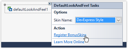
To register bonus skins in code, first ensure that your project references the DevExpress.BonusSkins assembly. Then call the DevExpress.UserSkins.BonusSkins.Register method before the main application form runs.
namespace WindowsFormsApplication1 {
    static class Program {
        [STAThread]
        static void Main() {
            DevExpress.UserSkins.BonusSkins.Register();

            Application.EnableVisualStyles();
            Application.SetCompatibleTextRenderingDefault(false);
            Application.Run(new Form1());
        }
    }
}
You can apply bonus skins once they are registered. The following code sets the Pumpkin bonus skin as the application’s default skin:
private void Form1_Load(object sender, EventArgs e) {
    DevExpress.LookAndFeel.UserLookAndFeel.Default.SetSkinStyle("Pumpkin");
}
Apply Themes to Entire Application
Invoke the DevExpress Project Settings page and select a desired theme to apply it to the entire application.
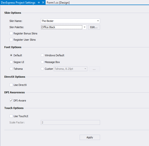
Alternatively, call the UserLookAndFeel.Default static object’s UserLookAndFeel.SetSkinStyle method.
To apply a vector skin in code, use the UserLookAndFeel.SetSkinStyle method overload that takes a SkinSvgPalette object as a parameter. This parameter allows you to apply a pre-defined color palette (swatch) to a skin.
Form Title Bar and Border Skinning
DevExpress forms and message boxes have skinned title bars and borders by default.
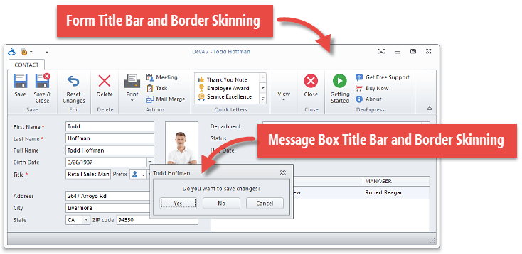
You can disable default title bar skinning using a compatibility option (see Version Compatibility: Default Property Values) or the WindowsFormsSettings.DisableFormSkins method.
Related API
Provide Runtime Skin Selector UI for End-Users
DevExpress Toolbars and Menus and Ribbon provide pre-defined skin selector items - SkinBarSubItem and SkinRibbonGalleryBarItem - which are automatically populated with available skin items and allow end-users to switch an application theme at any time.
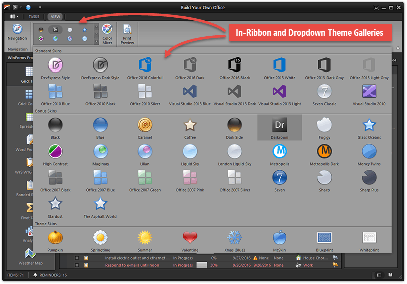
The SkinDropDownButtonItem and SkinPaletteRibbonGalleryBarItem skin selectors provide additional functionality.
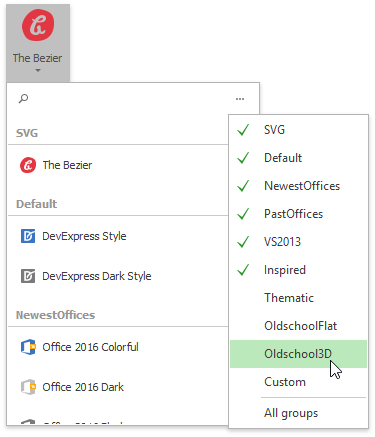
The SkinDropDownButtonItem displays available skins in a drop-down list. Unlike SkinBarSubItem, the SkinDropDownButtonItem allows you to search for a specific skin by its name and hide unwanted skin groups.
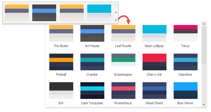
The SkinPaletteRibbonGalleryBarItem selector displays swatches instead of skins. It is hidden if a traditional raster skin is currently active. Note that this item is only available in the Ribbon Control and does not support the Bar Manager.
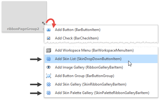
You can create all these skin selectors at design time using the Ribbon and Toolbar smart tags.
To change skin selectors’ item captions and icons, handle the static DevExpress.XtraBars.Helpers.SkinHelper.CreateGalleryItem event.
SkinHelper.CreateGalleryItem += (s, e) => {
     if(e.SkinName.Equals(MySkinName)) {
        e.GalleryItem.Image = e.UseLargeIcons ? MyLargeIcon : MySmallIcon;
        e.GalleryItem.HoverImage = MyLargeIcon;
        e.GalleryItem.Caption = "Glacier";
    }
};
You can also manually obtain the list of available skin styles and create a custom UI element to switch between them. Refer to the following topics to learn how to use a built-in selector and create a custom one:
- Add and Customize the Toolbar and Menu Skin Selector
- Add and Customize the Ribbon Gallery Skin Selector
- Build a Custom End-User Skin Selector
- How To: Localize Bar and Ribbon Skin Items
Adjust Skin Colors
DevExpress skins allow you to modify their default color palettes. For example, you can adjust the Office 2016 Colorful skin’s default colors (which are based on MS Outlook colors) to match other MS Office applications’ color palette.
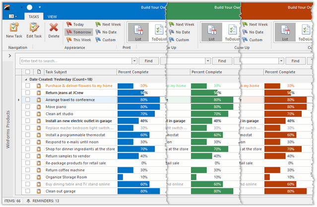
You can use the pre-defined Color Mixer dialog to adjust the skin color in DevExpress WinForms demos, as shown below.
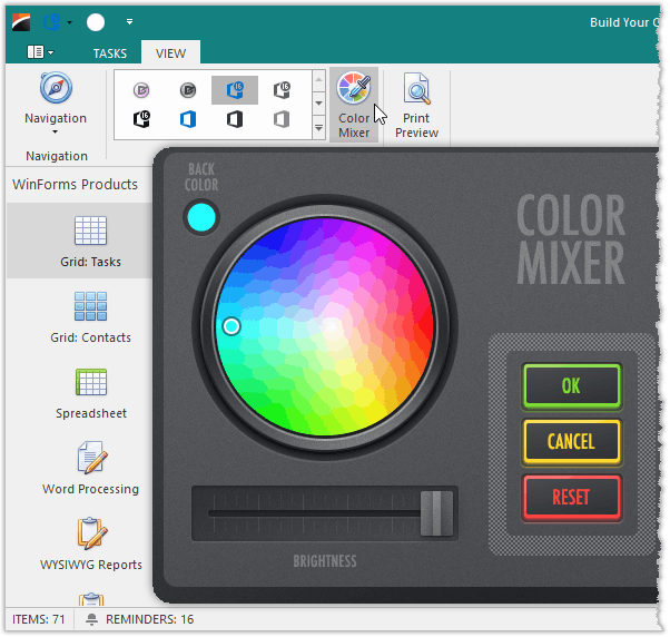
Use the following code to invoke this dialog in your application:
using DevExpress.XtraEditors.ColorWheel;
//..
ColorWheelForm cwForm = new ColorWheelForm();
cwForm.Show();
You can also customize the entire application’s (with the DefaultLookAndFeel component) or a specific control’s (via its LookAndFeel property) skin color palette at design time or in code.
| Member | Description |
|---|---|
| UserLookAndFeel.SkinMaskColor | Specifies the primary or background color. |
| UserLookAndFeel.SkinMaskColor2 | Specifies the highlight color. |
| UserLookAndFeel.SetSkinMaskColors | Allows you to set both colors in one call. |
You can access these properties at design time.
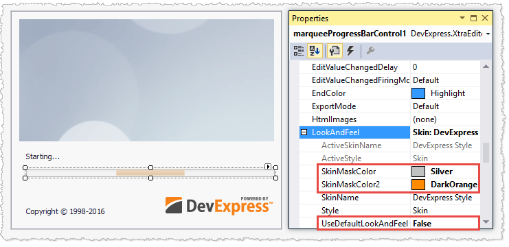
Call the method below to adjust the skin palette in code.
Skin Editor: Modify and Re-Package Skins
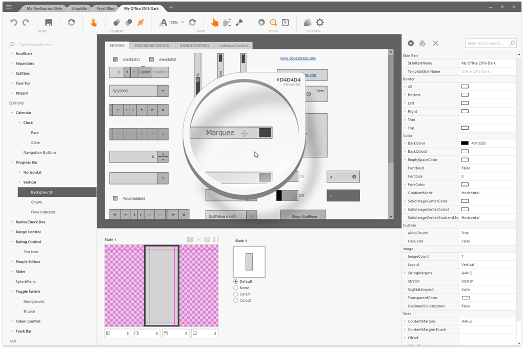
A skin is a set of bitmaps, fonts, and alignment settings that determine how control elements are painted in all possible states: normal, hot-tracked, selected, etc. DevExpress designers use the Skin Editor application to associate skin attributes with individual controls, and this information is compiled into the skin assemblies mentioned earlier. You can access the Skin Editor application from the DevExpress menu in Visual Studio to modify skins to fit a specific corporate style or re-package skins into lightweight DLLs.
