Tabbed Group's Settings
- 3 minutes to read
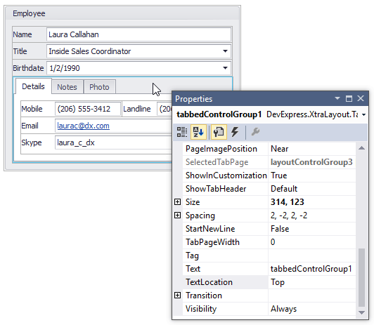
This document covers customization settings provided by tabbed groups. At design time, you can access these settings in the Properties window by clicking the empty space within the tabbed group’s header region.
Tabs
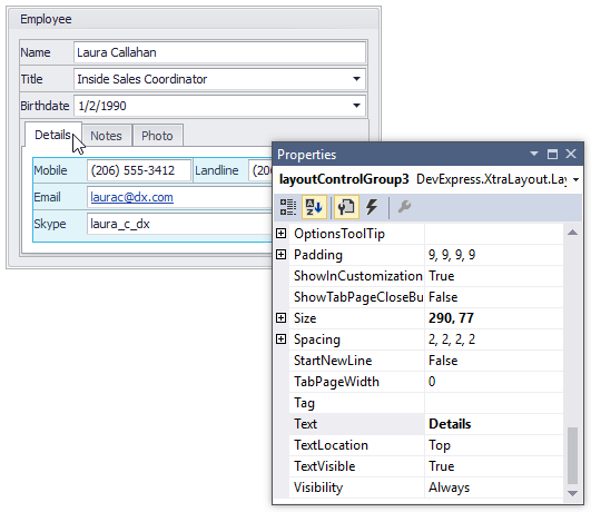
A tabbed group renders its child layout groups as tabs. You can click any tab to access and customize its settings in the Properties window. For instance, you can change the text displayed in tabs with the BaseLayoutItem.Text properties provided by child groups.
You can display custom images within tabs by specifying the LayoutGroup.CaptionImage or LayoutGroup.CaptionImageIndex property for child groups.
The options that affect the display of all tabs are accessible from a tabbed group object. For instance, use a tabbed group’s BaseLayoutItem.TextLocation property to anchor tabs to the top, bottom, left or right edge.
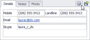
To add custom buttons to a tabbed group’s header region, use the group’s TabbedGroup.CustomHeaderButtons collection.
Spacing
For a tabbed group you can specify inner and outer indents. The inner indents specify the space between the group’s border and the contents of tab pages. The outer indents specify the space between the group’s border and group’s edges. It’s possible to specify different indents for different edges of the tabbed group.
To set the group’s inner and outer indents, use the group’s BaseLayoutItem.Padding and BaseLayoutItem.Spacing properties.
Please refer to the Spacing and Paddings topic for more information.
Appearance
To customize the appearance of an individual tabbed group, you can use this group’s LayoutItemContainer.AppearanceTabPage property. It provides access to the appearance settings for the contents of tab pages and tabs (in normal, active, disabled and hot-tracked states).
The Layout Control supports inheritance of the appearance settings. So generally instead of customizing the appearance of individual groups, you can specify the appearance settings in the root group (the LayoutControl.Root property) and these will be applied to its nested groups by default. To make all tabbed groups in the Layout Control look the same, specify the appearance settings with the root group’s LayoutItemContainer.AppearanceTabPage property. Surely, it’s possible to override these default settings by changing a specific tabbed group’s LayoutItemContainer.AppearanceTabPage property.
Note
The background colors of tabs and tab pages cannot be changed if the Layout Control is painted using the Skin or WindowsXP painting scheme. To change the current painting scheme, use the LayoutControl.LookAndFeel property.
Customization settings
The ability to customize a group’s layout at runtime is determined by the LayoutItemContainer.AllowCustomizeChildren property. If this property is set to false, it’s not possible to add items to, remove them from or move them within the group.
To prevent a group from being hidden to the Customization Form, use the BaseLayoutItem.AllowHide property.