Layout Item's Settings
- 4 minutes to read
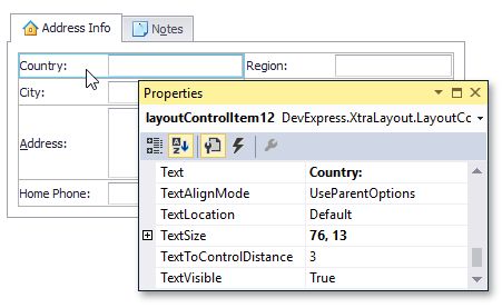
To access the layout item’s settings via the Properties window, select the item by clicking its label (caption). If there is no text label, you can click anywhere in the item’s area that is not occupied by the control.
The ability to display layout item settings within the Properties window means that layout items are component descendants. Thus, they can be accessed in code directly by their names.
Note
If an item is almost entirely occupied by the control, it may be inconvenient to select the item by clicking its empty space since you will frequently select the control instead of the empty space. To easily select such items, click the control and then press ESC. Note that you can continue pressing ESC to select parent elements until you reach the Layout Control (i.e. the root group available via its LayoutControl.Root property).
The following sections describe a layout item’s settings by categories:
Control
At design time, a layout item is automatically created after a control has been dropped onto the Layout Control. When creating layout items at runtime, you should manually assign the control to the layout item’s LayoutControlItem.Control property. After the control has been assigned, you won’t be able to modify its Size, Location, Dock, Anchor properties, etc. Now these settings are wholly controlled by the layout item. For instance, to move a specific control to another position within the Layout Control you need to drag the corresponding layout item.
Label
The label displayed next to a layout item’s control allows you to add a description for the control. To set the item’s label use the BaseLayoutItem.Text property.
The label’s visibility is determined by default by the type of the control displayed within the layout item (for instance, it’s visible by default for text editors and hidden for buttons). A layout item provides settings that let you specify the label’s visibility, it’s location, size and contents.
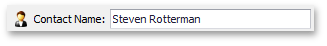
The item’s BaseLayoutItem.Text property can contain the ampersand character (‘&’). In this instance, the character that follows the ampersand is underscored and this indicates that it can be used as a shortcut. At runtime, an end-user can press this character while holding the ALT key down to quickly move focus to the corresponding control. For the following layout item, the Text property is set to “Contact &Name”:
Please refer to the Item Label topic for more details.
Size Constraints
For each layout item you can set size constraints that limit the size range the item and so its control can be adjusted in. During resizing operations (for instance, when the Layout Control is resized) an item can only be resized within the specified ranges. However, the size constraints can be set to values that allow the layout item to be freely sized horizontally and/or vertically.
The default size constraints are determined by the Layout Control automatically depending upon the type of the control displayed within the layout item. To set custom size constraints, set the layout item’s LayoutControlItem.SizeConstraintsType property to Custom and then use the LayoutControlItem.MinSize and LayoutControlItem.MaxSize or LayoutControlItem.ControlMinSize and LayoutControlItem.ControlMaxSize properties to assign the constraints.
See the Size Constraints topic for more information.
Spacing
A layout item’s BaseLayoutItem.Padding and BaseLayoutItem.Spacing properties allow you to specify inner and outer indents for a layout item. You can use these properties to change the default indents. Refer to the Spacing and Paddings document for additional information.
Appearance
The appearance settings of a layout item can be changed via the properties provided by the layout item itself and via the properties of the group that owns this item.
to change the font settings and foreground color of all the layout items within a specific group, use this group’s BaseLayoutItem.AppearanceItemCaption property;
to change the font settings and foreground color of a specific layout item, use this item’s BaseLayoutItem.AppearanceItemCaption property;
to change the background colors of layout items within a group use the group’s LayoutItemContainer.AppearanceGroup property.
Generally to change the appearances of the visual elements in the Layout Control you will use the properties provided by the root group (the LayoutControl.Root property). Due to the inheritance mechanism the appearance settings that are set for a specific group are applied to all its nested groups and items.
To change the appearance settings of the controls that are displayed within the Layout Control use the LayoutControl.Appearance property. The settings provided by this property are only in effect for specific DevExpress controls.
Please refer to the Appearances topic for more information.