Item Label
- 5 minutes to read
Layout items may display labels (text and an optional image) near their controls. The initial visibility of a label depends upon the control’s type. For instance, labels are visible by default for text editors and are not visible for buttons. Layout items provide the settings that allow you to control the label’s visibility, position, size, etc.
Item Label Settings
Visibility
The initial visibility of an item label depends on the control’s type. For instance, item labels are visible for text editors and are not visible for buttons by default. In either case, you can control the item label’s visibility manually via the BaseLayoutItem.TextVisible property. Empty Space Items can also display text that is hidden by default. To use an Empty Space Item as a text label, set its EmptySpaceItem.TextVisible property to true.
Appearance
The appearance settings that are used to paint item labels and group captions can be accessed and specified via the BaseLayoutItem.AppearanceItemCaption property. For more information on appearances, see Appearances.
Contents
The text that is displayed within the item label is specified by the BaseLayoutItem.Text property. For tabbed pages, this property specifies the text that is displayed within the tab header.
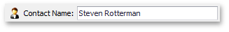
The item’s BaseLayoutItem.Text property can contain the ampersand character (‘&’). In this instance, the character that follows the ampersand is underscored, which indicates that it can be used as a shortcut. At runtime, an end-user can press this character while holding the ALT key down to quickly move focus to the corresponding control. For the following layout item, the Text property is set to “Contact &Name”:
You can display images next to labels, and format labels using HTML tags.
An image can be assigned via the LayoutControlItem.Image or LayoutControlItem.ImageIndex property. Image alignment settings are specified by the LayoutControlItem.ImageAlignment and LayoutControlItem.ImageToTextDistance properties.
To format the item’s text using HTML tags, enable the LayoutControlItem.AllowHtmlStringInCaption property and specify the format string via the item’s BaseLayoutItem.Text property.
Location
Item labels can be displayed at any edge of an item. The item label’s position within the item is specified by the BaseLayoutItem.TextLocation property. For groups, this property specifies which side displays the group’s captions. For tabbed groups, this property specifies which side displays the group’s tabs.
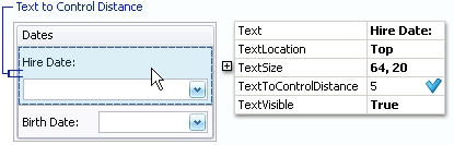
Distance to the control
The distance between the control displayed within the layout item and the item label is specified by the BaseLayoutItem.TextToControlDistance property.
Size and Alignment
The LayoutControl provides a flexible method to control the size and alignment of text labels and corresponding controls. Labels/controls can be aligned throughout the LayoutControl or independently within groups. It is also possible to enable the auto-size feature or specify a label’s size explicitly.
Global alignment settings, which by default affect all layout items, are specified by the OptionsItemText.TextAlignMode property of the LayoutControl.OptionsItemText object. This property allows you to choose one of the following alignment modes:
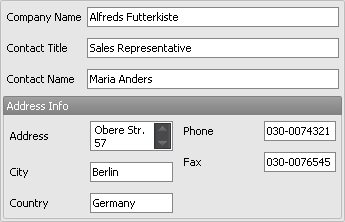
AlignInLayoutControl (default)
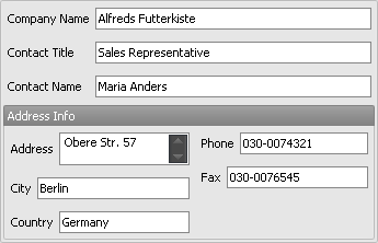
Controls are aligned throughout the LayoutControl. All text labels have the same width, which matches the width of the largest label. In the following image, the widths of all text labels (including those within the Address Info group) match the width of the Company Name label.
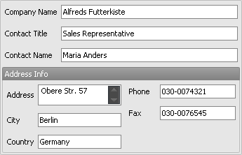
AlignInGroups
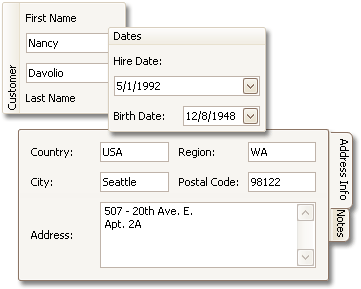
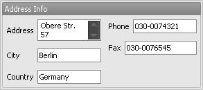
Enables independent automatic alignment within groups. The following image demonstrates this mode. In the image, text labels in the Address Info group have the width of the largest label in this group (Address), while labels in the root group are aligned relative to the Company Name label.
AutoSize
Applies the auto-size feature throughout the LayoutControl.
CustomSize
Allows you to control the size of layout item labels manually. Use the BaseLayoutItem.TextSize property to set labels to a custom size.
The global alignment settings can be overridden for individual groups. A layout group provides the OptionsItemTextGroup.TextAlignMode property, which is accessible via the LayoutGroup.OptionsItemText property. This property allows you to choose one of the following alignment modes:
UseParentOptions (default)
Alignment settings are determined by the group’s parent. For the root group, the parent is the LayoutControl itself. For other groups, the parents are upper-level groups. So if the root group’s TextAlignMode property is set to UseParentOptions, the alignment settings are specified by the LayoutControl.OptionsItemText.TextAlignMode property, as described above.
AlignLocal
Overrides the parent’s alignment settings by applying automatic alignment throughout the current group.
AutoSize
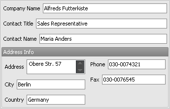
Overrides the parent’s alignment settings by applying the auto-size feature to the current group. For instance, in the following image the Address Info group’s TextAlignMode property is set to AutoSize, while the layout control’s TextAlignMode property is set to its default value (AlignInLayoutControl):
CustomSize
Overrides the parent’s alignment settings by enabling custom size mode, where the size of the current group’s text regions must be specified manually via the BaseLayoutItem.TextSize property.
Each layout item also provides the LayoutControlItem.TextAlignMode property, which allows you to explicitly set the alignment mode for individual items and override the parent settings. The following alignment modes are available (which are similar to the modes provided by layout groups):
UseParentOptions (default)
Alignment settings are determined by the item’s parent.
AutoSize
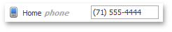
Overrides the parent’s alignment settings by applying the auto-size feature to the current item. In the following image, the TextAlignMode property of the Phone and Fax items is set to AutoSize, while the parent group’s TextAlignMode property is set to AlignLocal.
CustomSize
Overrides the parent’s alignment settings, which enables custom size mode for the current item. In custom size mode, the size must be specified manually via the BaseLayoutItem.TextSize property.