How to: Customize Tooltips Using the Default ToolTipController
- 2 minutes to read
This example demonstrates a way of customizing tooltips by using the Default ToolTipController. This controller’s settings can be accessed via the static ToolTipController.DefaultController property or the DefaultToolTipController component, which can be placed on a form.
In this example a tooltip is set for a standard TextBox control, which will be displayed using the Default ToolTipController. In addition, the controller’s settings are customized, so tooltips will be displayed within rounded light-pink boxes with callout beaks. It is assumed that the TextBox control has already been placed on a form.
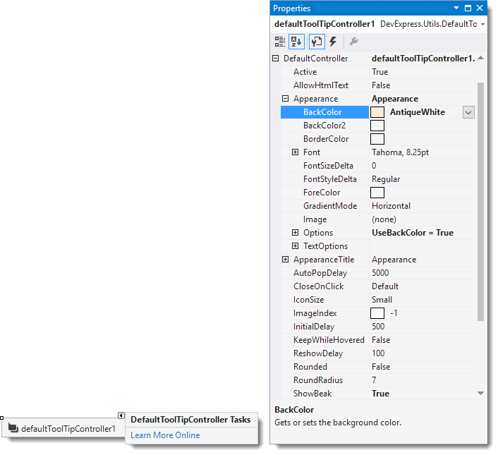
In order to set tooltips for standard WinForms controls at design time, place the DefaultToolTipController component onto a form. Select the component in the tray to display its settings in the Properties window. Set the controller’s settings as follows.
- Appearance.BackColor to AntiqueWhite
- ShowBeak to true
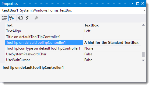
To set a tooltip for the TextBox control, display its settings in the Properties window. Set the ‘ToolTip on defaultToolTipController1’ property to some text.
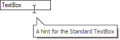
Now run the application and hover over the TextBox control to activate a tooltip. It will look like the image below.
The code equivalent for these operations is shown below. Unlike the design-time example, the Default ToolTipController will be customized via the static ToolTipController.DefaultController property rather than via the DefaultToolTipController component.
using DevExpress.Utils;

// Access the Default ToolTipController.
ToolTipController defController = ToolTipController.DefaultController;
// Customize the controller's settings.
defController.Appearance.BackColor = Color.AntiqueWhite;
defController.ShowBeak = true;
// Set a tooltip for the TextBox control.
defController.SetToolTip(textBox1, "A hint for the Standard TextBox");