Color Schemes
- 3 minutes to read
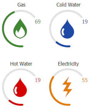
Color schemes allow you to specify a unified appearance for circle gauge range bars. The image below shows four Gauge controls with different color schemes applied.
Tip
For best visual results use monochrome images on a transparent background for all image elements that will be colorized via a color scheme.
To set a color scheme you need to specify only two settings, accessed via the GaugeControlBase.ColorScheme property:
ColorScheme.TargetElements- allows you to specify which gauge elements will be affected by this color scheme. It does not matter whether or not you currently have this or that element within your gauge (a range bar, for instance) - theTargetElementsproperty enumerates gauge element types, not specific elements.ColorScheme.Color- gets or sets the color that will be used to paint selectedTargetElements.
When both properties are set, your color scheme is ready to go. You can turn it off for individual elements by doing one of the following:
painting the desired element with a SolidBrushObject or BaseGradientBrushObject object. Color scheme is only applied to elements painted with an empty brush object. Use this method to set a custom color for the element.
Set the element’s
UseColorSchemeproperty tofalse. This approach is used to leave default skin colors for the target element.
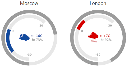
You can modify color scheme colors depending on an external factor. For instance, the following animation illustrates one of the DevExpress gauge demos, where the state image indicator, the range bar and one of the labels are painted in different colors depending on the current temperature.
Example
The following example lists a code that applies the same color scheme to the set of gauge controls as the figure below illustrates.
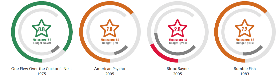
Each gauge control has a single gauge with the Ignis style applied. The default arc scale and range bar are duplicated via the Gauge Designer and arranged inside the outer scale. The outer scale ranges from 0 to 100 and displays the movie metascore. This value affects the color of the color scheme applied to the following elements: the outer range bar, the star image and two labels for IMDb and Metacritics movie scores. The inner range bar that displays the movie budget, as well the label related to this range bar, ignore the color scheme settings and are customarily painted in gray.
private void simpleButton1_Click(object sender, EventArgs e) {
    foreach (var gauge in this.Controls.OfType<GaugeControl>())
        SetColorScheme(gauge, (gauge.Gauges[0] as CircularGauge).Scales[0]);
}

public void SetColorScheme(GaugeControl gauge, IScale metaRankScale) {
    CircularGauge movieGauge = gauge.Gauges[0] as CircularGauge;
    float metascore = metaRankScale.Value;
    //Setting appearance for elements unaffected by the color scheme
    movieGauge.RangeBars[1].AppearanceRangeBar.ContentBrush = movieGauge.Labels[2].AppearanceText.TextBrush = new SolidBrushObject(Color.Gray);
    //Setting color scheme parameters for the rest of gauge elements
    if (metascore < 50F) gauge.ColorScheme.Color = Color.Crimson;
    else if (metascore >= 50F & metascore < 70F) gauge.ColorScheme.Color = Color.Chocolate;
    else if (metascore >= 70F) gauge.ColorScheme.Color = Color.SeaGreen;
}