Appearance Customization
- 2 minutes to read
The Gauges library contains numerous settings that allow you to build an appearance for both gauges and their elements per your needs.
This document lists the available tools required for customizing a gauge appearance, and describes how they can be accessed at design time.
Brushes
Brushes are used to paint an element’s background, borders, content and text.
You can use brushes to alter the appearance of the following gauge elements:
- In circular and linear gauges: scales and their major and minor tickmarks, labels, range bars.
- In digital gauges: segments, labels.
- In state indicators: labels.
For your convenience, the properties that represent brushes starting with the Appearance… prefix.
You can access brushes one of two ways: using the gauge element’s Designer or via the Property Grid.
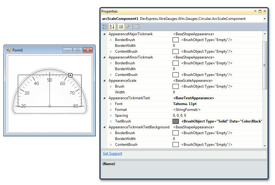
For instance, the following image shows Appearance… properties in the properties grid for an ArcScaleComponent object that represents a scale in circular gauges.
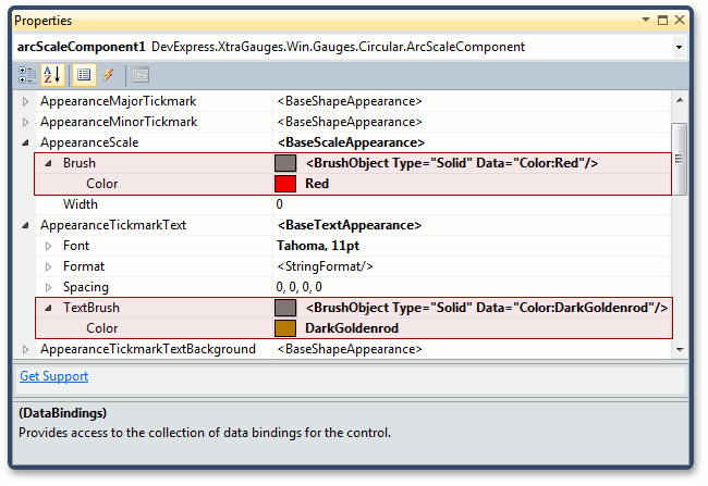
Let’s alter the scale appearance. For this, change the ArcScaleComponent.AppearanceScale and ArcScaleComponent.AppearanceTickmarkText properties, as shown below.
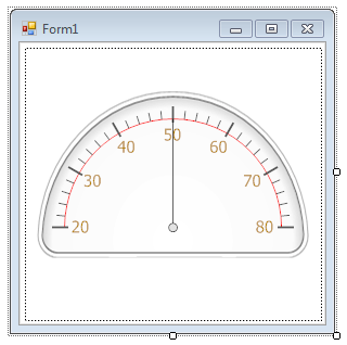
The circular gauge should look like the following.
Shaders
The appearance of most gauge elements is specified by the current gauge style (predefined image) applied to this element.
In addition, you can use the shader mechanism that allows you to change the color theme by mixing default colors with custom colors.
A shader is an object that implements the color blending feature. You can specify a shader for a gauge element via the element’s BaseLeafPrimitive.Shader property.
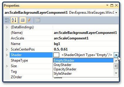
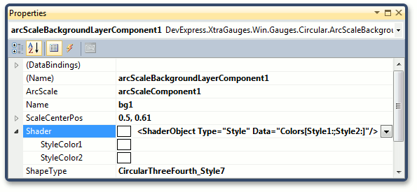
The image below shows the list of shaders for the ArcScaleBackgroundLayerComponent object.
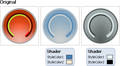
A StyleShader is the most used shader. It allows you to specify two colors for the resultant color calculation.
The StyleShader works the following way:
First, it calculates a grey tone (a value between 0 and 255) corresponding to the input color of the predefined image. The shader’s two colors define the range of colors in the color space. The output color is calculated as a projection of the grey tone onto this range.
The following image shows the result of blending colors for a sample background layer.
To learn more about background layer, see the Ornamental Elements topic.
See Also
Below is the list of other topics related to modifying the way your gauges look.