Gauge Styles and Style Manager
- 4 minutes to read
A Gauge control ships with numerous styles that can be applied to most of gauge elements (scales, needles, background and effect layers, level bars, etc.). A gauge style is a mini-preset that affects only the current gauge. Styles change the appearance settings of elements that belong to this gauge but do not add or remove any gauge elements like Scales or state indicators (compare with gauge presets that effect the entire GaugeControl and completely replace the current gauge layout).
This document gives the definition of a gauge style, lists its existing types, and explains how you can assign style to a gauge element at design time.
Built-In Styles
Gauge styles are predefined images that are stored internally in vector format, so they can be easily zoomed or stretched without loss in quality. The gauge styles define the size, proportions and appearance settings of the elements.
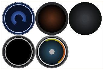
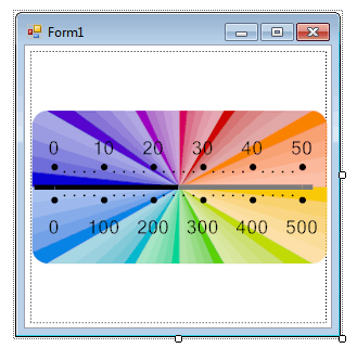
For example, the image below shows some styles that you can use to paint the background of circular gauges.
The alternative way to change the gauge appearance is to use ready-to-use gauge presets with applied styles.
You can see a full list of gauge presets in the Preset Manager, shown below.
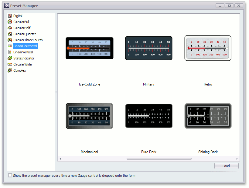
For more information on how to use this manager, see the Preset Manager topic.
Important
Applying a different preset to a GaugeControl completely removes all currently added gauges and replaces them with the selected gauge preset. Use this approach if you have only one gauge within the control. If multiple gauges are added, use the Style Chooser dialog to customize each particular gauge (see the section below).
Style Chooser
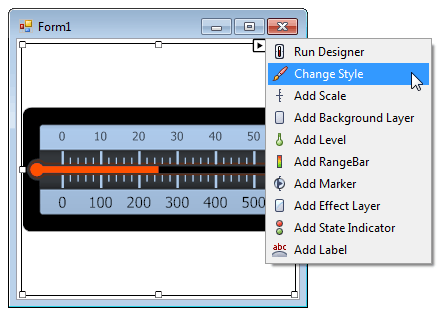
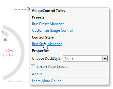
A gauge control provides Style Chooser that is used to quickly change the gauge appearance.
To access this editor, locate the gauge’s smart tag and select Change Style, as shown below.
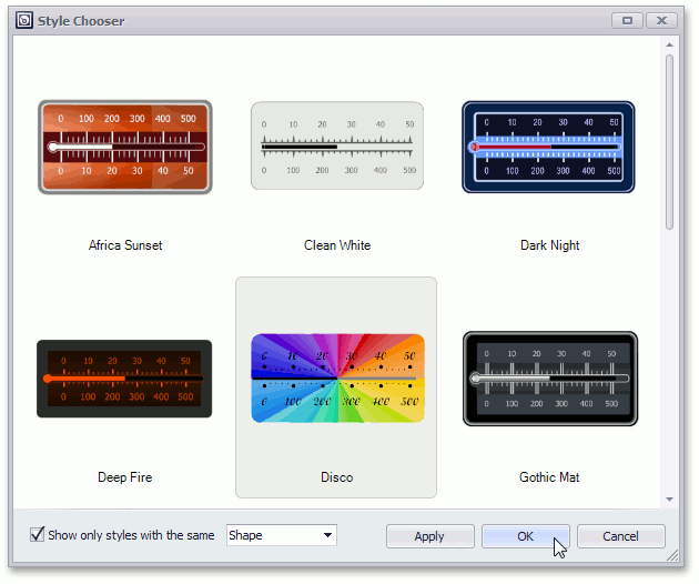
In the Style Chooser, select the required preset (e.g., Disco) and click OK.
Then, the Form panel should look like the following.
Note
Certain gauge styles are not compatible with specific gauge presets. For instance, you cannot apply a traditional needle-based gauge style for Ignis and Haze gauge presets. And vice verca, Ignis and Haze styles are disabled for traditional gauge presets.
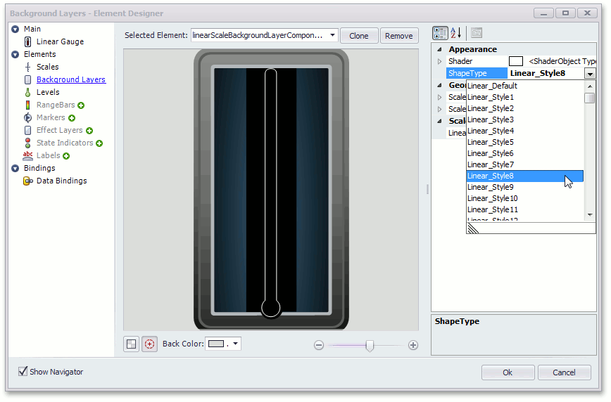
In some cases, you may need to change the style of a certain gauge element. This can be done by changing the ShapeType property of a required element.
The following image shows style changes of the background layer element using its designer.
See the Gauge Designer topic to learn more.
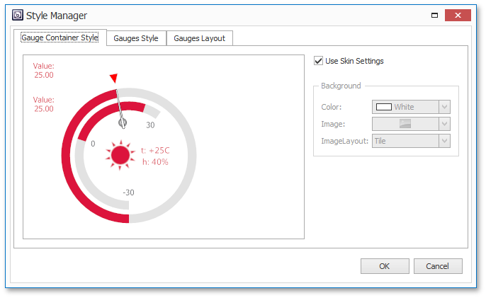
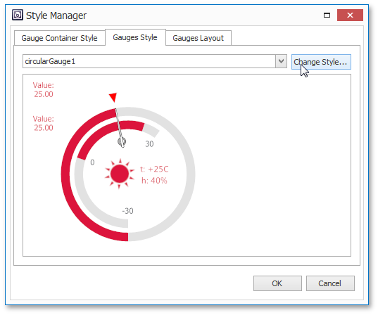
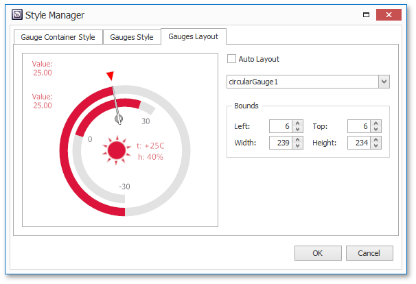
Style Manager
Another way to modify the gauge style along with its appearance and layout is using the Style Manager, available by clicking the corresponding link within the GaugeControl’s smart-tag.
This tool contains 3 tabs that allow you to modify control appearance.
The Gauges Container Style allows you to set the background for the entire gauge control.
The Gauges Styles tab features gauge styles. Clicking the ‘Change Style…’ button invokes the Style Chooser described previously. This tab allows you to quickly apply different styles to each of existing gauge within this control.
In the Gauges Layout tab, you can arrange gauges by enabling or disabling the auto-layout feature, or by manually setting gauge bounds.
Applying Gauge Styles in Code
Note
Your application must reference the DevExpress.XtraGauges.Presets library to be able to change gauge styles in code.
To apply a specific gauge style, you need to create a StyleCollectionKey object. This object stores all required information about the gauge: its type, shape and the desired style. For instance, the code below creates a new key for the circular gauge.
//Creating a new key and setting its scope (type)
DevExpress.XtraGauges.Core.Styles.StyleCollectionKey newKey = new DevExpress.XtraGauges.Core.Styles.StyleCollectionKey("Circular");
//The name of the style you want to apply
newKey.Name = "Pure Dark";
//The new shape for the gauge - Full, Half, QuarterLeft etc.
newKey.Tag = "QuarterLeft";
The key created can now be used to initialize a StyleCollection object. To apply the style stored within your key, call the collection’s Apply method and pass the required gauge as a parameter.