Gauge Designer
- 3 minutes to read
This document briefly describes how the Gauge Designer can be invoked, and explains its structure.
The Gauge designer is an integrated visual editing tool, providing you with the ability to quickly and easily customize gauges. It contains all necessary instruments for editing gauges and its elements including Label and Range editors.
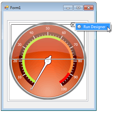
The designer can be invoked for a gauge or for any of its elements using the corresponding smart tags. This makes it possible to edit not only the whole gauge, but also a separate gauge elements you really need.
To open the designer for a gauge or its element, do the following:
- select the gauge / element on the windows form;
- locate the smart tag and click it;
- select Run Designer.
The following image demonstrates this approach for the Effect Layer element.
After that, you will see the Effect Layers editor.
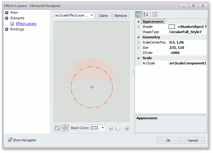
As you see, this editor contains all necessary settings to customize an element’s appearance, geometry and the scale position.
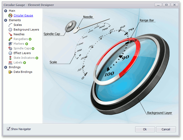
Let’s consider the common designer structure.
The typical designer view consists of the navigation pane on the left and the working area. The navigation pane is divided into three main categories, providing access to gauge properties grouped by features:
- Main
- Elements
- Bindings
These panes are described below using an example of the Circular Gauge editor.
Main
The Main category’s working area demonstrates the structure of the selected gauge and marks its main elements.
Elements
The Elements category allows creation and removal of elements and changing their properties as required.
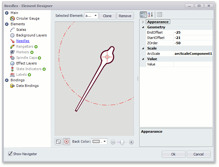
The supported gauge element types are listed under the category’s name. To get access to a specific element, click the required gauge element type.
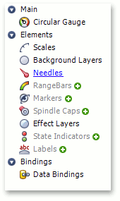
If the gauge does not contain any element of a specific type, then the corresponding item in the navigation pane is grayed out (see the image above). In this instance, you can create the first element of this type by clicking the  icon at the right of the group’s name.
Then, choose the required element via the Selected Element combo box at the top of the working area.
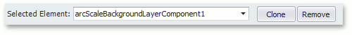
If an element of a specific type already exists, the icon is hidden. In this instance you can add more elements of this type by clicking the Clone button. This creates a new element copying the currently selected element’s properties.
To remove an existing element, first select it via the Selected Element combo box and then click the Remove button.
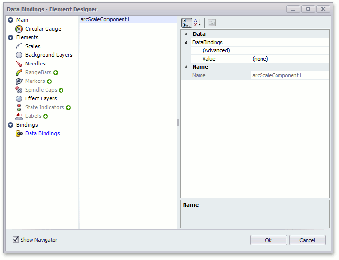
Bindings
The Bindings panel supports binding of various element properties to data sources. For example, it allows binding a scale’s value (ArcScale.Value) in circular gauges to a data source. For digital gauges, you can bind the DigitalGauge.Text property to a data source.
For more information on data binding, see Data Binding.