Digital Gauges
- 3 minutes to read
This document lists Digital Gauge types shipped in XtraGauges Suite and explains how you can use these gauges in your application.
For details on other gauge types, refer to the corresponding topics of the Gauge Types section.
Digital Gauges Overview
Digital gauges display text or numbers like LEDS do.
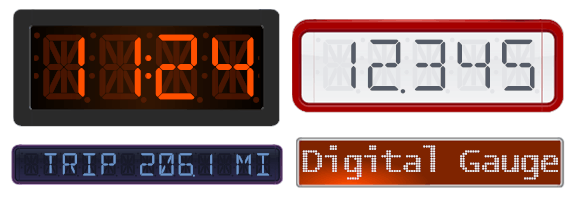
This control imitates the work of a real digital clock, audio receiver or any other LED device.
Digital Gauge provides the following types:
- Seven Segment;
- Fourteen Segment;
- Matrix 5x8;
- Matrix 8x14.
Numbers can be painted using a 7 or 14 segment or matrix view type, and text can be painted using the 14 segment view type or any matrix mode (see the image above).
A full set of digital gauge shapes is available at design time in the gauge Preset Manager.
DigitalGauge Class
A Digital Gauge is represented by an instance of the DigitalGauge class. This object can be accessed as an item of the GaugeCollection object returned by the GaugeControlBase.Gauges property of the GaugeControl object.
See the following code:
You can create a Digital Gauge control either at design time within Visual Studio or programmatically at runtime. The following examples demonstrate how it can be done:
Digital Gauge Elements
This section describes digital gauge elements, as well as gives a brief overview of their properties.
A Digital Gauge consists of numerous elements each of which is intended to perform a specific task.
The following image demonstrates main Digital Gauge elements.
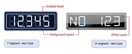
Symbols Panel is a container that looks and behaves like a real LED device. It hosts one or more symbols to display either characters or digits.
The following options affect how the gauge’s contents are displayed:
- DigitalGauge.Text - specifies the text to be displayed;
- DigitalGauge.DigitCount - specifies the number of placeholders for the text;
- DigitalGauge.LetterSpacing - specifies the distance between characters.
A Background Layer is the background of the digital gauge. It is represented by the DigitalBackgroundLayerComponent class. This layer provides the following main display options:
- DigitalBackgroundLayer.TopLeft and DigitalBackgroundLayer.BottomRight - specify the bounds within which the background layer is rendered;
- DigitalBackgroundLayer.ShapeType - allows you to choose the background layer‘s painting style.
An Effect Layer adds a style effect (for instance, a glare effect) to the gauge. The effect layer is represented by the DigitalEffectLayerComponent class. It provides the following main display options:
- DigitalEffectLayer.TopLeft and DigitalEffectLayer.BottomRight - specify the bounds within which the layer is rendered;
- DigitalEffectLayer.ShapeType - allows you to choose the layer’s painting style.
For more information on gauge elements, see the Visual Elements section.