Getting Started
- 10 minutes to read
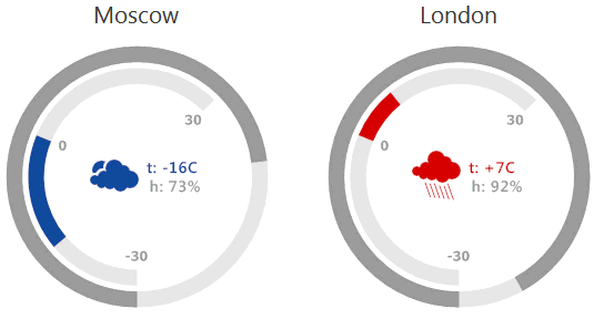
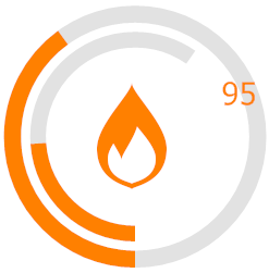
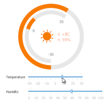
This topic will guide you through the main terms, concepts and mechanics used in WinForms Gauges. You will learn about the common workflow for creating gauges from scratch, starting with picking the gauge type and concluding with detailed elements customization. This lesson will use the gauges illustrated in the figure below as an example of the final result for the steps listed under the figure.
Note
Depending on the complexity of your desired gauge, there are two options available to you: the use of pre-defined gauge presets or the creation of a completely new gauge from the ground up. This topic will guide you through the first approach. For the second option, see the Creating a Gauge from Scratch topic.
Online Video
Selecting The Gauge Type
The first step is to clarify which gauge type you need. There are three gauge types.
- Analog Gauges - traditional scale-based gauges. This group consists of two separate gauge types - circular and linear gauges.
- Digital Gauges - gauges imitating LED info panels.
- State Indicator Gauges - simple gauges that display images of specific shapes that change depending on the gauge state.
To learn more about gauge types, refer to the Gauge Types topic.
For this example, you will need circular gauges.
Selecting the Gauge Preset
DevExpress WinForms Gauges possess a powerful and easy-to use tool that instantly creates a gauge of the desired type - the Preset Manager. Whenever you need to create a new gauge - check the available presets first, since the gauge you are looking for may already have been created by DevExpress. By default, this manager is automatically shown each time you drop a new GaugeControl onto the form.
Most similar to our desired gauge presets are Ignis or Haze.
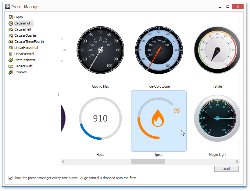
Pick the Ignis preset and click load. The Preset Manager will warn you that this action will completely destroy your current gauges layout and create a new one. Bear in mind that if you have multiple gauges within a single GaugeControl, using the Preset Manager will replace all of them at once with the selected preset. In this case, use the Gauge Styles and Style Manager instead - it affects only one gauge at a time rather than the entire GaugeControl, and changes the appearance of gauge elements without affecting your gauge layout.
Customizing Gauge Elements
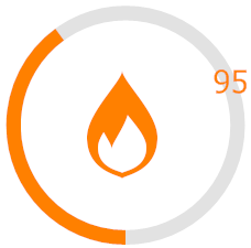
The selected Ignis preset differs from what we need in this example: it has only one circle instead of two, no text labels, images, etc. This can be easily fixed since gauges are not solid objects. Instead, each gauge is a set of elements, each with its own appearances and settings. To see the list of available elements, see the Visual Elements topic.
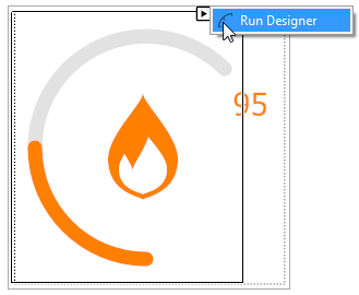
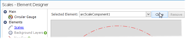
The light-gray circle in the Ignis preset is its scale that ranges gauge values from minimal to maximal. It is represented by an object of the ArcScaleComponent class. The orange bar on the scale is the range bar that indicates the current value. To modify any gauge element, select it at design time, and either use the Visual Studio’s properties window, or invoke the element’s smart-tag and call the Gauge Designer as shown below.
The default Ignis scale is a rounded line, but for this example we need a complete circle. You can fix it by setting its ArcScale.EndAngle property to 90. Refer to the Coordinate System article for more details. Also, set the ArcScaleRangeBar.RoundedCaps property to false to make range bar’s edges flat.
Adding and Removing Gauge Elements
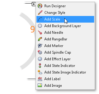
For the purpose of this example, you will need two scales with two range bars linked to them. You already have the first, outer scale. To add new gauge elements, do one of the following.
Select the gauge and click the required menu item within its smart-tag (see the following figure). For instance, in this example you could click the ‘Add Scale’ and ‘Add RangeBar’ items. This method is fast but has a minor drawback: all newly created elements appear with their default settings. Here, in this example, you would probably want to add a scale and range bar that look exactly like the previously customized items. To do so, use the second approach below.
Invoke the Gauge Designer and clone the required elements. This will duplicate your existing scale and range bar, so you will only need to modify their sizes and start angles.
After a slight modification (see the code below), you will get the layout illustrated on the following figure.
//Default Range Bar
arcScaleRangeBarComponent1.StartOffset = 87F;
arcScaleRangeBarComponent1.EndOffset = 0F;
//Cloned scale
arcScaleComponent2.RadiusX = 80F;
arcScaleComponent2.RadiusY = 80F;
arcScaleComponent2.StartAngle = 90F;
arcScaleComponent2.EndAngle = 306F;
//Cloned Range Bar
arcScaleRangeBarComponent2.ArcScale = arcScaleComponent2;
arcScaleRangeBarComponent2.StartOffset = 68F;
arcScaleRangeBarComponent2.EndOffset = 0F;
Values. Gauge Data
In this example, you will create a gauge displaying weather info. Obviously, in a real-life application, the gauge should receive all the required info from an outer source that should be bound to the gauge control as its data source. See the Data Binding topic to learn how to accomplish that. The gauge can also work in an unbound mode. Examine this mode for educational purposes.
Tip
Each value indicator has its own Value property, which specifies the value on the related scale that this indicator points to. However, this property should be manually set only if you have multiple value indicators (e.g., a needle and a range bar) linked to the same scale. In this example each scale has only one related range bar, so you should use the most common and reasonable workflow - the value indicator automatically displays the scale’s value.
Add two TrackBarControls to the form. Set their minimum and maximum values in accordance to the scales’ ranges (from 0 to 100 for humidity, from -30 to +30 for temperature) and bind their EditValue properties to the ArcScale.Value property of related scales.
//Temperature scale values
arcScaleComponent2.MinValue = -30F;
arcScaleComponent2.MaxValue = 30F;
//Binding track bar values to scale values
private void trackBarControl1_EditValueChanged(object sender, EventArgs e) {
    arcScaleComponent2.Value = (float)System.Convert.ToDouble(trackBarControl1.EditValue);
}

private void trackBarControl2_EditValueChanged(object sender, EventArgs e) {
    arcScaleComponent1.Value = (float)System.Convert.ToDouble(trackBarControl2.EditValue);
}
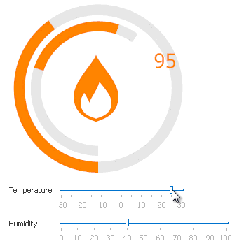
The animation below illustrates the result.
Images, Labels, State Indicators
The default Ignis preset has two additional gauge elements - image and label. You can learn more about each of these element types from the Labels and Images topic. For this example we will need two labels and one image element that changes its images depending on the weather type.
First, customize the label that already lies on the form, then go to the Gauge Designer, clone it as you did it with scales and move it to the required position. Finally, bind labels’ text to the trackbar values.
private void trackBarControl1_EditValueChanged(object sender, EventArgs e) {
    . . .
    string sign = "";
    if (arcScaleComponent2.Value > 0) sign = "+";
    labelComponent1.Text = "t: " + sign + arcScaleComponent2.Value.ToString() + "C";
}

private void trackBarControl2_EditValueChanged(object sender, EventArgs e) {
    . . .
    labelComponent2.Text = "h: " + arcScaleComponent1.Value.ToString() + "%";
}
Labels that display scale values are called tickmarks (refer to the Scales topic for the details). Show extreme and zero tickmarks by specifying the ArcScale.MajorTickCount property.
arcScaleComponent2.MajorTickCount = 3;
arcScaleComponent2.MajorTickmark.ShapeType = DevExpress.XtraGauges.Core.Model.TickmarkShapeType.Default;
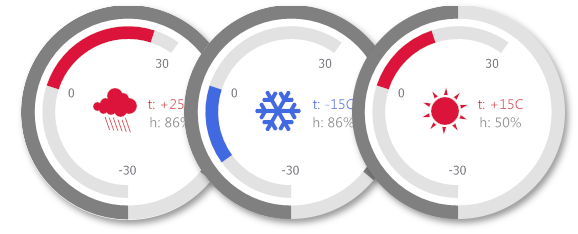
The image added by default is the ImageIndicatorComponent class object. This element is designed to display static images. For this example, you need to display multiple images depending on the weather type, so remove this default element and add a state image indicator. State image indicators store a collection of images, each displayed when the related scale enters the specific value indicator. Alternatively, you can manually choose which state image should be currently shown. Refer to the State and State Image Indicators topic to learn more.
Again, in a real-life applications you would probably receive all the required data, including the weather type, from an outer source. This example doesn’t have a real-life weather info bound, so generate different weather types depending on temperature and humidity:
- sunny - temperature > 0C, humidity < 75%;
- rainy - temperature > 0C, humidity > 75%;
- clowdy - temperature < 0C, humidity < 75%;
- snow - temperature < 0C, humidity > 75%.
public int GetWeatherType() {
    //0 - sunny, 1 - rainy, 2 - clowdy, 3 - snow
    if (arcScaleComponent2.Value > 0) {
        if (arcScaleComponent1.Value < 75) return 0;
        else return 2;
    }
    else {
        if (arcScaleComponent1.Value < 75) return 1;
        else return 3;
    }
}
Using this method’s return value, update the displayed images whenever the temperature/humidity changes. To do so, set different values to the StateImageIndicatorComponent.StateIndex property.
private void trackBarControl1_EditValueChanged(object sender, EventArgs e) {
    . . .
    stateImageIndicatorComponent1.StateIndex = GetWeatherType();
}

private void trackBarControl2_EditValueChanged(object sender, EventArgs e) {
    . . .
    stateImageIndicatorComponent1.StateIndex = GetWeatherType();
}
The animation below shows the result.
Customizing Gauge Appearance
Each gauge element can be painted independently using its own brush object. See the Appearance Customization topic to learn more.
You can notice that all gauge elements except for the scale are painted using the orange color - this happens because the Ignis preset automatically turns on the Color Scheme that allows you to colorize all required gauge elements in a centralized way. The scheme is applied to elements that are painted with an empty brush. Paint the outer range bar and its related label with gray colors as the sample figure at the top of this topic illustrates.
arcScaleRangeBarComponent1.AppearanceRangeBar.ContentBrush = new DevExpress.XtraGauges.Core.Drawing.SolidBrushObject(Color.Gray);
labelComponent2.AppearanceText.TextBrush = new DevExpress.XtraGauges.Core.Drawing.SolidBrushObject(Color.Gray);
Finally, change the color scheme color and set different colors depending on the current temperature.
gaugeControl1.ColorScheme.Color = Color.Crimson;

private void trackBarControl1_EditValueChanged(object sender, EventArgs e) {
    . . .
    if (arcScaleComponent2.Value > 0) {
        . . .
        gaugeControl1.ColorScheme.Color = Color.Crimson;
    }
    else gaugeControl1.ColorScheme.Color = Color.RoyalBlue;
}
The resulting gauge that fully matches the initial task is illustrated below.
Applying Gauge Animation
You can additionally customize your gauge by enabling gauge animation. This feature allows your value indicators to move using specific easing functions whenever the related scale’s value changes. See the Animation topic to learn more.
arcScaleComponent1.EnableAnimation = arcScaleComponent2.EnableAnimation = true;
arcScaleComponent1.EasingMode = DevExpress.XtraGauges.Core.Model.EasingMode.EaseOut;
arcScaleComponent1.EasingFunction = new DevExpress.XtraGauges.Core.Model.BackEase();
arcScaleComponent2.EasingMode = DevExpress.XtraGauges.Core.Model.EasingMode.EaseIn;
arcScaleComponent2.EasingFunction = new DevExpress.XtraGauges.Core.Model.CircleEase();