Scales
- 6 minutes to read
A scale is the base element for any analog gauge, be it circular or linear. Scales are rounded or linear bars that range from minimum to maximum values. Depending on the current gauge style, a scale can be invisible or filled with a specific background color. Scales for circular gauges are instances of the ArcScaleComponent. The LinearScaleComponent class represents scales for linear gauges. Each gauge can contain multiple scales at the same time, each with its own appearance and behavior settings.
Values
Each scale ranges within a specific interval starting with the ArcScale.MinValue (LinearScale.MinValue) and up to the ArcScale.MaxValue (LinearScale.MaxValue). The current scale value is specified by the ArcScale.Value (LinearScale.Value) property.
In the most common scenario, each scale has only one related value indicator. In this case, the indicator’s Value property should remain empty - the indicator will then point to the scale’s value. Alternatively, if you have multiple value indicators, specify the value of each of them separately.
Analog gauges can rescale their extreme values when the gauge value reaches minimum or maximum. Refer to the ArcScale.AutoRescaling topic to learn more.
Scale values can also increase with non-linear speed. See the ArcScale.Logarithmic and LinearScale.Logarithmic properties for details.
Geometry and Layout
Similarly to all the other gauge elements, scales can be selected at design-time. You can invoke a scale’s smart-tag and call the Gauge Designer or modify the scale by using the Visual Studio’s Property Grid.
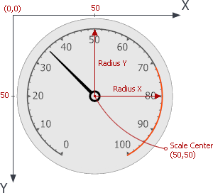
For the ArcScaleComponent, you can set the ArcScale.RadiusX and ArcScale.RadiusY properties to set the scale size counted from the ArcScale.Center point (see the Coordinate System topic for details).
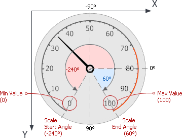
You can also customize the circular scale’s shape, setting the ArcScale.StartAngle and ArcScale.EndAngle properties. This changes the scale shape from a full circle to any desired span.
Linear scales are arranged based on the LinearScale.StartPoint and LinearScale.EndPoint properties.
Appearance
You can specify brush objects that will paint the scale itself or its specific elements (e.g., tickmark labels). See the Appearance Customization topic to learn more.
Ranges
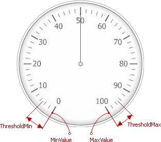
Full scale range can be visually divided into separate intervals called ranges. For instance, you may want to mark some safe or critical value ranges.
Note
Do not confuse ranges with range bars. Ranges are static visual elements that belong to a scale, mark its intervals and do not depend on a current gauge value. Range bars, in turn, are independent elements that can either be associated with Scales to reflect their current values, or mark their own values. In some gauge styles (e.g., Haze or Ignis) range bars serve as a replacement for the traditional needle element.
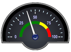
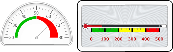
Visually, ranges are displayed as bars along scales, which can be rectangular in linear gauges or rounded in circular gauges. In the following image, a circular gauge contains two range bars (green and red), and a linear gauge contains three range bars (green, yellow and red).
Ranges belong to a scale, and can be created and accessed by using the scale’s Ranges collection (ArcScale.Ranges or LinearScale.Ranges).
In circular gauges, ranges are represented by ArcScaleRange class objects, and in linear gauges these are represented by LinearScaleRange class objects.
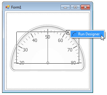
To create a range at design time, you need to invoke the Scale Ranges. It can be done in one of two ways:
Select a scale (for instance, by hovering over it with the mouse and clicking it). Then, invoke the Collection Editor for the Ranges property in the Property Grid;
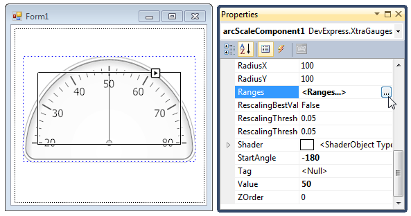
Locate the scale smart tag on the form and click Run Designer.
In the invoked Scales - Element Designer, click the Ranges… button, as shown below.
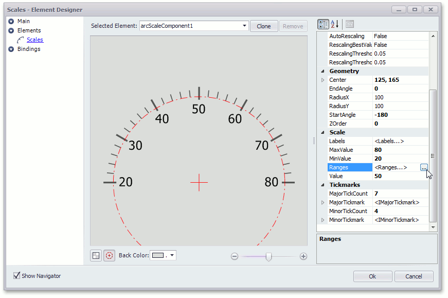
In the Scale Ranges editor, you can create new, delete or customize existing ranges:
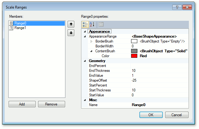
Each range provides properties that allow its visual options to be modified. The main properties are:
BaseRange.StartValue and BaseRange.EndValue - specify the starting and ending absolute values for the range along the scale;
If you prefer to specify a range’s bounds as a percentage, use the ScaleRange.StartPercent and ScaleRange.EndPercent properties, instead;
- BaseRange.ShapeOffset - the offset of the bar’s edge from the scale axis, in relative coordinates;
- BaseRange.StartThickness and BaseRange.EndThickness - the thickness of the bar at the starting and ending points;
- BaseRange.AppearanceRange - contains appearance settings for the range.
Tickmarks
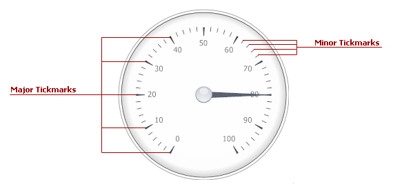
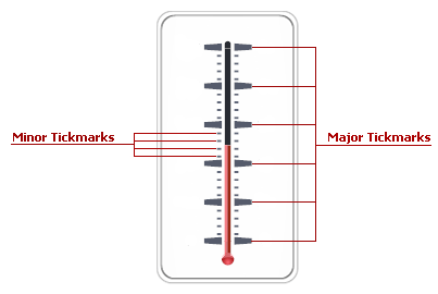
Tickmarks are dashes of different sizes and shapes that mark scale values with the specific step. There are two types of tickmarks - major tickmarks that are able to display related scale values and minor tickmarks, which are dashes of a smaller size without text, located between two neighboring major tickmarks (see the figure below).
To specify the number of tickmarks, use the ArcScale.MajorTickCount and ArcScale.MinorTickCount properties (the LinearScale.MajorTickCount and LinearScale.MinorTickCount properties for linear scales). Just like many other gauge elements, tickmarks can be painted using a specific brush object, assigned to the related properties within the ArcScaleComponent.AppearanceMajorTickmark (LinearScaleComponent.AppearanceMajorTickmark) and ArcScaleComponent.AppearanceMinorTickmark (LinearScaleComponent.AppearanceMinorTickmark) property sections.
Scales have two sets of properties that manage tickmarks of each type - the ArcScale.MajorTickmark and ArcScale.MinorTickmark properties (the LinearScale.MajorTickmark and LinearScale.MinorTickmark properties for linear scales). These sections provide access to such properties as:
- IMajorTickmark.ShowTick (IMinorTickmark.ShowTick) - gets or sets if the tickmark dash should be displayed;
- IMajorTickmark.ShapeType (IMinorTickmark.ShapeType) - specifies the shape of the tickmark dash if dashes are displayed;
- IMajorTickmark.ShowText - allows you to display scale values for major tickmarks;
- IMajorTickmark.ShowFirst and IMajorTickmark.ShowLast - gets or sets if tickmarks for minimum and/or maximum values are enabled.
Labels
A scale can display text of two types: tickmarks’ text and scale labels. Tickmarks’ text is shown or hidden by using the IMajorTickmark.ShowText property. Minor tickmarks do not display their values with labels.
Scale labels are accessed using the ArcScale.Labels (LinearScale.Labels) collection. The core differences between scale labels and tickmarks text is that scale labels are not related to other elements (like tickmarks’ text are related to major tickmarks), and secondly, not only can scale labels display scale values, they can also be used to display any custom text content. Scale labels can also be formatted using HTML tags (see HTML Text Formatting to learn more). Finally, unlike custom labels, scale labels belong to a scale, so they have the same Z-index and are displayed at the same level as the parent scale.
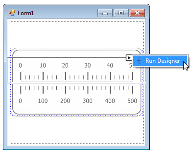
To add a scale value label at design time, you need to run the label collection editor. It can be done in one of two ways.
Select the required scale, and then in the Properties Grid, invoke the collection editor for the Labels property (ArcScale.Labels or LinearScale.Labels).
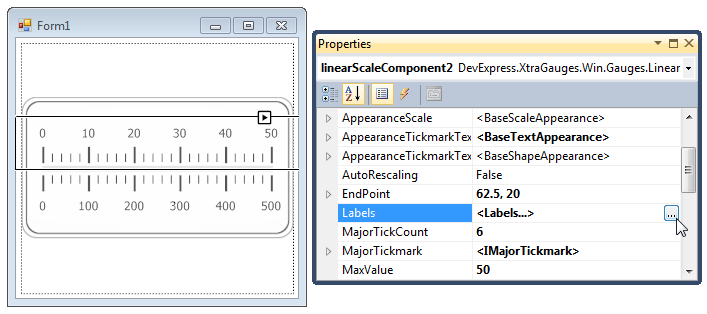
For the required scale, locate its smart tag and click Run Designer.
Then, in the invoked Scales - Element Designer, locate and click the Labels… button, as shown below.
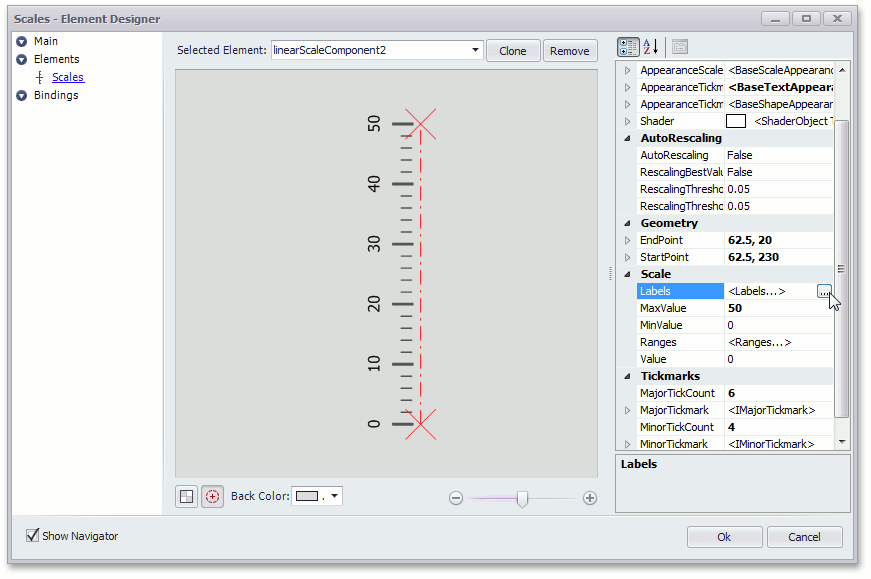
In the collection editor, you can add one or more labels and customize their settings:
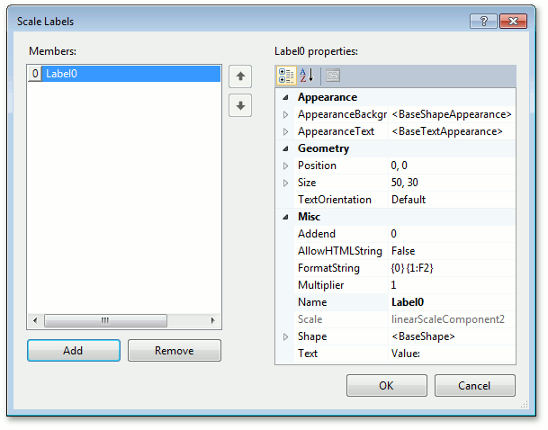
For instance, the FormatString property allows you to include the scale’s current value in the label’s text. Note that placeholder {0} stands for the value of the label’s Text property, and placeholder {1} stands for the scale’s current value.
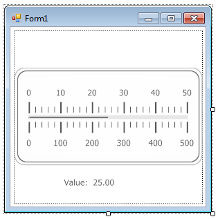
In the image below, the label belongs to the upper scale, so it shows a value of 25.